CLICK HERE TO VISIT MY ETSY SHOP!

VISIT MY ETSY.COM SITE.
Preview
JUST CLICK ON MY PRESS!
Showing posts with label reduction printmaking. Show all posts

Tuesday, February 28, 2017

But WAIT! There's MORE!

This isn't a very good photo, but the darker green is actually a fairly bright, grassy green. I was pleased with the color, and I had called this print finished. Still, something was nagging at me about it.

I've long believed that you need three tones of color to show depth. Sometimes you can use shading, sometimes you need three colors.

To me, this lacked depth. The dome has three levels of color -- white and two grays, and I think it gives the dome a good feel. While the Poinsettias aren't bad, they just don't pop for me. So I went back.

So, I carved out larger areas where I had carved for the light yellow-green, and added some cross-hatching in places (notably, on the stems). I then overprinted with a fairly dark green. I definitely got the effect I wanted, but now I have a different problem: The leaves feel too 2D. That's fine, except that I have carved away all that area. With reduction printing, there's no going back.

Well, there's always a way to go back. I will carve another block and attempt to add in some darker areas and maybe do some shadowing in those hatched areas in the center. It's a lot of work, but I think this print deserves it, and you know I could use the practice. The center of the sunflower in "Sunflower Farm (2014) used the same save.

Saturday, February 25, 2017

Going Green

Just one more color to go. I'm really pleased with the colors and the coverage I'm getting from my Renaissance Graphics ink.

This light green will serve as the base for a darker green. I've had few issues with this print, and I'm surprised a bit because when a large area gets cut away, I am often plagued by ink getting on the block in areas it shouldn't be. Am--am I getting better? Gasp!🤔😁

Tuesday, August 23, 2016

Out of Control

The original design for this print called for about seven colors, and in my last attempt, I only made it to five before I had to stop due to the ink issues. This time, because the ink is laying down so well, I keep changing the plan, adding more colors. There's only supposed to be one blue green, and the blue here was actually supposed to be part of the rainbow roll; now it's the first of two blues.

The risk, of course, is going too far, either building up the ink layers to the point that the picture loses detail; worse yet is the deterioration of the plywood, which can crumble and cause pieces that need to stay to the end, start to disappear. But the failure to explore is where art stops and factories begin, and I already spend too much of my life in a factory. So, I will play!

Thursday, July 16, 2015

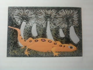
All Newt Review

Sometimes printmaking just breaks your heart. Bless the ones who find their niche and master it. I, on the other hand, just keep pushing the envelope. I guess that'll lead me somewhere awesome, but the road....well, friends, the road can be tough.

So, about four colors into the newt print, I knew it wasn't going to work. But I finished it. I made myself finish it, and finish the whole lot. Not just to finish it, but to make notes along the way so that I could at least salvage the education. There are things I do love about it, but other things that have me tearing my hair out.

But the one thing that calms me down is knowing that if I was just playing it safe, I wouldn't be here. So, while the nut goes uncracked, I'm certain that when I do figure this all out, there's going to be magic.


Wednesday, June 3, 2015

Press-ure Pointers

I have been printmaking for over 13 years now, and one of the things I love about it is that I always learn something. Every time I hit the studio, it's education.

Being self taught is freeing, but you are also hampered by your own unknowns. If you go down Path A, you will go directly to the wellspring of all knowledge. But if you don't know Path A is there, you can get lost in the woods pretty easily.

Of course, if you take Path A, you also miss all of the crazy stuff in the woods. So there it is.

Anyway, I belong to an online group of amazing artists known as Baren Forum. They've been to the font of knowledge and are kind enough to run cups back to us morons still crawling around in the weeds. As part of this group, I am encouraged to participate in the print exchanges, where up to 30 members exchange prints. I did participate, as you saw a few posts back. And it was such a great experience. But as I was going through the work of others, I was struck by how nice an opaque some of the prints looked. Some looked like screen prints, the ink was so dense and even, regardless of the paper used.

And that led me to some serious trouble shooting in the studio last night, and some serious internet investigation. And it all came down to one thing, the thing that makes everything in the universe work: pressure.

I use an antique cast iron book press, which I have just discovered offers a raction of the pressure that an etching press does. In fact, though I turn and crank that wheel as hard as I can, it gives less pressure than using a wooden spoon, which is how I used to make my prints back in the beginning.

Here is an example of spoon vs. press.

On the right is the coverage I get from a lightly-inked block. On the left is what the ink transfer is like using a wooden spoon to burnish the back.

Well, issues with my hands prevent me from going back to the spoon, and I'm not giving up printmaking. So, I have found that by inking the block a little more, and just making peace with the effect of less pressure on the block, I can get back to some solid work. We'll see, won't we?!