CLICK HERE TO VISIT MY ETSY SHOP!

VISIT MY ETSY.COM SITE.
Preview
JUST CLICK ON MY PRESS!
Showing posts with label woodcuts. Show all posts

Monday, March 25, 2019

Lighten Up


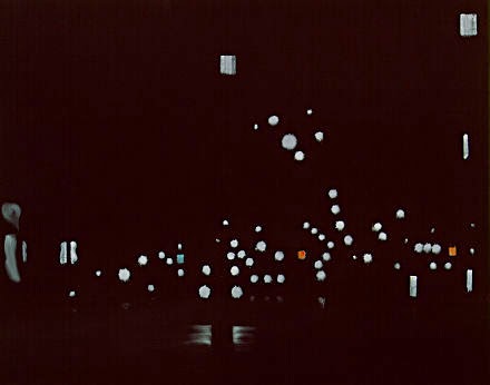
 The first four states of my latest print. I am using fluorescent pigments in white to achieve a glowing sky. Pretty happy with the results.


Wednesday, November 16, 2016

In the Club

Early last year, after years of promising myself I would, I participated in the Baren Forum's print exchange. You can view the participating prints in this exchange, and other exchanges by clicking http://www.barenforum.org/exchange/exchange_64/intro.html. Mine is center, second from the bottom. There was so much great work, and I feel both thrilled and unworthy to be among this group.

Tuesday, August 23, 2016

Out of Control

The original design for this print called for about seven colors, and in my last attempt, I only made it to five before I had to stop due to the ink issues. This time, because the ink is laying down so well, I keep changing the plan, adding more colors. There's only supposed to be one blue green, and the blue here was actually supposed to be part of the rainbow roll; now it's the first of two blues.

The risk, of course, is going too far, either building up the ink layers to the point that the picture loses detail; worse yet is the deterioration of the plywood, which can crumble and cause pieces that need to stay to the end, start to disappear. But the failure to explore is where art stops and factories begin, and I already spend too much of my life in a factory. So, I will play!

Friday, August 19, 2016

Everything On the Line

Still untitled, the print is starting to take form now, with the addition of a pretty retro blue-green, my wife's favorite color. This is my second attempt at this print. The first attempt, which I believe was some time last summer, ended in disaster, due mostly to the ink issues I've documented. No sign of any of those problems this time. The coverage with the Renaissance and Graphic Chemical inks has been outstanding.

I usually like to show previous attempts, but I have had no luck finding an old print or even a photograph. As I recall, I made it to the last or second-to-last color before it went all to hell. You may notice that the rainbow roll looks less prominent, but as the darker colors go down, the sky will regain its vibrancy.

Thursday, July 28, 2016

A River Runs Through It


This is state #4 of the second try for the "Ohio St Bridge" print. I am happy to report that the new ink has performed excellently. The inks are Graphic Chemical and Renaissance Graphic inks. I have abandoned burnt plate oil for hydrolyzed linseed oil, known as Sets well. This gives inks a creamy, buttery texture that allowed the ink to stand up and flow out, making coverage easier and facilitating overprinting. I only use a small amount, and even with white ink, it works great. I have also switched from Grumbacher cobalt drier to Hancock, which I used for ten years without issue. One single drop per ounce of ink and The print is dry the next day. There are 3 more colors. This print will be my entry in the 2016 Erie County Fair.

Wednesday, May 13, 2015

Loon-ar Landing

In December 2012, after settling back in Hamburg, I unpacked my studio and set to work on a new woodcut print. The print was inspired by "Maroon," a track off of the sublime Ken Nordine album, "Colors."

So much went wrong with this print, I won't detail it. But I was very unhappy with it when it was done. As you look at it here, you can see that one of my biggest problems was the most common problem -- coverage.

There were three problems affecting coverage here: the grain of the wood (which is such an awesome thing in woodcuts, but has been a nightmare in reduction printing), the grain of the paper, which had way too much texture for this type of printing, and the fact that the paper was like card-stock. Woodcuts fare better when the paper has some give. But it's what I had. And at this point, having just found refuge back in my hometown after a horrible exile in the city, we were scrounging pennies (we're scrounging nickels now, so everything's much better).

But now, 2.5 years later, I want to give it another go using the linoleum I recently purchased. Come walk with me as I redo "Maroon." In the meantime, go check out Ken Nordine's "Maroon" on Youtube!  https://www.youtube.com/watch?v=9pwyjqq2ju4

Tuesday, February 24, 2015

I'm A Katz Man

In late 2002, as I was devouring all things woodcut, I read an article in the Buffalo News about an exhibition at the Albright-Knox that featured the work of Alex Katz. I was familiar with his work as a painter of mostly portraits, and was very excited to see his woodcuts.

"Camp", 1990, shown here, stole the show for me. They only needed to hang this one up. As I recall, it was the first print one saw when entering the exhibition hall (and I mean hall; one of the things that drives me nuts is that works on paper are often relegated to this little underground hallway, which is clean and well lit, but I get the feeling that, unless you know to look for it, you'll walk on by).

I guess one might look at this print and sneer at it's minimalism, just a few colors, no detail. But there's a story here.

Or maybe there isn't. For decades people have been reading messages and moods in Edward Hopper's work, but in interviews he has claimed to only have been painting the effects of light and shadow.

This painting by Katz has become very influential to me, which I think you will see soon.

Wednesday, February 11, 2015

Etsy Store Reopened

Just a quick note to remind you that the etsy.com shop is back up for the new year. On my way home from work yesterday afternoon, I caught a V of over 50 Canada geese overhead. They were heading north; however, they seemed to be arguing loudly about the decision!

Thursday, September 25, 2014

Let's All Go to the Lobby

I have attempted this print before. If practice makes perfect, we should be seeing a real treat emerge here. The ink is laying down very well, and I'm not seeing any of the issues I had with the duck print.

This state defines what I love most about reduction woodcut printing: at a certain pint, you begin to see the bones of what will become the finished print. You can start to see where the cars will be, where the features of the cars will be.

The toughest part of this print is next, a two color sky. There are a few names for this in printing. In commercial printing and in screen printing, it's called a "split" or a "split fountain"; in relief printing, it's a "rainbow roll." In any case, when it's done well, it adds dimension and complexity to a print. At right
is a blurry photo of a split I did on a screen as I was figuring out colors.

Tuesday, August 26, 2014

The Store Is Open!

"Desoto Motel" 2014
I finally got the etsy.com shop up and running. You can click on the link above the press at the top of the page, or the link included at the bottom of this post. There are a few kinks to work out yet. If you're not comfy doing business on the net, I'm happy to work around that. Just drop me a line at nappingcatpress97@gmail.com.


Click link: https://www.etsy.com/shop/NappingCatPress

Tuesday, July 8, 2014

Extreme Closeup: Sunflower Farm

Better photo to come, but this was a cell phone closeup of "Sunflower Farm" immediately after finishing color #10.
 Sorry about the orientation: grampaw isn't so good with his technology. As I said, better pictures are forthcoming.

As you may know, I traditionally enter a print in the Fine Arts competition at the Erie County Fair. As I prepared to start this print, I found myself in the muck of procrastination. "You need to get going on a print," my wife chided. "You need to give yourself time to do it over."

The joke is, of course, that I have a tendency to do a print a few times before it's right. And while I nailed this baby right out of the gate, allow me to take you back almost exactly one year, to the summer of 2013, when I was working on a little something I called "Sunflower Farm..."

This attempt was donated to the Chaffee Landfill, if anyone wants to go digging for it.


Thursday, March 27, 2014

Hall of Heroes: Edvard Munch


I scream for Munch's "Scream."
This painting seems...familiar.
Although in my own work, I tend to gravitate toward the light and bright, that is certainly not where I live, day-to-day, as my poor wife will tell you. And while my output over the years has focused on the visual beauty of nature, my creativity feeds mainly on the stark, tortured and emotionally anguished images of the Expressionists. Favorite among them, of course, is Edvard Munch (pronounced "Moooonk", although if you pronounce it to rhyme with "crunch", it will make Expressionists around you laugh, and face it, they could use a smile).

Most famous for "The Scream," Munch is as well known for his woodcuts as he is for his paintings. In fact, he often did the same images in different media.


Munch is often referred to as "The Clown Prince of Norwegian Expressionism." Not.
I find his woodcuts severe, having a certain darkness that the paintings do not. He takes no opportunity to smooth out the gouges in the wood, and sometimes it looks like they were made by a prisoner who only had a nail and a board. That, of course, is a compliment.

It hasn't shown up yet, but Munch's inspiration is in me, somewhere. Maybe over there, in that cobwebbed, shadowy corner in my mind.

Wednesday, June 12, 2013

Autumn Camping

Last night I finished this print, still untitled, and I have to say that I am extremely pleased with the result. I apologize for the picture quality (camera phone, poor light). The colors really seen to come out with the addition of the brown and black.

For those in the know, this is the second print I have done of one of these small vintage trailers. The first, "Little Camper" (2009) was a favorite at shows. It was never my favorite, believing I could do better work. That was...wow...four years ago now. I'm more confident with my style, I'm working in a larger format, and I have become far more knowledgeable of the subject. We see these beautiful little midcentury gems all over in our travels, and while I wasn't looking for a "trademark" subject, I can guarantee you will be seeing more of these in the near future.


"Little Camper" (2009) Copyright 2009 Jeffrey Dean


Wednesday, June 5, 2013

And We're Back


Well, I sure do need to focus, don't I.

There are two more colors to go on this one, but I'm very skeptical about how it's all going to come together. I guess I'll just shut up about it until I'm done.

Thursday, November 29, 2012

So, having moved back from the cruel city to our home in Hamburg, NY (where it all began), I now have a comfortable though incomplete studio setup in our very toasty basement. The first order of business was to try to get back to a woodcut I began over the summer. Unfortunately, the print wouldn't take the ink, so I had to scrap the prints I'd begun. However, I am still going to finish the print, minus the two colors I'd already printed -- gray and orange.

The design is based on mental imagery I got from listening to one of Ken Nordine's color poems, "Maroon." If you have a moment, pop over to Youtube and check it out. "there's a singer's croon...as she sings a tune...to an orange moon...like a crazy loon." Not a literal translation of the poem/song, but a fun little excercise. It will probably just be a three-color print, a little something to get me back in the water.

The picture here is one of the states of the print, the maroon layer, printed on linen as a test to see how well the material takes the ink. The intention is that Amy & I will collaborate on a future project, so stay tuned for that.

The Etsy shop is presently closed, and probably will remain closed until after the holidays. Please check back for updates, and "like" Napping Cat Press on Facebook to get alerts to the latest work.

Saturday, February 20, 2010

A Bit About A Block....

I like to show people the blocks once the printing is done. It helps people to understand the reduction printing process better. The print (see yesterday's post) was printed from a single block of birch plywood. Usually, there is very little left of the block. This was one of those rarities where the remaining block could hold up as its own print.

Friday, February 19, 2010

12:01 At The Oasis: Win This Print!

Some years ago, when I was working as a screenprinter in a greeting card factory, I became fascinated by the play of the overhead fluorescent lights in the cups of ink on my press table. And thanks to my overindulgence on "Harold and the Purple Crayon" books, among other things, I became fascinated by the moon. Add being drawn to Henri Rousseau's famous "The Sleeping Gypsy" (left) and the eerie album art of my brother's Blue Oyster Cult "Agents of Fortune" LP, it was only inevitable (in my mind only, I imagine) that they would all come together to form the print I am introducing to you now.

This untitled (as yet) woodcut began its life as a light yellow rectangle. You will notice a little dot in one corner. Not only is that there to tell me the position of the block on the press, but it also helped to remind me which print this was for, as I was printing a different, non-descript block the same night with the same ink for a different print.

The next state was a very light orange-gray, specifically, a PMS Warm Gray 5 approximation. I love the warm grays, and used them for liberally in the previous ocean storm print. You will notice that I had cut out the crescent moon and a few stars.

You might say, "Dude, that's not Warm gray anything. That's BLUE!" Good sleuthing, Sherlock. Indeed. I had forgotten to print a proof of this state at the time, and had to print this proof out the next day. So then, because you're like that, you might say, "But dude! Aren't you supposed to print a proof BEFORE you print the edition. That's when I take you aside and slip you a fin and ask you kindly-yet-threateningly to shut your yap, saying that when I print, I prefer to play the game called "Proof or Dare."

Next up, having cut out the highlights of the dunes (or mountains, if you prefer...but they're dunes) to reveal the Warm gray #5, I printed state 3 in a very dark version of Warm Gray 11.

There is also a shoreline highlight at the water's edge, a technique I learned from watching Bob "Happy Little Trees" Ross on PBS. Hey, when you can't afford art school, you take your knowledge anywhere it comes from. Thanks, Bob.

The fourth state was a scary one for me. When you are doing a night sky, it's really hard to judge how light or dark to go. I used a straight medium blue ink for this state originally. But the ink was very transparent, and the darker color underneath caused the ink to go almost black. I hemmed and hawed over that for a few minutes, then decided it wasn't right. I added just a touch of white, which not only lightens a color but makes it more opaque, and this was the result. This is about the point I get very nervous about a print, because it just looks weird. Reduction printing, like life, requires a lot of blind faith that everything is going to work out just fine. 

The last block usually ties everything together. In multiple block printing, it's called the key block, and is usually black ink. In reduction printing it is called -- at least by me -- the if-I-make-a-mistake-on-this-I'm-going-to-cry-like-a-colicky-infant block. I've lost my share of prints like this. But, losing in the last minutes of the game is old hat for us Buffalonians. Am I right people?! Heeya!

But seriously, folks, this block was a very scary one to cut. I studies the lay of the fronds of palms at the Botanical Gardens, and from photos, and developed a technique of cutting the fronds that made me very, very satisfied with this print. I was also a little nervous about how the water was going to look.

And when it was all over, this is what I had:


Now, here's where you can WIN THIS PRINT!

With all apologies to Maria Muldaur, there is no way in hell I'm calling this "Midnight at the Oasis." Even though the song was stuck in my head the whole time I was printing it. So, I'm leaving it up to you. Think up a title and either post it in the comments section below this post, or email me at thadeenz97@verizon.net. My lovely wife, Amy, will choose her favorite of the entries. The winner will receive one of this edition of six. That's a $20 value. Ssssssweet!

Contest closes at 3:30 PM March 1, 2010. Winner will be announced March 2. Not very creative? Then just go ahead to my etsy.com store (click the press at the top of the page).

Thanks for reading!


Saturday, January 30, 2010

Ahoy!

Still untitled, this is the very latest off of the press here at NCP. A ship tossed in angry foaming seas, watched by a sentinel deep in the shroud of fog, this is my favorite print so far.

The image is 6"x4", and is 8 colors of oil-based ink on lightweight off-white French-made paper.

The print was inspired by a quote, now forgotten, concerning hope, which I had read during a particularly dark and worrisome time in December. This image came to me, and I am thrilled that I was able to recreate the image on paper.

While it is common to print from lightest color to darkest, I chose to print the water darkest to lightest, hoping that the water would take on more texture and a more "mottled" appearence, particularly in the foam.
For information on acquiring this or other prints, please visit my etsy.com shop.

Monday, September 14, 2009

Stalking Marv Levy


Okay, just so you know I'm not a one-track-mind kinda guy...
Saturday night, after celebrating my grandmother's 92nd birthday, the Little Woman and I went to Wegmans in Blasdell to get some provisions. As we were browsing the books and magazines, she leaned over to me and whispered: "Marv Levy." I looked next to me, and there was the man, the Football Hall of Famer himself in a bright orange, blue-striped Hilfiger shirt. Everyone around him was staring, but no one was approaching him. Which is nice. But if you're wearing a traffic cone inside a crowded supermarket, aren't you just asking to be hasseled?
Anyway, Marv was behind us with his cart full of fruit, and as we strolled out to the car, I had a great idea: let's stalk Marv Levy!
So, we drove around the parking lot until we found him and tailed him. After four turns and a hop onto the 219, we realized that he was going our way. So, I guess it's not really stalking, especially since we exited in West Seneca as he proceded up the I-90, destination unknown.
Another brush with greatness, brought to you by Napping Cat Press. And check out Marv's photo. He looked just like that when he squeezed the nectarines!

Thursday, September 10, 2009

Amazing Response


It's interesting, the things that pique the interests of folks. My call for input on the "Life is all about..." project has generated much response. But I need more.
The most interesting thing is that not one person has written anything negative. Even the goofy ones. My God! Are we optimists? (or are we dancers?)