CLICK HERE TO VISIT MY ETSY SHOP!

VISIT MY ETSY.COM SITE.
Preview
JUST CLICK ON MY PRESS!
Showing posts with label printing. Show all posts

Monday, April 22, 2019

Damp Details

 This Traffic signal was the original seed of this print, a childhood memory of my neighborhood. Obviously, it was not the focus, but I love that the red and green held through all of the printing.

Whether it's clear or not that there is a church among the hazy buildings in back doesn't matter -- the silhouettes are there for depth (this place exists only in my mind and, now,bon paper). However, a fun note is that the rosette window is a spontaneous tribute to Notre Dame Cathedral, which burned during the making of the print.

The block is destroyed during the making of a reduction woodcut. Trying to explain the process to non-printmakers is a challenge. This should drive the point home.


Saturday, April 20, 2019

Rainy Day

9x7 reduction woodcut, 10 colors.

Monday, October 8, 2018

Rainy Day Rainbow Roll

I used to work very small -- 6"x4" -- and while I loved that size, it had too many limitations for the work I wanted to do. I started the larger sizes (9x7) about 13 years ago, and it has challenges of it's own.

On the small blocks, I could easily do a rainbow roll, vertically or horizontally. My largest brayer is only 6 inches, so if I'm doing one, I need to be creative about it. The biggest problem is that -- for the last couple of years -- I have, until right now, been using a large block with registration grooves cut into the edges. While this is good for registration -- REALLY good -- it is also very hard to get full coverage with the roller.

I finally built a jig that allows me to pop out the block to ink it, which means excellent coverage, and more rainbow rolls.

Rainbow rolls allow a printmaker to put multiple colors down, and also to use the gradation to show atmosphere, distance, shape. This should be a huge gain in my work.

Sunday, February 4, 2018

Nonstop

Not too long ago I almost gave up printmaking. The saga is well documented in past blog posts, but the gist is that I was having serious technical issues ultimately related to ink and and an ink additive. I finally solved the problem, but was surprised to discover that I'd been so obsessed with solving that problem, I'd drifted away from what I loved about printmaking.

Finally, I broke through the block, and I'm trying to make up for lost time. I have 3 more colors to go on this one, and I'm so happy about it!

Monday, January 29, 2018

Baggage

It's really not travel I dislike. But I'm a naturally anxious person, and from the moment the house fades away in the rearview, I begin to imagine all of the calamities that could happen at home -- from the trite is-the-coffee-pot-still-on to the more realistic daymare of one of our cats getting a tail amputated by a door blown shut to the insane Rube Goldbergesque fantasies of a spilled bowl of water ballooning into a situation in which first responders bust in and then everyone will know that I didn't clear the breakfast dishes! Yeah, that's the inside of my skull. And I haven't even begun with all of the insane possibilities of hitting the road.

In my defense, when we headed out to Columbus, OH last May for our anniversary, we didn't make it to the Eden-Angola exit before the windshield wiper came loose and began flopping around. So I'm not TOTALLY nuts. I'm not.

I'm NOT.

Totally.

Thursday, January 25, 2018

Night Lights

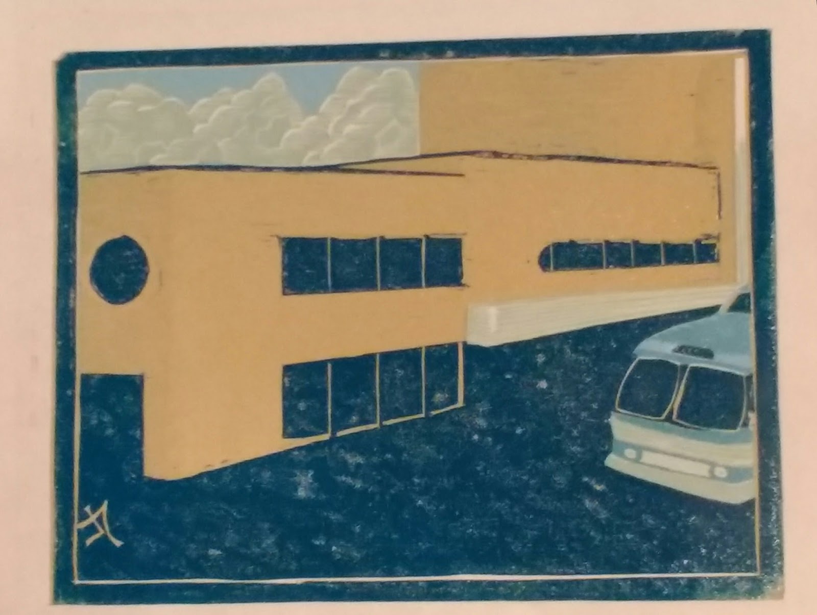
"Sans Furniture" Reduction woodcut print, 8 colors, printed on Masa paper from single shina plywood block using Renaissance Graphic oil ink on an antique cast iron book press with additional burnishing via wooden spoon. Edition TBD. First print of 2018.

I love this print. Folks familiar with Hamburg know Sans Furniture, which has occupied a mid century modern building in the heart of the Village for my entire life time and beyond. While their bold storefront dominates on Buffalo Street, the rear Pine Street entrance, seen here, is cosier and more inviting. I pass by often at night on weary walks home from the bus stop, peering into the windows warm with the golden glow of artificial homescapes.

As a color mixer by trade, I'm most proud of the colors here. The sky, yellow gray with the aura of street light, the warm interior. The ceiling was a crap shoot -- I left it unfinished in my drawing, unsure how to execute.

It may be my most favorite print yet.

Sunday, January 29, 2017

All Newt Review II

 Presently untitled, here is the final finished print, in the last two states. I always love how the black ties everything together. It's a little more primitive than I'd originally conceived, but it works for this print, particularly in the shading. If I were to do it over again -- and I am NOT!-- I might make the pink bolder, and the colors on the mushrooms darker. But I'm happy with it!


Thursday, January 26, 2017

Hello There, Newtiful!

So here's our little guy, creeping across the forest floor. I'm still figuring out the background and how to finish, but I've no shortage of ideas.

Tuesday, January 24, 2017

Twofer Tuesday

Having rescued the print from the trick brown I used on the disappearing mushroom, I did a nice bright pink. The animal in the picture is a newt, very comon in the woods in Western New York. They are a striking bright orange with fluorescent pink dots. I prefer not to print with fluorescents due to fading, so I do the best I can to mimic. I love the look of the pink with the brown gray.

Last night, seeing that the print had dried well, I took a risk and printed the first orange. This will be the darker orange of the shadowed areas of the newt. I was very happy with this color. However, because the lighter orange is a tone of this orange, I neetd to be mindful of what happened with the mushroom. But on one of the earlier versions of this print, I played it too safe and there was way too much contrast. Here's hoping that I've figured it out!

Wednesday, August 31, 2016

Tone Depth

 While it may look identical to the last color, this lighter green helps establish depth and texture on the trees and grass. One last color!


Tuesday, August 16, 2016

On a (rainbow) Roll

In commercial printing, the blending of two colors in gradation is usually called a "split" or a "split fountain." In block printing it is generally referred to as a "rainbow roll." For landscapes and such, it helps add depth to the picture. It can also be used to give the illusion of dimension. In "Ohio Street," I used a rainbow roll (RR) for the sky. It really works well for sky, and I'm using it again in the current subtitle piece seen here. I used to use RR a lot more when I worked with smaller sized prints. I've been reluctant to employ RR because I have been so occupied with the other printing issues I've had. Now that those appear to be resolved, I'm looking to perfect RR techniques to bring my prints the vibrancy I want.

This print is a redo of a print I attempted a while back, which fell apart due to ink issues.

Tuesday, August 2, 2016

Ask Amy

Me: I think I might be done with the print.
Amy: Really? I thought you had one more color.
Me: Yeah, I was going to. But I don't know how much it will add to it. Why don't you take a look at it and temm me what you think.....Besides, so much of the block is missing now, it would just be a pain to print.
(too long pause)
Amy: Well, you know I'm going to say it needs the last color.
Me (sigh) I know.

That night, I reluctantly went to the studio. Just as I said, it was a long painful experience inking the block.

As she said, it needed it.
Her advice, even when I ask for it, is usually ill-timed, inconvenient, and ill-informed. But it's always right. I mean always. Thank you Sweet Pea!

Thursday, July 28, 2016

A River Runs Through It


This is state #4 of the second try for the "Ohio St Bridge" print. I am happy to report that the new ink has performed excellently. The inks are Graphic Chemical and Renaissance Graphic inks. I have abandoned burnt plate oil for hydrolyzed linseed oil, known as Sets well. This gives inks a creamy, buttery texture that allowed the ink to stand up and flow out, making coverage easier and facilitating overprinting. I only use a small amount, and even with white ink, it works great. I have also switched from Grumbacher cobalt drier to Hancock, which I used for ten years without issue. One single drop per ounce of ink and The print is dry the next day. There are 3 more colors. This print will be my entry in the 2016 Erie County Fair.

Wednesday, October 29, 2014

Orna-mental

Last night was a blur of activity in the studio as I get ready for my first display in four or five years. Amy and I are working together on a project that is coming along nicely, but is very time-consuming. These little prints are only two colors, but have been a lot of fun. The snowman will be finished off with a stencil for the details, and we have found some perfect frames for them. They will be offered singly or as a set. They will be on sale at the Reinstein benefit Saturday, and remaining prints will be up on the Etsy site Sunday.

In addition to these prints and all of the framing and other stuff, I have been trying to finish the "mystery
print." It is coming along, but I have doubts that it will be dry enough to offer at Reinstein, though I may feature it as a work in progress.

Bottom line, less than eight hours of sleep in the last 48 hours. And I love it.

Tuesday, October 7, 2014

My Ship Came In

Here's a  terrible picture of a pretty nice print. I had been planning a different print altogether, but that one needs more drawing out. To keep my printing muscles limber, I decided to do a fairly simple print. Clocking it at a mere 5 colors, it was a fun weekend job.

Boats and water are a recurring subject in my work. This is an irony, since I get terribly, awfully, horribly seasick. Honestly, I have no idea how my family came to America back in the day. But I love the idea of water, and boats, and the whole nautical image.

The palette here is blues and grays, which works very well for this print. I am planning a companion piece featuring the windmills along the Lake Erie shore. That's going to be down the road a bit. Right now I want to jump on something with some bright colors. Any requests?

Tuesday, March 18, 2014

Catching Up

 
It was somewhere in the middle of the "DeSoto" print, or maybe very near the beginning, or perhaps even in the middle of "Memorial Day," that I realized that something didn't feel right. I mean, the prints themselves had their issues, and I wasn't happy with them, but the frustration went far deeper.

It was August, a really hot, steamy August, here on the shores of Lake Erie. I was still getting used to our new place back in Hamburg after fleeing our rotting house in South Buffalo. I had my work space pretty well set up in a clean, dry and well-lit basement, plenty of board to cut, plenty of ink to roll, lots of paper to print on. And, after several dry years, lots of ideas.

And I think it was the disconnect between the sweet scenes in my head and the...stuff...that was coming from my hands that was really getting me down. The pretty "Autumn Camper" had turned out to be an anomaly, and I found that terrifying.

I'm a self-taught printmaker, and as such, I know that I can expect a lot of moments of frustration as I learn along the way (and that was what last year's daily updates were about, the journey to figuring it all out). But what about being an artist? And just exactly what does  that mean?
Art has a pretty sad history in my family. Though my dad was a craftsman in spirit, the only real art ever practiced on that side was sarcasm and covering up odd branches on the family tree. My mom's side was creative, but sad; my grandparents told my uncle that if he could copy a tapestry with pencil, they'd try to find a way to send him to art school. According to my grandmother, he did, and it was beautiful, like a photocopy. Unfortunately, there still wasn't any money, and he went onto a rewarding career in the US Navy. My mother was also a natural artist and crafter. She didn't draw or paint much, but when she did, it was flawless, and beautiful. For his part, my brother actually was able to marry talent and ambition, and is an architect.
Me? Funny story. I'm pretty sure I was the only kid in 6th grade carrying around a Picasso monograph. Yeah, I had all the silly notions of what it was to be an artist that a young kid has, but I also really loved art. But every time I touched a pencil to a piece of paper, it was a disaster. In my mind, anyway. But I still tried. My notebooks through high school looked like a cross between a comic book and a cave painting, but looked nothing like a notebook. Still, when the time came to pick a path and head to college, I chose journalism.
Mmmm. Smart choice.
But what I wanted to study was art. Why didn't I. Because I was told, by my folks, by my teachers, by family friends: you can't make a living as an artist. Unfortunately, I accepted this at face value, not even bothering to investigate all of the art-based careers out there.
That, and I couldn't draw noses. Seriously. I got so hung up on not being able to draw a proper nose that, instead of actually learning to draw a nose, I avoided an entire discipline for almost 20 years. And then, one night I dreamed of carving a block and printing it on paper, having little knowledge of block printing, and I began working and studying on my own.
Again, I've done what I can through books and whatnot, and a lot of observation. But I finally realized that what was causing the disconnect was a lack of some real training, and some real guidance.

So, for the last few months, and for many years to come, I am back in school, starting from the ground up. I hope this will show in my future work. I don't plan to do daily updates, because I don't think anybody needs to know how the pictures happen, but I will post when I think there's something cool to show.


Tuesday, June 18, 2013

Hidden Gems

My wife and I are road trip junkies; every weekend finds us lost somewhere in the hills and valleys surrounding Buffalo. This is a great time of year, full of freshly mown grass, bright blue skies and roadside stands bursting with nature's bounty.

Our artists' eyes dart along the landscape, looking for interesting ideas and compositions. This work in progress, "Memorial Day," was a happy accident. As we were driving around the village of Cuba, we missed a turn to a wildlife management area. I turned around by ducking into a small cemetery, still decorated with flags from Memorial Day the weekend before.

The aged stones agains the bright flowers and lush greens of the lawn and surrounding trees left a mark on me, and I knew I would have to mark up some paper when I got home.

This is the first two colors, a very light gray and a dark gray. I'm very nervous about this one, as I need to create bright colors over the very dark gray. Please stay tuned as I try to navigate this one without it ending up in the print graveyard.

Wednesday, June 12, 2013

Autumn Camping

Last night I finished this print, still untitled, and I have to say that I am extremely pleased with the result. I apologize for the picture quality (camera phone, poor light). The colors really seen to come out with the addition of the brown and black.

For those in the know, this is the second print I have done of one of these small vintage trailers. The first, "Little Camper" (2009) was a favorite at shows. It was never my favorite, believing I could do better work. That was...wow...four years ago now. I'm more confident with my style, I'm working in a larger format, and I have become far more knowledgeable of the subject. We see these beautiful little midcentury gems all over in our travels, and while I wasn't looking for a "trademark" subject, I can guarantee you will be seeing more of these in the near future.


"Little Camper" (2009) Copyright 2009 Jeffrey Dean


Friday, February 8, 2013

You Go Back, Jack, Do It Again...

Well, having learned plenty of lessons from the last month, I am coming out swinging. I am completely changing the order of colors, starting with yellow. When I began printmaking 11 years ago, yellow was always the color I started with, until I realized that it was causing trouble with some of the later colors, like grays.

The expected path for this print is yellow, orange, red, beige, gray, blue, turquoise, rust, brown and black. Due to a really stupid mistake involving a razor blade, I lost five sheets right off the bat, so we're down to an edition of 15. Of course, that's always subject to change.

Incidently, the paper is 115 gsm Rives offwhite. I bought it at Hyatt's on Main Street in downtown Buffalo. I like to get it there, because I think it's important to support local businesses. However, if anyone from Hyatt's happens to read this post, STOP PUTTING YOUR GD BARCODE STICKERS SO FAR FROM THE EDGE -- THE ADHESIVE TEARS OFF PART OF THE PAPER. Unfortunately, I've been having a lot of problems with Hyatt's, and I am nowhere near a picky high-maintenance shopper. It may be back to Blick for this Bad Boy of Block.