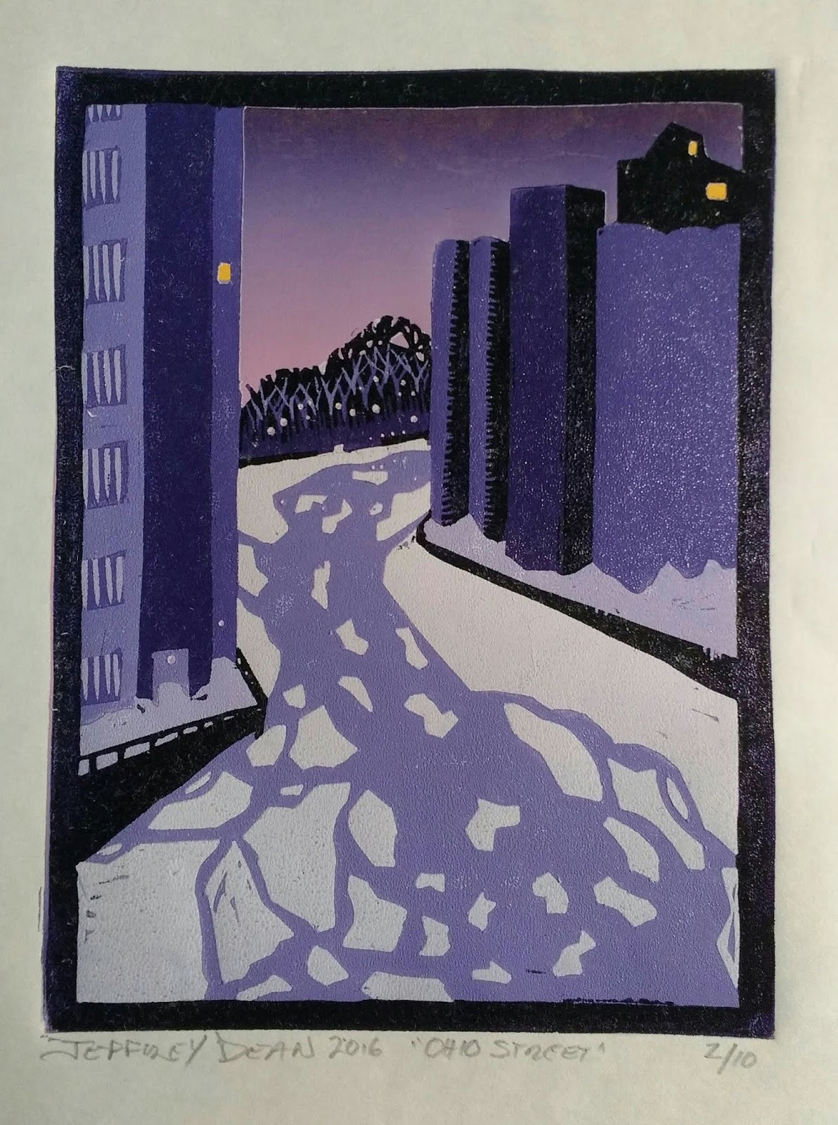
9x7 reduction woodcut, 10 colors.
Napping Cat Press: Original Hand-Printed Woodcut Prints by Jeffrey Dean
Showing posts with label printmaker. Show all posts
Saturday, April 20, 2019
Tuesday, March 26, 2019
Greatest Hits
The Etsy shop is up and running again, and everything gets free shipping. Just click on the photo of my press at the top of the page! There you'll see such award-winning gems as:
Labels:
baren,
baren forum,
barenforum,
printmaker,
printmaking,
reduction woodcut,
woodcut
Saturday, February 3, 2018
Destination Unknown
As discussed in the previous post, reduction woodcut printmaking is different than most other graphic arts in that you are carving away what you want to be seen. And to get certain details, you need to print an entire layer of a color just to let a small bit show through.
Additionally, you should have a good idea where you are going before you start.
Labels:
printmaker,
printmaking,
reduction woodcut,
woodcut
Tuesday, January 16, 2018
Pop the Cork!
Happy New Year, folks. I'm starting a little late on my first print of '18 -- I decided that it was time for a new brayer and new knives. Now that they're here, I've begun. Feels very good.
I want this print to be revealed as I go. As you see it develop, I'll add some observations and insight into this print, which I hope will lead to a larger exploration of the subject.
I live in the town I grew up in, a small pretty village South of Buffalo. I spent many late nights as a kid walking the streets in the wee hours, watching the business district change over the years. I saw it bustle with shoe stores and grocery stores and liquor stores, dissolve into vacant shopfronts and demolished buildings, rouse again with offices and new structures, empty out again as the economy collapsed, then surge back to life with an infusion of hipsters.
Through it all, though, there have been a few constants.....
I want this print to be revealed as I go. As you see it develop, I'll add some observations and insight into this print, which I hope will lead to a larger exploration of the subject.
Through it all, though, there have been a few constants.....
Labels:
buffalo,
hamburg,
night,
NY,
printmaker,
printmaking,
reduction print,
retail,
woodcut
Tuesday, August 2, 2016
Ask Amy
Me: I think I might be done with the print.
Amy: Really? I thought you had one more color.
Me: Yeah, I was going to. But I don't know how much it will add to it. Why don't you take a look at it and temm me what you think.....Besides, so much of the block is missing now, it would just be a pain to print.
(too long pause)
Amy: Well, you know I'm going to say it needs the last color.
Me (sigh) I know.
That night, I reluctantly went to the studio. Just as I said, it was a long painful experience inking the block.
As she said, it needed it.
Her advice, even when I ask for it, is usually ill-timed, inconvenient, and ill-informed. But it's always right. I mean always. Thank you Sweet Pea!
Labels:
buffalo ny,
buffalo river,
printing,
printmaker,
printmaking,
reduction woodcut,
silo city
Thursday, March 27, 2014
Hall of Heroes: Edvard Munch
![]() |
| I scream for Munch's "Scream." |
![]() |
| This painting seems...familiar. |
Most famous for "The Scream," Munch is as well known for his woodcuts as he is for his paintings. In fact, he often did the same images in different media.
![]() |
| Munch is often referred to as "The Clown Prince of Norwegian Expressionism." Not. |
It hasn't shown up yet, but Munch's inspiration is in me, somewhere. Maybe over there, in that cobwebbed, shadowy corner in my mind.
Labels:
buffalo ny,
edvard munch,
expressionism,
hamburg ny,
printmaker,
printmaking,
woodcut print,
woodcuts
South Buffalo, NY
Hamburg, NY 14075, USA
Friday, March 21, 2014
Hall of Heroes: Dorothy Markert
![]() |
| Maple Avenue Sunset by Dorothy Markert |
About the same time I was discovering Gustave Baumann, I saw a sign announcing a screen printing demonstration by Roycroft Master Artisan Dorothy Markert. to be held at the Hamburg Library. The event, as I recall, was a full house (I was later to learn that, as a Hamburg Village resident, she has a tremendous local fan base). Though Dorothy is most notably a screen printer and I am a woodcut printer, I found her work fascinating and inspirational.
![]() |
| Palace Theater by Dorothy Markert |
She'll deny it, but Dorothy ia a celebrity among art aficianados. She has retired from doing shows, but she still gets her arm twisted enough to give the occasional demonstration or teach a class (I was fortunate to be her student for several weeks during an otherwise long and dreary winter in early 2005, a very fond memory).
A few years ago, my wife and I acquired the Monarch print seen here, which hangs in a beautiful arts and crafts frame hand-built by her husband, John, a fantastic craftsman in his own right.Dorothy's warmth and eagerness to share her skill makes her a true treasure, and I will always be grateful for her work, her teaching and her friendship.
Visit Dorothy's page at: http://www.dorothymarkert.com/
Labels:
Dorothy Markert,
hamburg,
NY,
primaker,
printmaker,
roycroft,
screenprinting
South Buffalo, NY
Hamburg, NY 14075, USA
Tuesday, March 18, 2014
Catching Up
It was August, a really hot, steamy August, here on the shores of Lake Erie. I was still getting used to our new place back in Hamburg after fleeing our rotting house in South Buffalo. I had my work space pretty well set up in a clean, dry and well-lit basement, plenty of board to cut, plenty of ink to roll, lots of paper to print on. And, after several dry years, lots of ideas.
And I think it was the disconnect between the sweet scenes in my head and the...stuff...that was coming from my hands that was really getting me down. The pretty "Autumn Camper" had turned out to be an anomaly, and I found that terrifying.
I'm a self-taught printmaker, and as such, I know that I can expect a lot of moments of frustration as I learn along the way (and that was what last year's daily updates were about, the journey to figuring it all out). But what about being an artist? And just exactly what does that mean?
Art has a pretty sad history in my family. Though my dad was a craftsman in spirit, the only real art ever practiced on that side was sarcasm and covering up odd branches on the family tree. My mom's side was creative, but sad; my grandparents told my uncle that if he could copy a tapestry with pencil, they'd try to find a way to send him to art school. According to my grandmother, he did, and it was beautiful, like a photocopy. Unfortunately, there still wasn't any money, and he went onto a rewarding career in the US Navy. My mother was also a natural artist and crafter. She didn't draw or paint much, but when she did, it was flawless, and beautiful. For his part, my brother actually was able to marry talent and ambition, and is an architect.
Me? Funny story. I'm pretty sure I was the only kid in 6th grade carrying around a Picasso monograph. Yeah, I had all the silly notions of what it was to be an artist that a young kid has, but I also really loved art. But every time I touched a pencil to a piece of paper, it was a disaster. In my mind, anyway. But I still tried. My notebooks through high school looked like a cross between a comic book and a cave painting, but looked nothing like a notebook. Still, when the time came to pick a path and head to college, I chose journalism.
Mmmm. Smart choice.
But what I wanted to study was art. Why didn't I. Because I was told, by my folks, by my teachers, by family friends: you can't make a living as an artist. Unfortunately, I accepted this at face value, not even bothering to investigate all of the art-based careers out there.
That, and I couldn't draw noses. Seriously. I got so hung up on not being able to draw a proper nose that, instead of actually learning to draw a nose, I avoided an entire discipline for almost 20 years. And then, one night I dreamed of carving a block and printing it on paper, having little knowledge of block printing, and I began working and studying on my own.
Again, I've done what I can through books and whatnot, and a lot of observation. But I finally realized that what was causing the disconnect was a lack of some real training, and some real guidance.
So, for the last few months, and for many years to come, I am back in school, starting from the ground up. I hope this will show in my future work. I don't plan to do daily updates, because I don't think anybody needs to know how the pictures happen, but I will post when I think there's something cool to show.
Labels:
art school,
buffalo,
hamburg,
Jeff Dean,
NY,
printing,
printmaker,
reduction woodcut,
woodcut
Thursday, July 25, 2013
I Blue It
HA! That's what I get. yesterday, I was feeling quite confident: The colors were vibrant, the register dead-on. I was once again, in my mind, the Bad Boy of Block Printing. Then I went home to find that I am actually the Boy of BAD Block Printing.
Okay, that's a harsh self criticism, and I have already completed the post-mortem to find what went wrong. And, to my credit, I did stop after I saw the first horrible, horrible print.
That dark color you see in the print, that's actually a beautiful Ultramarine Blue. Do not adjust your monitor. Yes, it is comparable to Portland Black...when printed over something, like, say, scarlet. The reason, of course, is that the ultramarine is as clear as water. What annoys me is a) I've done this exact thing before [some nine years ago] and b) I saw how transparent it was on the plate.
So, I have done some research, and have found a way to get the results. Stay tuned for that in coming days.
I was also surprised that the ink wasn't covering as nice as previous layers. Remember what I said about drying times yesterday? Well, I guess I was right on that.
So, I'm coming away a bit smarter (hope it sticks with me this time). However, as the ink technician and "color expert" for a commercial printing company, I sure do feel like a doofus.
Friday, February 22, 2013
Labels:
cats,
donations,
hamburg ny,
help,
Jeffrey Dean,
printmaker,
printmaking,
save a cat,
woodcut
Thursday, February 21, 2013
Not Out of the Woods Yet!
For state number six, I've added a dark gray which will approximate a brushed silver for certain elements such as door and window frames, the wheel cover and perhaps some small trees in the woods. The gray is very close to the beige color, so the photograph doesn't really do it justice. I'm really very happy with how the print is turning out now. The color of the sky is exactly what I wanted, and the reflecting puddles are much more pronounced than they were on the first attempt of this print.
The next color is the retro turquoise which will really make the camper the center of attention, and a deep red is going to pull the background and foreground together and help connect the color in the trees to the color on the ground.
The last to colors I've planned are brown and black, which will finish the print. Estimated completion date is Sunday.
Thursday, February 14, 2013
Fall's Flamin' Foliage
![]() |
| Autumnal Glory: State #3 |
Printing is always about balance and give and take, and this print is no exception. By printing the blues and grays first, the print ended up losing a lot of its punch with the other, brighter colors. By printing the bright colors of the foliage first, I am keeping the colors bright and vibrant; however, as I now turn to blues and pastels for the rest of the print, I run into a big conundrum. Any color I print now will be affected by that flaming red.
To minimize this, I will next print a straight white "buffer layer" to neutralize the red. The next color is a beige; if I don't print the white layer, the beige will be pink. And I will cry pink tears.
The register of the colors has thus far been impeccable, and it is vital that the buffer layer be printed with just as much care to keep the colors lining up. I don't like printing buffer layers; it sorta feels like cheating. I don't know why I feel that way, as we do it in professional commercial printing all the time. I get some weird ideas sometimes.
I just worked out the math and, best case scenario is that this print won't be done until next Saturday! So check back often!
Thursday, January 31, 2013
That Awkward Stage
So, now the print enters the awkward stage. You start gambling on colors, maybe start improvising here and there. The only thing to guide you at this point is the vision you have in your mind, the one that got you started down this road in the first place.
I particularly hate printing light colors over dark colors. Although this state completes the form of the trailer, the details of the woods around it are only hinted at. As I mentioned in the last post, I knew that the yellow going over the turquoise would present special challenges.
However, I added red to the yellow ink (which has a naturally green cast). The extra red helped curb the color's tendency to blend with the turquoise and make a lime green. The result is a gold that I think will blend well with the oranges and reds to come. I hemmed and hawed about printing another yellow, but I think the gold will serve the autumnal feel well.
Every print I've done has had this awkward stage, and I've learned to just push through it. I know I'll be rewarded if I stop fretting about it and concentrate on carving and printing the next colors.
Five colors to go!
Labels:
art,
block printing,
camper,
Jeff Dean,
jeff dean buffalo,
Jeffrey Dean,
printmaker,
printmaking,
reduction woodcut,
reduction woodcut print,
trailer,
woodcut,
woodcut print
South Buffalo, NY
Hamburg, NY 14075, USA
Monday, November 16, 2009
And now...
The Labatt's Streamliner!
The last color is actually a very dark blue. I try to avoid using straight black as it's often very harsh, especially when going up against different shades of color. I also thought the blue worked well with the green to complete a very retro look for a very vintage subject.
"Labatt's Streamliner" 2009
Image 6"x4"
6-color reduction print from
single birch plywood block
using Reanaissance Graphics oil-
based inks on 110# Rives off white
cotton paper
Edition: 10
$30 unframed
Edition
Labels:
Jeff Dean,
Labatt's truck,
NY,
printmaker,
reduction woodcut,
south buffalo
Labatt Streamliner State #5
First, a big congratulations to Mr. James Jordan who identified this print in its 4th state as the Labatt's Streamliner. I fell in love with this vehicle one winter evening when Amy and I were downtown one evening. We stopped to watch a building being torn down when the Streamliner passed us. Already interested in early 20th century design, this baby spoke to me. Literally, it spake. It said, "Drink some Labatt's. And I did. And it was good.
Back to the print. The color in the 5th state was a happy accident. Thinking that the red was going to affect any color I put over it, I formulated a special color that, had this been screen printing, would have ended up looking like a light gray when printed over red. Ah, but this is NOT screen printing, and the color did not change much at all. In the photo, it looks gray, but is actually a very light green, perhaps the color of dried moss. It is a very retro color (usually found in Nike missile silo basements and jails of the period) and complemented the red so nicely, I decided to change my color plans. The light color of state 5 was necessary to combat the dark of the red. The fact is, I should have done the background first, as I usually do, but unfortunately was already well into the print when I realized my mistake.
Subscribe to:
Posts (Atom)


