CLICK HERE TO VISIT MY ETSY SHOP!

VISIT MY ETSY.COM SITE.
Preview
JUST CLICK ON MY PRESS!
Showing posts with label reduction print. Show all posts

Tuesday, January 16, 2018

Pop the Cork!

Happy New Year, folks.  I'm starting a little late on my first print of '18 -- I decided that it was time for a new brayer and new knives. Now that they're here, I've begun. Feels very good.

I want this print to be revealed as I go. As you see it develop, I'll add some observations and insight into this print, which I hope will lead to a larger exploration of the subject.

I live in the town I grew up in, a small pretty village South of Buffalo. I spent many late nights as a kid walking the streets in the wee hours, watching the business district change over the years. I saw it bustle with shoe stores and grocery stores and liquor stores, dissolve into vacant shopfronts and demolished buildings, rouse again with offices and new structures, empty out again as the economy collapsed, then surge back to life with an infusion of hipsters.

Through it all, though, there have been a few constants.....

Monday, June 8, 2015

Creepy

A busy weekend in the studio. The next color down was a dark green, which defined our subject. The following color is a nice earthy brown. I tried to get a third color last night, but was only able to cut the block. It was a great deal of precision cutting, and I was pretty tired after that.


Friday, June 5, 2015

Clarity

My very favorite thing about reduction printmaking, even ahead of near-perfect register, is the slow reveal. Yes, of course, I know what the final image is supposed to look out -- I work from a completed drawing. And even if I make changes as I go along, I still have a good idea about what it should look like.

But there's something about watching something happen. Maybe it's like watching a favorite movie you've watched before -- you know what's going to happen, but watching it develop is the joy. Maybe it's also like we used to stand around and watch our mom's shake a Polaroid until the image appeared (betcha some of you got a fine earworm now -- Hey, Ya!

So, with the third color down, I think it's pretty clear what we're going for, although there's going to be a lot more going on over the course of the next five colors.

The mystery animal will be much clearer after the next color goes down. I was very happy with my color choices on this one. Unfortunately, because of how I have my jig set, I'm getting crimping in the corners. However, I have designed jig modifications that should eliminate the issue.


Friday, May 15, 2015

Maroon Loon

The second color, the eponymous maroon, went down nicely.The foundation colors are important, but you can't really see much going on until the dark colors go down. Usually, the darker colors go on way down the line, but since this is a night picture, the dark comes on quickly.

I'm still getting used to the linoleum. It cuts wonderfully, but it's easy to dent the block around the lines, so I have to keep the tools sharp. I also don't need to cut as deep as with the wood. I also need to refine the jig I use to print, as it's causing crimping of the paper in the corners. These are pretty easy issues to resolve, I think. Right now, I am just having fun doing the work, something I've been missing for a while. It's good to be back.

Wednesday, October 15, 2014

End of Summer Sail

I forget sometimes how long I've had this blog (despite large gaps of inactivity). It's nice that I can go back and see what I was doing five years ago. It's also painful, at times. It's also fun to remember some moments, like the time my wife accidently stabbed herself with a v-gouge. No, it wasn't funny, but we do laugh about it now.

As I was perusing, I uncovered a print I did back in 2009, I think. Seems like a long time ago now, so much has happened in that time. I'd forgotten about this print, which was done in the tiny 6x4 format I used to use. I had only just begun to understand color, and was still burnishing the prints with a wooden spoon. I remember printing it with spiders falling down around me from the ceiling in my little cave in the back of the basement in Buffalo. Not exactly joyful days, but the print, I think, is happy.

Five years later, I see that I've dropped the "graphic" esthetic from my prints. I've also lost the borders, which had mostly served as a "rail" for smooth inking. I've been studying all along, and I like to think I'm getting a better eye.

Tuesday, September 2, 2014

Behind The Print: Desoto Motel

In May of 2013, my wife and I were driving in the Southern Tier along the Pennsylvania border. We hadn't planned on going to Olean. If you know us, or you're AAA, you well know that we usually don't plan on anything. Soon we found ourselves touring the city and finding the aged neon signs and midcentury architecture engaging. It appears that sometime around the middle of the last century, Olean was flush with cash, saw a building boom, and then the boom went buss. As the floods of fortune ebbed, gems like the DeSoto Motel were left to bear witness to a better time.


Aficianados of mid century design, we were immediately struck by the DeSoto, which sits down the street from St. Bonaventure University. Not quite in a state of disrepair, as it has only been vacant a few years, it is definitely showing the wear and tear of a life unloved. The postcard photo to the right shows the motel in happier times.

There is hope for the DeSoto. It was bought by a Buffalo firm known for turning around neglected architectural gems.

The photo at left is my first attempt at the print. The print suffered from a number of problems, not least of all was poor registration. I also wasn't happy with the neon red color or the solid yellow. I think I was being over-influenced by Ed Ruscha's screenprints at the time. A drawing class and a rededication to the art of woodcut printmaking put me back on track for what eventually became "DeSoto Motel."

Tuesday, August 26, 2014

The Store Is Open!

"Desoto Motel" 2014
I finally got the etsy.com shop up and running. You can click on the link above the press at the top of the page, or the link included at the bottom of this post. There are a few kinks to work out yet. If you're not comfy doing business on the net, I'm happy to work around that. Just drop me a line at nappingcatpress97@gmail.com.


Click link: https://www.etsy.com/shop/NappingCatPress

Monday, June 30, 2014

A New Leaf

Not quite ready for the big reveal, "Sunflower Farm" one color away from completion. It clocks in at 11 colors, and I used two blocks. When the ink is dry and the dust settles, I will give a rundown of the process. However, they're looking so good drying on the line that I had to show them off. 

The post is called a new leaf, because 2014 has been an incredible period of growth for me. I began the year by enrolling in school and taking a drawing class which simply changed by whole approach to everything. When I finally forced myself back to the studio with the "DeSoto" print I found that I had improved markedly from the stop & go torture sessions that marked last summer's studio time.

For the first time in years, I am working on multiple projects. My other, heh heh, "pet project," is "Solstice," a portrait of my good friend, whom we call Ticey. This is state two of a 6-color print.


Friday, August 23, 2013

Red, Son? At NIGHT?

Ha ha. I do love a good pun. Anyway, if you've been reading this blog for a while, and I know you have (I'm apparently very popular with someone in Latvia (Heloooooo Riga!)) you know that I have a certain history with red. For some reason, I love to add it to a print early in the process, and then battle my way through the rest of the print trying to escape the red showing through.

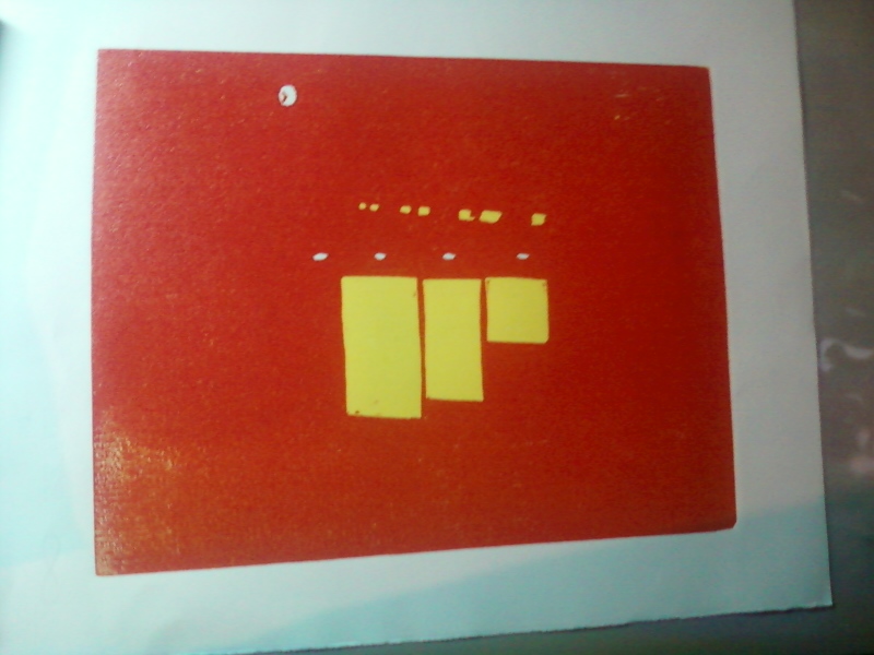
"Motel DeSoto" third state (red)
This time is different. Through thorough testing and color selection, and the fact that this is a sunset scene where everything has a certain red tinge, this was the perfect opportunity to add this magnificent bright red. I don't want to go into detail about where the red will be used, but I will say that you shouldn't expect an update on this print for several days, due to the fact that I have a lot of fine-line carving to do, and I intend for it to be awesome, so I'm going to go as slow as I need to. In the meantime, though, I'm looking forward to putting a couple of colors down on "Sunflower Farm" this weekend.

As for what we're looking at now, you can see the outdoor recessed lights on the exterior ceiling, as well as the face of a clock (it's not a moon), and now also you see rows of windows in the background, and the lit windows of the motel office.

Monday, August 19, 2013

Torrential Output

It's been a very busy weekend in the studio. Not sure what spurred it, but it resulted in getting way ahead on two new prints. The first, tentatively titled "Sunflower Farm," had an interesting unintended consequence. Having learned from my issues on preveious prints, I decided to put down a blue sky without inking the whole block. Then, when I printed the nice bright yellow, I got hills! Green hills! And they're right where I was planning to put green hills. Unfortunately, this anomaly will get printed over anyway, as it isn't the green I want, but it was a nice surprise I will have to revisit down the road.
 
And here's a little shot of the "Sunflower" block to give an idea of the layout. More on how this picture came to be will follow in the coming days and weeks.
 
And here is the first and second states of the "Desoto Motel" print. Since you can't really tell, the first color was a white very lightly tinted blue. This will be the outdoor lights on the exposed ceiling just outside the foyer. I'm really excited about this print, as it is an evening scene calling for both very bright and very dark colors, a print of great contrasts.


Thursday, August 15, 2013

Memorial Day (Eleven Color Woodcut, 2013)

What an adventure this was! I'm still not sure about the black. And, actually, I'm just now wondering if I'm really done. I'm teasing myself with the idea of adding brown to the branches. But I'm putting it on the back burner for now. I am turning my attention to two prints now. The first is a "googie" style (look it up) motel (abandoned) we found in Olean called the DeSoto. The second is from a nearby sunflower farm, so please stay tuned to watch these come together. And let's see if I've really learned anything!
Finished...?

Monday, August 12, 2013

Shadowy Figure

Many years ago, before I found my passion for printmaking, my dream was to be a writer. I concentrated on short fiction, heavily influenced by Raymond Carver and Rod Serling. This meant dark depressing prose, surreal plot twists, and "you-can-guess-the-rest" endings. All three seriously unnerved my wife, but none more so than the endings. She'd read a story, actually enjoying the writing, until the end, and she'd look up and say "Where's the rest?" It sure made me cranky, but over time, I have come to realize she's right. Not about most things. No, about everything.

Okay, she's probably left the blog. Here's the real story: my wife is a critic's critic. If she could write worth a damn, the artists, writers and musicians of the world would be trembling. And no, her batting average as far as being right probably gets around .200. Except with my work. Yes, she was spot on with the short stories, and she's a vicious truthteller regarding my artwork. So yesterday, after I wrapped up the dark blue, I brought it to her and asked what I thought. I was asking because I thought the blue might be enough. I've seen woodcuts without a black key block, and I've liked the effect, at times. But I just wasn't sure about this print.

The silence that emanated from her answered the question before her lips even moved. So, black it is!

Monday, August 5, 2013

Green Light!

Well, here in the Western New York region, the past few days have been pretty chilly, and the James E. Strates Shows train has pulled into the village depot signalling a.) the start of the Erie County Fair and b.) the coming end of summer. I know, it's barely August, but knowing that, after the Fair, it's a pretty fast slide into dark mornings and frosty nights.

However, the bright green of the latest state for "Memorial Day" has cheered me immensely. There are three more colors left, and I hope to use them to really bring some depth to this print. The last three are dark green, dark blue and black.

I was very concerned about the green, because the color is made with pthalo green and hansa yellow, two very transparent inks. However, I got a nice surprise -- the ink worked well with the blue beneath it, toning down the yellow in the color and bringing out a more natural, summery leaf green.

Speaking of the Fair, my print "Autumn Camper" will be in competition in the Arts Building. It's been a while since I entered, and I'm happy to be back on the wall. Judging by the entries I saw on drop off day, the competition is stiff, with so much great art, from amateur to professional. I would hate to be a judge. I love to see other artists doing greatwork, and I hope to be soundly trounced.

I have to praise the Erie County Fair for making the recarpeting of the Arts Building a priority. The building, which was formerly the racetrack's casino, had the garish floors only Donald Trump could love. They were downright disorienting. But now, they are a nice neutral, and there are quilt-like paintings on the ceilings. Great job -- it makes the building a lot more pleasant to spend time in.


Wednesday, July 31, 2013

Blue State

After a great deal of research and testing, I was able to concoct an ink that would cover the red yet retain the brightest blue I could create under the conditions.

The greatest issue one has in making a reduction print is coverage from layer to layer. As the ink builds up on the paper, unevenness of the layers becomes a very big issue.

When I first began over a decade ago, I printed with very thick, heavy inks, which gave the prints and almost impasto-like texture. The drawback to heavy inking is that small details and definition can get lost. I have since upgraded the quality of my inks and thin them liberally with burnt plate oil; this has solved the bulk of my issues.

Unfortunately, this has also empoldened me to continue to push the envelope by printing blues over reds, only to be left wondering "WHAT HAPPENED????!!!!"