I'm still not sure why I insist on starting with the darker colors. Maybe the challenge excites me.
Napping Cat Press: Original Hand-Printed Woodcut Prints by Jeffrey Dean
Saturday, October 24, 2020
Fall Into Place
I'm still not sure why I insist on starting with the darker colors. Maybe the challenge excites me.
Saturday, August 22, 2020
Elsie Alive
Finished at last! This print was going to be complicated, but I just wasn't prepared for HOW complicated. "Elsie" ended up being somewhere between 9 and 15 colors, and I was never sure if it was going to work nout. Several times I thought it might be scrapped. In the end, I only got about 4 decent prints (started with ten).
The main problem I had was that, at the start, I experimented with under-inking the block. This gave the print a very light, gauzy appearance, which I loved. The problem is, as the ink sits on the paper, it's like a butte, little flattened islands of color. When you print the next layer, you only print on the tops of those buttes, and the print area gets successively smaller with each layer of ink. By the end, those little islands have become mountains, with narrow, sloping tops. It becomes harder and harder for each color to print.
But in the end, I have depth, shadow and color. I don't think that I conveyed enough that the blue bottle on the right is actually the shadow of the bottle (left).
The figurine is a UCTCI Japan figurine from the 1960s. My wife found her at an estate sale in a big old warehouse on Main Street in Buffalo. Since finding her some 15 years ago, Elsie (named for her Grandmother) has been joined by many sisters.
Saturday, May 30, 2020
Rumination
I have two options: either redesign the print so the background color is lighter, and hope that the contrast is enough, or design it as darker. The problem is that whatever I choose as a design for the background needs to work with a light OR dark color. The reason is that, if I choose to make the background light, and I find light makes the hood too washed out, I can switch to dark, and vice versa.
The case for dark is seen here. You can see the contrast. The down side is, depending on what color I choose, the pot she's holding risks disappearing.
Conversely, because the hood is so light, the hood may not pop. Stay tuned!
Sunday, May 24, 2020
MISTER Ulean?! That's SIR Ulean to YOU, bub!
Fresh Start
It's been very relaxing to study cartooning, and gives me an opportunity to study perspective, color and composition.
Friday, June 28, 2019
Monday, April 22, 2019
Damp Details
Whether it's clear or not that there is a church among the hazy buildings in back doesn't matter -- the silhouettes are there for depth (this place exists only in my mind and, now,bon paper). However, a fun note is that the rosette window is a spontaneous tribute to Notre Dame Cathedral, which burned during the making of the print.
The block is destroyed during the making of a reduction woodcut. Trying to explain the process to non-printmakers is a challenge. This should drive the point home.
Saturday, April 20, 2019
Thursday, April 18, 2019
Day Brightener
Here you can see how the colors seem different. Another interesting thing is that the top color, a very light pink/beige, looked completely different when printed alone, more of a putty gray. But with the red under it, it casts a bit Pinker, which is why I printed in this order. I printed the brown over the green for the same reason -- printing red on green would have made the red too dark.Tuesday, April 16, 2019
Sunday, March 31, 2019
A Thousand Points of View
This morning, with the room full of bright natural light, I was surprised to find that the colors were far more vibrant than I thought.
The top photo is in natural light, the bottom in the yellow of blued incandescent. Quite a difference!
Saturday, March 30, 2019
"Harbor Lights"
Friday, March 29, 2019
Closing Time
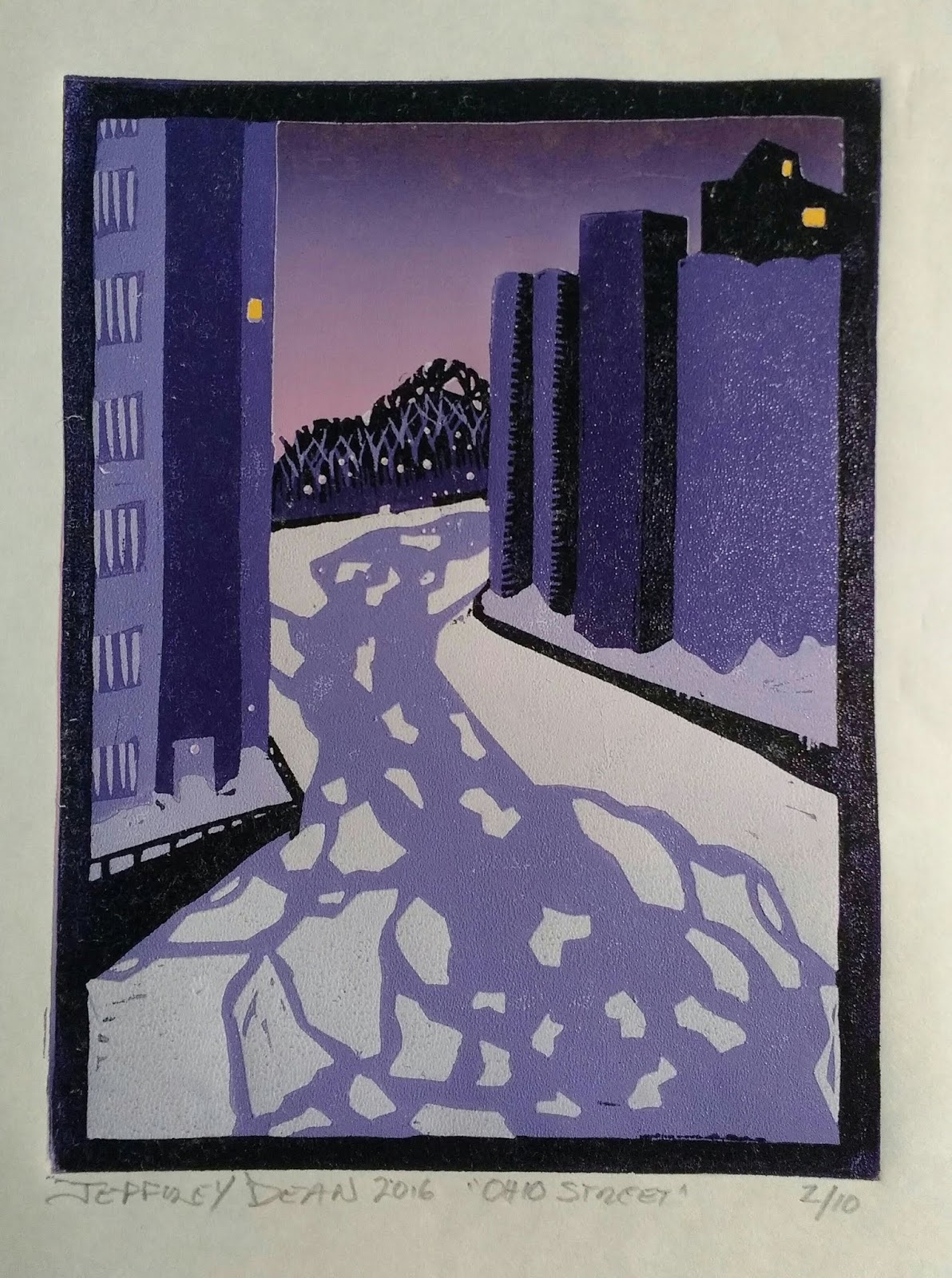
This is a very dark red. Maybe too dark? We'll see. It's hard to gauge how colors will look on completion. For example, though the sky looks really good, but I kind of wish I'd gone bolder. But then maybe it would be to cartoon?
Thursday, March 28, 2019
Developing Story
Tuesday, March 26, 2019
Greatest Hits
Monday, March 25, 2019
Lighten Up
The first four states of my latest print. I am using fluorescent pigments in white to achieve a glowing sky. Pretty happy with the results.
Tuesday, March 19, 2019
Floating An Idea
Etsy shop is now back up. Just click on the picture of my press!
Whatever your impression of Buffalo, you haven't experienced it without a Kayak trip down the Buffalo River (not to confuse it with the Niagara River, on which a fellow DID try to navigate Niagara Falls once; that didn't go so well). A blend of rich history, the heroic reclamation of the land by nature, rust vs wood. Stop by the shop for more details!


