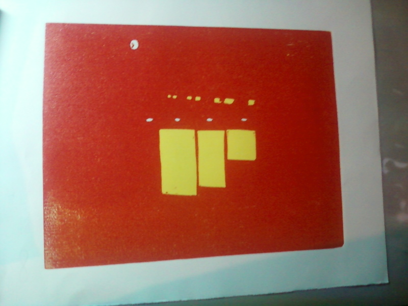
I was very happy to see how well the gray covered the red. The very fine line for the neon stayed open surprisingly well. I am especially happy that the sky is turning out so well. I just wanted a touch of that flame red in the sky, but I wasn't sure how I wanted to use it. I think I have just enough red in the sky, and I'm thinking of modifying the original color I had planned.
I'm a little nervous still about about the red I used. It's a tricky thing creating light with printing inks. We'll have to see if the color pops better as the colors in this print get darker.
Napping Cat Press: Original Hand-Printed Woodcut Prints by Jeffrey Dean
Wednesday, August 28, 2013
Monday, August 26, 2013
How Green Was My Valley?
Well, that made the flowers pop, didn't it. I love the bright colors on this one. The weekend was actually about as productive as last weekend, with a lot of printing going on in the studio.
Labels:
hamburg,
Jeff Dean,
napping cat press,
NY,
printmaking,
reduction woodcut,
sunflower farm,
sunflowers
Friday, August 23, 2013
Red, Son? At NIGHT?
Ha ha. I do love a good pun. Anyway, if you've been reading this blog for a while, and I know you have (I'm apparently very popular with someone in Latvia (Heloooooo Riga!)) you know that I have a certain history with red. For some reason, I love to add it to a print early in the process, and then battle my way through the rest of the print trying to escape the red showing through.
This time is different. Through thorough testing and color selection, and the fact that this is a sunset scene where everything has a certain red tinge, this was the perfect opportunity to add this magnificent bright red. I don't want to go into detail about where the red will be used, but I will say that you shouldn't expect an update on this print for several days, due to the fact that I have a lot of fine-line carving to do, and I intend for it to be awesome, so I'm going to go as slow as I need to. In the meantime, though, I'm looking forward to putting a couple of colors down on "Sunflower Farm" this weekend.
As for what we're looking at now, you can see the outdoor recessed lights on the exterior ceiling, as well as the face of a clock (it's not a moon), and now also you see rows of windows in the background, and the lit windows of the motel office.
![]() |
| "Motel DeSoto" third state (red) |
As for what we're looking at now, you can see the outdoor recessed lights on the exterior ceiling, as well as the face of a clock (it's not a moon), and now also you see rows of windows in the background, and the lit windows of the motel office.
Thursday, August 22, 2013
Here Comes The Sun...And It's All Right!
It seems that in woodcut printmaking, there are a few subjects every printmaker takes a shot at. Cows are one, and/or animals with stripes. Another is the sunset at the beach. But the one that is probably tried at least once by a goo 90% or more of block printers is the humble sunflower.
And now, at last, my turn. This print is inspired by an acceidental stumbling upon a sunflower farm somewhere in Western New York (I'm not being purposely vague; we really can't remember where the hell it is). I took a few pictures there, and one with a red barn in the background was so nice, I wanted to enter it in the Erie County Fair's photography competition. Due to time constraints and technical difficulties, that didn't happen. So, I decided to use it as a model for this print.
While I was drawing out the cartoon from which I'm now working, I realized how dull it can be trying to be "photorealistic," and decided to go with a more whimsical, expressionist approach. This may be the departure that sends me on the way to a new style of woodcut. Glad you could be here to see it!
And now, at last, my turn. This print is inspired by an acceidental stumbling upon a sunflower farm somewhere in Western New York (I'm not being purposely vague; we really can't remember where the hell it is). I took a few pictures there, and one with a red barn in the background was so nice, I wanted to enter it in the Erie County Fair's photography competition. Due to time constraints and technical difficulties, that didn't happen. So, I decided to use it as a model for this print.
While I was drawing out the cartoon from which I'm now working, I realized how dull it can be trying to be "photorealistic," and decided to go with a more whimsical, expressionist approach. This may be the departure that sends me on the way to a new style of woodcut. Glad you could be here to see it!
Monday, August 19, 2013
Torrential Output
It's been a very busy weekend in the studio. Not sure what spurred it, but it resulted in getting way ahead on two new prints. The first, tentatively titled "Sunflower Farm," had an interesting unintended consequence. Having learned from my issues on preveious prints, I decided to put down a blue sky without inking the whole block. Then, when I printed the nice bright yellow, I got hills! Green hills! And they're right where I was planning to put green hills. Unfortunately, this anomaly will get printed over anyway, as it isn't the green I want, but it was a nice surprise I will have to revisit down the road.
And here's a little shot of the "Sunflower" block to give an idea of the layout. More on how this picture came to be will follow in the coming days and weeks.
And here is the first and second states of the "Desoto Motel" print. Since you can't really tell, the first color was a white very lightly tinted blue. This will be the outdoor lights on the exposed ceiling just outside the foyer. I'm really excited about this print, as it is an evening scene calling for both very bright and very dark colors, a print of great contrasts.
Labels:
desoto motel,
farms,
googie,
hamburg,
Jeff Dean,
mid century modern,
motels,
napping cat press,
NY,
olean,
reduction print,
sunflowers,
woodcut
Thursday, August 15, 2013
Memorial Day (Eleven Color Woodcut, 2013)
What an adventure this was! I'm still not sure about the black. And, actually, I'm just now wondering if I'm really done. I'm teasing myself with the idea of adding brown to the branches. But I'm putting it on the back burner for now. I am turning my attention to two prints now. The first is a "googie" style (look it up) motel (abandoned) we found in Olean called the DeSoto. The second is from a nearby sunflower farm, so please stay tuned to watch these come together. And let's see if I've really learned anything!
![]() |
| Finished...? |
Monday, August 12, 2013
Shadowy Figure
Many years ago, before I found my passion for printmaking, my dream was to be a writer. I concentrated on short fiction, heavily influenced by Raymond Carver and Rod Serling. This meant dark depressing prose, surreal plot twists, and "you-can-guess-the-rest" endings. All three seriously unnerved my wife, but none more so than the endings. She'd read a story, actually enjoying the writing, until the end, and she'd look up and say "Where's the rest?" It sure made me cranky, but over time, I have come to realize she's right. Not about most things. No, about everything.
Okay, she's probably left the blog. Here's the real story: my wife is a critic's critic. If she could write worth a damn, the artists, writers and musicians of the world would be trembling. And no, her batting average as far as being right probably gets around .200. Except with my work. Yes, she was spot on with the short stories, and she's a vicious truthteller regarding my artwork. So yesterday, after I wrapped up the dark blue, I brought it to her and asked what I thought. I was asking because I thought the blue might be enough. I've seen woodcuts without a black key block, and I've liked the effect, at times. But I just wasn't sure about this print.
The silence that emanated from her answered the question before her lips even moved. So, black it is!
Okay, she's probably left the blog. Here's the real story: my wife is a critic's critic. If she could write worth a damn, the artists, writers and musicians of the world would be trembling. And no, her batting average as far as being right probably gets around .200. Except with my work. Yes, she was spot on with the short stories, and she's a vicious truthteller regarding my artwork. So yesterday, after I wrapped up the dark blue, I brought it to her and asked what I thought. I was asking because I thought the blue might be enough. I've seen woodcuts without a black key block, and I've liked the effect, at times. But I just wasn't sure about this print.
The silence that emanated from her answered the question before her lips even moved. So, black it is!
Friday, August 9, 2013
Green Green Grass of (ALMOST!) Home
I apologize again for the lousy picture. I need to stop using my camera phone, but for now it's the best I can do. The camera really doesn't pick up the beautiful effect created by the second layer of green. It really gives the piece texture and depth. I was pretty stunned when I saw how it printed. This print has been particularly destructive to the block, which makes it a challenge to properly ink the block. There isn't much left on the block to carve. But so far, the print is looking really, really good. A dark blue and a black will finish this off. It has been one of my most challenging prints to date, probably more so than "Autumn Camper."
Already thinking about the next print. There are so many things I want to try. And though I wouldn't mind a simple four color job, I kee looking to push the envelope.
'Cause that's why, you know, I'm the, er, bad boy of block printing. Yarp.
Already thinking about the next print. There are so many things I want to try. And though I wouldn't mind a simple four color job, I kee looking to push the envelope.
'Cause that's why, you know, I'm the, er, bad boy of block printing. Yarp.
Thursday, August 8, 2013
Red Means GO!
I would like to thank the judges for the Fine Arts competition at the 2013 Erie County Fair (Hamburg, New York) for selecting my print "Autumn Camper" for Second Place (Red Ribbon)--Professional division. It's a real honor to be judged by one's peers. The competition is nothing short of amazing, and if you make it to the Fair this year, please stop by the arts building located at the lower level of the Grandstand. The Fair has made so many improvements to the interior that it's a real treat to spend some time looking at the amazing talents of your friends and neighbors. It's also the coldest place at the Fair -- the A/C is full blast all the time!
It has been eleven years since I entered my very first color reduction woodcut print into the Fair competition, taking second place in the Novice Division. It's always been an honor to hang on the wall with some really great work.
Congratulations also to my wife, Amy, who's flowers made of cut aluminum soda cans earned a white ribbon in the Recycled Crafts competition!
It has been eleven years since I entered my very first color reduction woodcut print into the Fair competition, taking second place in the Novice Division. It's always been an honor to hang on the wall with some really great work.
Congratulations also to my wife, Amy, who's flowers made of cut aluminum soda cans earned a white ribbon in the Recycled Crafts competition!
Monday, August 5, 2013
Green Light!
Well, here in the Western New York region, the past few days have been pretty chilly, and the James E. Strates Shows train has pulled into the village depot signalling a.) the start of the Erie County Fair and b.) the coming end of summer. I know, it's barely August, but knowing that, after the Fair, it's a pretty fast slide into dark mornings and frosty nights.However, the bright green of the latest state for "Memorial Day" has cheered me immensely. There are three more colors left, and I hope to use them to really bring some depth to this print. The last three are dark green, dark blue and black.
I was very concerned about the green, because the color is made with pthalo green and hansa yellow, two very transparent inks. However, I got a nice surprise -- the ink worked well with the blue beneath it, toning down the yellow in the color and bringing out a more natural, summery leaf green.
Speaking of the Fair, my print "Autumn Camper" will be in competition in the Arts Building. It's been a while since I entered, and I'm happy to be back on the wall. Judging by the entries I saw on drop off day, the competition is stiff, with so much great art, from amateur to professional. I would hate to be a judge. I love to see other artists doing greatwork, and I hope to be soundly trounced.
I have to praise the Erie County Fair for making the recarpeting of the Arts Building a priority. The building, which was formerly the racetrack's casino, had the garish floors only Donald Trump could love. They were downright disorienting. But now, they are a nice neutral, and there are quilt-like paintings on the ceilings. Great job -- it makes the building a lot more pleasant to spend time in.
Labels:
erie county fair,
fair,
hamburg,
Jeffrey Dean,
NY,
printmaking,
reduction print,
reduction woodcut,
summer,
woodcut print
Wednesday, July 31, 2013
Blue State
After a great deal of research and testing, I was able to concoct an ink that would cover the red yet retain the brightest blue I could create under the conditions.
The greatest issue one has in making a reduction print is coverage from layer to layer. As the ink builds up on the paper, unevenness of the layers becomes a very big issue.
When I first began over a decade ago, I printed with very thick, heavy inks, which gave the prints and almost impasto-like texture. The drawback to heavy inking is that small details and definition can get lost. I have since upgraded the quality of my inks and thin them liberally with burnt plate oil; this has solved the bulk of my issues.
Unfortunately, this has also empoldened me to continue to push the envelope by printing blues over reds, only to be left wondering "WHAT HAPPENED????!!!!"
The greatest issue one has in making a reduction print is coverage from layer to layer. As the ink builds up on the paper, unevenness of the layers becomes a very big issue.
When I first began over a decade ago, I printed with very thick, heavy inks, which gave the prints and almost impasto-like texture. The drawback to heavy inking is that small details and definition can get lost. I have since upgraded the quality of my inks and thin them liberally with burnt plate oil; this has solved the bulk of my issues.
Unfortunately, this has also empoldened me to continue to push the envelope by printing blues over reds, only to be left wondering "WHAT HAPPENED????!!!!"
Labels:
hamburg,
Jeff Dean,
napping cat press,
NY,
printmaking,
reduction print,
woodcut,
woodcut print
Thursday, July 25, 2013
I Blue It
HA! That's what I get. yesterday, I was feeling quite confident: The colors were vibrant, the register dead-on. I was once again, in my mind, the Bad Boy of Block Printing. Then I went home to find that I am actually the Boy of BAD Block Printing.
Okay, that's a harsh self criticism, and I have already completed the post-mortem to find what went wrong. And, to my credit, I did stop after I saw the first horrible, horrible print.
That dark color you see in the print, that's actually a beautiful Ultramarine Blue. Do not adjust your monitor. Yes, it is comparable to Portland Black...when printed over something, like, say, scarlet. The reason, of course, is that the ultramarine is as clear as water. What annoys me is a) I've done this exact thing before [some nine years ago] and b) I saw how transparent it was on the plate.
So, I have done some research, and have found a way to get the results. Stay tuned for that in coming days.
I was also surprised that the ink wasn't covering as nice as previous layers. Remember what I said about drying times yesterday? Well, I guess I was right on that.
So, I'm coming away a bit smarter (hope it sticks with me this time). However, as the ink technician and "color expert" for a commercial printing company, I sure do feel like a doofus.
Okay, that's a harsh self criticism, and I have already completed the post-mortem to find what went wrong. And, to my credit, I did stop after I saw the first horrible, horrible print.
That dark color you see in the print, that's actually a beautiful Ultramarine Blue. Do not adjust your monitor. Yes, it is comparable to Portland Black...when printed over something, like, say, scarlet. The reason, of course, is that the ultramarine is as clear as water. What annoys me is a) I've done this exact thing before [some nine years ago] and b) I saw how transparent it was on the plate.
So, I have done some research, and have found a way to get the results. Stay tuned for that in coming days.
I was also surprised that the ink wasn't covering as nice as previous layers. Remember what I said about drying times yesterday? Well, I guess I was right on that.
So, I'm coming away a bit smarter (hope it sticks with me this time). However, as the ink technician and "color expert" for a commercial printing company, I sure do feel like a doofus.
Wednesday, July 24, 2013
Red Scare
Subtitle this post "Or How I Stopped Worrying And Learned To Love Potential Disaster." That is the nature of reduction printmaking.
The red is very strong, and I'm a little concerned about the next color, blue, going over it unbufferred. I really don't want to add another layer of white, but I will if I need to.
Some printmakers brush on colors only where they need them, and I have tried that in the past; it does make sense, when you consider that the only place I need the red is on the flag (I think you can see the flag pretty clearly, now). I haven't liked the end result of "spot colors" in my prints in the past, though it's been a while since I've tried, and maybe I'll try it on my next print.
I am particularly happy with my register on this print. By now, I've usually lost a few to a bouncy register. I don't know why things have clicked so well, although I do suspect that the extra-long drying time may help (due to my procrastination!)
I am eager to do some tests to see how I can get the blue down without a white layer, as that will leave me only three colors left.
The red is very strong, and I'm a little concerned about the next color, blue, going over it unbufferred. I really don't want to add another layer of white, but I will if I need to.
Some printmakers brush on colors only where they need them, and I have tried that in the past; it does make sense, when you consider that the only place I need the red is on the flag (I think you can see the flag pretty clearly, now). I haven't liked the end result of "spot colors" in my prints in the past, though it's been a while since I've tried, and maybe I'll try it on my next print.
I am particularly happy with my register on this print. By now, I've usually lost a few to a bouncy register. I don't know why things have clicked so well, although I do suspect that the extra-long drying time may help (due to my procrastination!)
I am eager to do some tests to see how I can get the blue down without a white layer, as that will leave me only three colors left.
Tuesday, July 16, 2013
The Dark Side
This latest color will eventually fill out the flowers behind and around the stone. The scene looks pretty jarring with that dark pink, and this is the stage of a print I call the "awkward phase," because it's so hard to imagine it looking like I want it to when the colors are so strong.This only reduces the threat of catastrophe, of course; threats loom large over a reduction print from start to finish. The result of a successful print though is a very unique and colorful piece of work.
Update on Etsy Site: You may be wondering why the prints on this blog are not available on etsy.com at the moment. I do apologize for any inconvenience. However, with moving, resetting the studio, and presently having no home computer, along with the time needed to actually produce the work, I have not really felt able to give the time to monitor the Etsy site and process orders. GOOD NEWS! I am recatalogging the old work, and will have both old and new work available at the end of August. Of course, if you just gotta have something right away, you can call anytime and we'll work out details. (716) 997-3046, or thadeenz97@yahoo.com
Friday, July 12, 2013
In The Pink
I'm sure you'd be entertained by what happens in these lapses between states, likely far more than I am. But the important thing is, I always come back.
So, excusing once again today's lousy photography, you can probably make out the flag to the lower right of the headstone. I wasn't sure what I really wanted for the color, but I think this bright pink really does it. It is also the color of black raspberry icecream, and it made me very hungry while printing. The next color is a darker version of the pink above, and I think you'll really get a good idea of what I'm going for in the next two passes.
In addition, I am presently engaged in a few experiments to offer these prints as hand-printed greeting cards, so please stay tuned!
Thursday, June 20, 2013
The Lighter Side of Graveyards
As was the case for the last print, I had to overcome a very oppressive darker color to allow the brightness of future colors to show. The second color on "Memorial Day" was a very dark shadow gray, and the next color is a bright pink. I printed a buffer of plain white, which brought the color down to a more manageable shade.
The method at work here is called "reduction printing," in which one block is used, and areas are cut away for each color. The drawback to this method is trying to maintain the brightness of colors; you can usually tell a reduction print by the darkness of the colors; I have had prints start of with explosive, bright color, only to end up a muddy mess. A few talented printers out there have somehow beat the system (I recommend Gordon Mortenson as a prime example). I intend to be in that small crowd.
As you can see in the above photo, the white has buffered the dark gray back to a very light gray. This should accept the light pink very easily. It is hard to get an idea of where the print is going in this view, but in this backlit picture, you get a better idea of what I'm going for.
The next challenge is creating a vibrant pink and presenting it in a way that is going to breath some life into what at this stage looks like a very cold print!
The method at work here is called "reduction printing," in which one block is used, and areas are cut away for each color. The drawback to this method is trying to maintain the brightness of colors; you can usually tell a reduction print by the darkness of the colors; I have had prints start of with explosive, bright color, only to end up a muddy mess. A few talented printers out there have somehow beat the system (I recommend Gordon Mortenson as a prime example). I intend to be in that small crowd.
As you can see in the above photo, the white has buffered the dark gray back to a very light gray. This should accept the light pink very easily. It is hard to get an idea of where the print is going in this view, but in this backlit picture, you get a better idea of what I'm going for.
The next challenge is creating a vibrant pink and presenting it in a way that is going to breath some life into what at this stage looks like a very cold print!
Tuesday, June 18, 2013
Hidden Gems
My wife and I are road trip junkies; every weekend finds us lost somewhere in the hills and valleys surrounding Buffalo. This is a great time of year, full of freshly mown grass, bright blue skies and roadside stands bursting with nature's bounty.
Our artists' eyes dart along the landscape, looking for interesting ideas and compositions. This work in progress, "Memorial Day," was a happy accident. As we were driving around the village of Cuba, we missed a turn to a wildlife management area. I turned around by ducking into a small cemetery, still decorated with flags from Memorial Day the weekend before.
The aged stones agains the bright flowers and lush greens of the lawn and surrounding trees left a mark on me, and I knew I would have to mark up some paper when I got home.
This is the first two colors, a very light gray and a dark gray. I'm very nervous about this one, as I need to create bright colors over the very dark gray. Please stay tuned as I try to navigate this one without it ending up in the print graveyard.
Our artists' eyes dart along the landscape, looking for interesting ideas and compositions. This work in progress, "Memorial Day," was a happy accident. As we were driving around the village of Cuba, we missed a turn to a wildlife management area. I turned around by ducking into a small cemetery, still decorated with flags from Memorial Day the weekend before.
The aged stones agains the bright flowers and lush greens of the lawn and surrounding trees left a mark on me, and I knew I would have to mark up some paper when I got home.
This is the first two colors, a very light gray and a dark gray. I'm very nervous about this one, as I need to create bright colors over the very dark gray. Please stay tuned as I try to navigate this one without it ending up in the print graveyard.
Labels:
block printing,
cemetery,
cuba,
hamburg ny,
Jeff Dean,
memorial day,
napping cat press,
NY,
printing,
printmaking,
reduction woodcut print,
woodcut
South Buffalo, NY
Hamburg, NY 14075, USA
Wednesday, June 12, 2013
Autumn Camping
Last night I finished this print, still untitled, and I have to say that I am extremely pleased with the result. I apologize for the picture quality (camera phone, poor light). The colors really seen to come out with the addition of the brown and black.
For those in the know, this is the second print I have done of one of these small vintage trailers. The first, "Little Camper" (2009) was a favorite at shows. It was never my favorite, believing I could do better work. That was...wow...four years ago now. I'm more confident with my style, I'm working in a larger format, and I have become far more knowledgeable of the subject. We see these beautiful little midcentury gems all over in our travels, and while I wasn't looking for a "trademark" subject, I can guarantee you will be seeing more of these in the near future.
"Little Camper" (2009) Copyright 2009 Jeffrey Dean
For those in the know, this is the second print I have done of one of these small vintage trailers. The first, "Little Camper" (2009) was a favorite at shows. It was never my favorite, believing I could do better work. That was...wow...four years ago now. I'm more confident with my style, I'm working in a larger format, and I have become far more knowledgeable of the subject. We see these beautiful little midcentury gems all over in our travels, and while I wasn't looking for a "trademark" subject, I can guarantee you will be seeing more of these in the near future.
"Little Camper" (2009) Copyright 2009 Jeffrey DeanMonday, June 10, 2013
What Can Brown Do For You?
I'll admit to being a little discouraged following the printing of the last color. It's sort of a curse with reduction printing -- you just don't know how the finished product will look until it's done. And I will admit to being more than a little surprised when the brown layer seemed to bring the whole picture to life.
There is one more color -- the black -- which should really give everything some definition. The brown really brings out the reds and oranges of the leaves, and enhancing the warmer colors really brings the cool turquoise out.
I was about halfway through with the turquoise when I almost trashed the bunch. Artistic temperament, I guess. Luckily, a deep breath, and some soothing tunes from Bob Dylan's Tempest CD, and I continued.
Uncle Bob has seen me through a lot of tough spots.
Wednesday, June 5, 2013
And We're Back
There are two more colors to go on this one, but I'm very skeptical about how it's all going to come together. I guess I'll just shut up about it until I'm done.
Labels:
art,
camper,
hamburg ny,
Jeffrey Dean,
reduction woodcut print,
retro,
woodcuts
Subscribe to:
Posts (Atom)