

CLICK HERE TO VISIT MY ETSY SHOP!
VISIT MY ETSY.COM SITE.
JUST CLICK ON MY PRESS!
Tuesday, July 29, 2014
Rocking A Slice of Pie
The Erie County Fair is a week away. Amy and I regularly enter the fine arts and craft competitions. Every year we paint rocks, and every year it seems I end up doing something food-related. I'm like the Weird Al of rock painting, I guess. Last year it was a baked potato with sour cream and chives. This year it's a lattice-crust cherry pie. And I'm writing this at lunch time, and now I'm hungry.
Tuesday, July 8, 2014
Extreme Closeup: Sunflower Farm
Better photo to come, but this was a cell phone closeup of "Sunflower Farm" immediately after finishing color #10.
 Sorry about the orientation: grampaw isn't so good with his technology. As I said, better pictures are forthcoming.
As you may know, I traditionally enter a print in the Fine Arts competition at the Erie County Fair. As I prepared to start this print, I found myself in the muck of procrastination. "You need to get going on a print," my wife chided. "You need to give yourself time to do it over."
The joke is, of course, that I have a tendency to do a print a few times before it's right. And while I nailed this baby right out of the gate, allow me to take you back almost exactly one year, to the summer of 2013, when I was working on a little something I called "Sunflower Farm..."

This attempt was donated to the Chaffee Landfill, if anyone wants to go digging for it.
As you may know, I traditionally enter a print in the Fine Arts competition at the Erie County Fair. As I prepared to start this print, I found myself in the muck of procrastination. "You need to get going on a print," my wife chided. "You need to give yourself time to do it over."
The joke is, of course, that I have a tendency to do a print a few times before it's right. And while I nailed this baby right out of the gate, allow me to take you back almost exactly one year, to the summer of 2013, when I was working on a little something I called "Sunflower Farm..."
This attempt was donated to the Chaffee Landfill, if anyone wants to go digging for it.
Monday, July 7, 2014
Alert Cat Press
"Solstice" is a six-color reduction woodcut I completed just before the July 4 holiday. Ticey, as we call her, picked me when we visited the Ten Lives Club back in March 2007. We had lost our Kalie after almost 12 years, and we were feeling broken-hearted, and the house seemed far too empty. We decided to stop by the shelter, just to see what was there.
 Of course, we fell in love with all of them (and wow, there were lots). But Ticey fell in love with me, and followed me around, and wouldn't leave me alone. She was a scrawny little stray from Kentucky with a remarkable case of gingivitis which robbed her of all but one very sharp tooth (she lisps when she meows...no, that's not true; however, I do a lispy Ticey voice when I speak for her. Because that's how pet people are.) After all these years (7 already?!) she's still my buddy.
Monday, June 30, 2014
A New Leaf
Not quite ready for the big reveal, "Sunflower Farm" one color away from completion. It clocks in at 11 colors, and I used two blocks. When the ink is dry and the dust settles, I will give a rundown of the process. However, they're looking so good drying on the line that I had to show them off.

The post is called a new leaf, because 2014 has been an incredible period of growth for me. I began the year by enrolling in school and taking a drawing class which simply changed by whole approach to everything. When I finally forced myself back to the studio with the "DeSoto" print I found that I had improved markedly from the stop & go torture sessions that marked last summer's studio time.
For the first time in years, I am working on multiple projects. My other, heh heh, "pet project," is "Solstice," a portrait of my good friend, whom we call Ticey. This is state two of a 6-color print.

Thursday, March 27, 2014
Hall of Heroes: Edvard Munch
 |
| I scream for Munch's "Scream." |
 |
| This painting seems...familiar. |
Most famous for "The Scream," Munch is as well known for his woodcuts as he is for his paintings. In fact, he often did the same images in different media.
 |
| Munch is often referred to as "The Clown Prince of Norwegian Expressionism." Not. |
It hasn't shown up yet, but Munch's inspiration is in me, somewhere. Maybe over there, in that cobwebbed, shadowy corner in my mind.
Tuesday, March 25, 2014
Hall of Heroes: Gwen Diehn

Not only was it full of projects and tep-by-step techniques, but it also had a full color gallery of woodcuts by artists I would later communicate with through barenforum.org. It helped push me further down the rabbit hole and into a deeper world of printmaking. Visit Diehn at http://real-life-journals.blogspot.com/
Monday, March 24, 2014
Hall of Heroes: David Bull and Barenforum.org

 |
| David Bull |
I hate to think how slow and painful this journey could have been with out this group. Visit www.barenforum.org, and check out the many galleries of fine, fine work from all over the world.
Saturday, March 22, 2014
Hall of Heroes: Matt Brown
 After making my first woodcuts, I went looking for other woodcut artists on the web, and I was not disappointed. One of the first to pop up was the work of artist Matt Brown.
While his subject matter is decidedly American, my favorites being his urban prints, his style comes from the traditional Japanese hanga method. Soft, fluid colors give the prints a dreamy look, as opposed to the bold blocks of color present in western-style woocuts.
I would later learn that Dorothy Markert had studied at one of Matt Brown's workshops. Small world!
Visit him at www.ooloopress.com.
Friday, March 21, 2014
Hall of Heroes: Dorothy Markert
 |
| Maple Avenue Sunset by Dorothy Markert |
About the same time I was discovering Gustave Baumann, I saw a sign announcing a screen printing demonstration by Roycroft Master Artisan Dorothy Markert. to be held at the Hamburg Library. The event, as I recall, was a full house (I was later to learn that, as a Hamburg Village resident, she has a tremendous local fan base). Though Dorothy is most notably a screen printer and I am a woodcut printer, I found her work fascinating and inspirational.
 |
| Palace Theater by Dorothy Markert |
She'll deny it, but Dorothy ia a celebrity among art aficianados. She has retired from doing shows, but she still gets her arm twisted enough to give the occasional demonstration or teach a class (I was fortunate to be her student for several weeks during an otherwise long and dreary winter in early 2005, a very fond memory).
 A few years ago, my wife and I acquired the Monarch print seen here, which hangs in a beautiful arts and crafts frame hand-built by her husband, John, a fantastic craftsman in his own right.
Dorothy's warmth and eagerness to share her skill makes her a true treasure, and I will always be grateful for her work, her teaching and her friendship.
Visit Dorothy's page at: http://www.dorothymarkert.com/
Thursday, March 20, 2014
Hall of Heroes: Gustave Baumann

A year later, I learned that there was going to be a small display of Baumann's western works at the Chicago Institute of Art. We took the train to Chicago to take in the exhibit, a glass artists' convention, and a lot of Frank Lloyd Wright.
Before settling down in New Mexico, where a museum houses many of his works, Baumann spent a short period of time in Wyoming, NY, a hop skip and a jump down Route 20A here in Western New York. It's fun to match up some of his prints of that time with the landscape in that area.
I have two large books of Baumann's work, and I still reference them when I'm drawing out plans for a print, and I imagine I always will.
Wednesday, March 19, 2014
Under Construction

In the meantime, I'm going to pay tribute to printmakers who have inspired me since I first started down this awesome road 12 years ago. So please check back regularly to learn a little about these great artists, and what they've meant to me.
The picture at right is a useless project brought to you by the once-poignant UB School of Architecture. It always makes me mad to look at it. I assume it's still standing over on Buffalo's West Side, because it's in a pretty lousy neighborhood where everyone's just given up anyway.
Tuesday, March 18, 2014
Catching Up

It was August, a really hot, steamy August, here on the shores of Lake Erie. I was still getting used to our new place back in Hamburg after fleeing our rotting house in South Buffalo. I had my work space pretty well set up in a clean, dry and well-lit basement, plenty of board to cut, plenty of ink to roll, lots of paper to print on. And, after several dry years, lots of ideas.
And I think it was the disconnect between the sweet scenes in my head and the...stuff...that was coming from my hands that was really getting me down. The pretty "Autumn Camper" had turned out to be an anomaly, and I found that terrifying.
I'm a self-taught printmaker, and as such, I know that I can expect a lot of moments of frustration as I learn along the way (and that was what last year's daily updates were about, the journey to figuring it all out). But what about being an artist? And just exactly what does that mean?
Art has a pretty sad history in my family. Though my dad was a craftsman in spirit, the only real art ever practiced on that side was sarcasm and covering up odd branches on the family tree. My mom's side was creative, but sad; my grandparents told my uncle that if he could copy a tapestry with pencil, they'd try to find a way to send him to art school. According to my grandmother, he did, and it was beautiful, like a photocopy. Unfortunately, there still wasn't any money, and he went onto a rewarding career in the US Navy. My mother was also a natural artist and crafter. She didn't draw or paint much, but when she did, it was flawless, and beautiful. For his part, my brother actually was able to marry talent and ambition, and is an architect.
Me? Funny story. I'm pretty sure I was the only kid in 6th grade carrying around a Picasso monograph. Yeah, I had all the silly notions of what it was to be an artist that a young kid has, but I also really loved art. But every time I touched a pencil to a piece of paper, it was a disaster. In my mind, anyway. But I still tried. My notebooks through high school looked like a cross between a comic book and a cave painting, but looked nothing like a notebook. Still, when the time came to pick a path and head to college, I chose journalism.
Mmmm. Smart choice.
But what I wanted to study was art. Why didn't I. Because I was told, by my folks, by my teachers, by family friends: you can't make a living as an artist. Unfortunately, I accepted this at face value, not even bothering to investigate all of the art-based careers out there.
That, and I couldn't draw noses. Seriously. I got so hung up on not being able to draw a proper nose that, instead of actually learning to draw a nose, I avoided an entire discipline for almost 20 years. And then, one night I dreamed of carving a block and printing it on paper, having little knowledge of block printing, and I began working and studying on my own.
Again, I've done what I can through books and whatnot, and a lot of observation. But I finally realized that what was causing the disconnect was a lack of some real training, and some real guidance.
So, for the last few months, and for many years to come, I am back in school, starting from the ground up. I hope this will show in my future work. I don't plan to do daily updates, because I don't think anybody needs to know how the pictures happen, but I will post when I think there's something cool to show.
Thursday, March 13, 2014
Where Have I Been All Your Life
Yes, well, sorry about the sudden departure. No, I wasn't kidnapped, imprisoned or abducted. The real story is pretty dull and run-of-the-mill. I'm not back yet, but I'm close. So, hang in there.
One piece of the story is that, after a few less-than thrilling prints, I decided to go back to school to add some much-needed definition to a pretty decent base of self-taught skill. Best decision I ever made.
So, very soon, these pages will bloom again with artwork, so I ask that you stop by again this Spring.
If Spring ever comes.
Wednesday, August 28, 2013
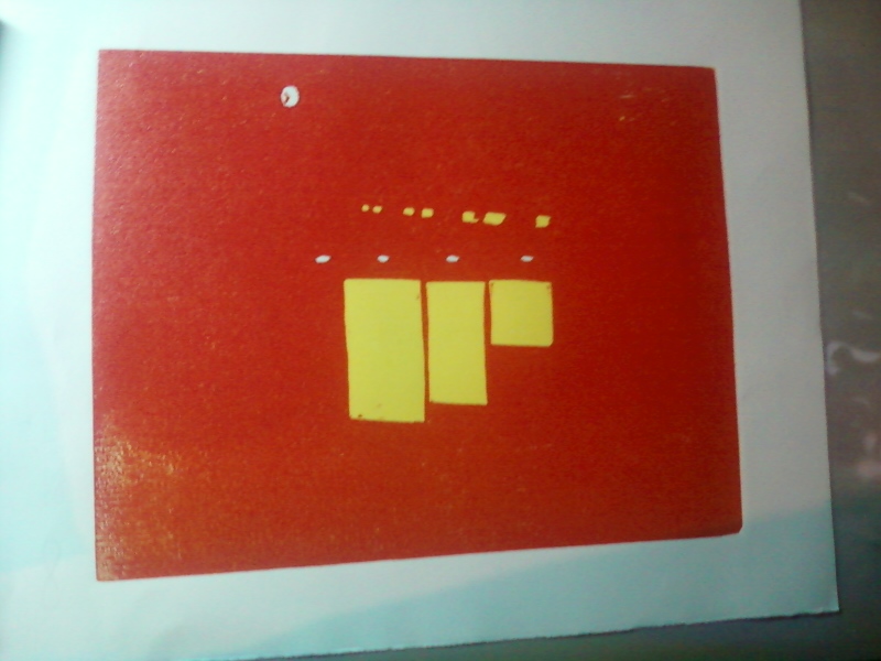
Touch of Gray

I'm a little nervous still about about the red I used. It's a tricky thing creating light with printing inks. We'll have to see if the color pops better as the colors in this print get darker.
Monday, August 26, 2013
How Green Was My Valley?
 Well, that made the flowers pop, didn't it. I love the bright colors on this one. The weekend was actually about as productive as last weekend, with a lot of printing going on in the studio.
 Friday, August 23, 2013
Red, Son? At NIGHT?
Ha ha. I do love a good pun. Anyway, if you've been reading this blog for a while, and I know you have (I'm apparently very popular with someone in Latvia (Heloooooo Riga!)) you know that I have a certain history with red. For some reason, I love to add it to a print early in the process, and then battle my way through the rest of the print trying to escape the red showing through.
This time is different. Through thorough testing and color selection, and the fact that this is a sunset scene where everything has a certain red tinge, this was the perfect opportunity to add this magnificent bright red. I don't want to go into detail about where the red will be used, but I will say that you shouldn't expect an update on this print for several days, due to the fact that I have a lot of fine-line carving to do, and I intend for it to be awesome, so I'm going to go as slow as I need to. In the meantime, though, I'm looking forward to putting a couple of colors down on "Sunflower Farm" this weekend.
As for what we're looking at now, you can see the outdoor recessed lights on the exterior ceiling, as well as the face of a clock (it's not a moon), and now also you see rows of windows in the background, and the lit windows of the motel office.
 |
| "Motel DeSoto" third state (red) |
As for what we're looking at now, you can see the outdoor recessed lights on the exterior ceiling, as well as the face of a clock (it's not a moon), and now also you see rows of windows in the background, and the lit windows of the motel office.
Thursday, August 22, 2013
Here Comes The Sun...And It's All Right!
It seems that in woodcut printmaking, there are a few subjects every printmaker takes a shot at. Cows are one, and/or animals with stripes. Another is the sunset at the beach. But the one that is probably tried at least once by a goo 90% or more of block printers is the humble sunflower.
 And now, at last, my turn. This print is inspired by an acceidental stumbling upon a sunflower farm somewhere in Western New York (I'm not being purposely vague; we really can't remember where the hell it is). I took a few pictures there, and one with a red barn in the background was so nice, I wanted to enter it in the Erie County Fair's photography competition. Due to time constraints and technical difficulties, that didn't happen. So, I decided to use it as a model for this print.
While I was drawing out the cartoon from which I'm now working, I realized how dull it can be trying to be "photorealistic," and decided to go with a more whimsical, expressionist approach. This may be the departure that sends me on the way to a new style of woodcut. Glad you could be here to see it!

While I was drawing out the cartoon from which I'm now working, I realized how dull it can be trying to be "photorealistic," and decided to go with a more whimsical, expressionist approach. This may be the departure that sends me on the way to a new style of woodcut. Glad you could be here to see it!
Monday, August 19, 2013
Torrential Output
It's been a very busy weekend in the studio. Not sure what spurred it, but it resulted in getting way ahead on two new prints. The first, tentatively titled "Sunflower Farm," had an interesting unintended consequence. Having learned from my issues on preveious prints, I decided to put down a blue sky without inking the whole block. Then, when I printed the nice bright yellow, I got hills! Green hills! And they're right where I was planning to put green hills. Unfortunately, this anomaly will get printed over anyway, as it isn't the green I want, but it was a nice surprise I will have to revisit down the road.


And here's a little shot of the "Sunflower" block to give an idea of the layout. More on how this picture came to be will follow in the coming days and weeks.

And here is the first and second states of the "Desoto Motel" print. Since you can't really tell, the first color was a white very lightly tinted blue. This will be the outdoor lights on the exposed ceiling just outside the foyer. I'm really excited about this print, as it is an evening scene calling for both very bright and very dark colors, a print of great contrasts.

Thursday, August 15, 2013
Memorial Day (Eleven Color Woodcut, 2013)
What an adventure this was! I'm still not sure about the black. And, actually, I'm just now wondering if I'm really done. I'm teasing myself with the idea of adding brown to the branches. But I'm putting it on the back burner for now. I am turning my attention to two prints now. The first is a "googie" style (look it up) motel (abandoned) we found in Olean called the DeSoto. The second is from a nearby sunflower farm, so please stay tuned to watch these come together. And let's see if I've really learned anything!
 |
| Finished...? |
Monday, August 12, 2013
Shadowy Figure

Okay, she's probably left the blog. Here's the real story: my wife is a critic's critic. If she could write worth a damn, the artists, writers and musicians of the world would be trembling. And no, her batting average as far as being right probably gets around .200. Except with my work. Yes, she was spot on with the short stories, and she's a vicious truthteller regarding my artwork. So yesterday, after I wrapped up the dark blue, I brought it to her and asked what I thought. I was asking because I thought the blue might be enough. I've seen woodcuts without a black key block, and I've liked the effect, at times. But I just wasn't sure about this print.
The silence that emanated from her answered the question before her lips even moved. So, black it is!
Subscribe to:
Posts (Atom)