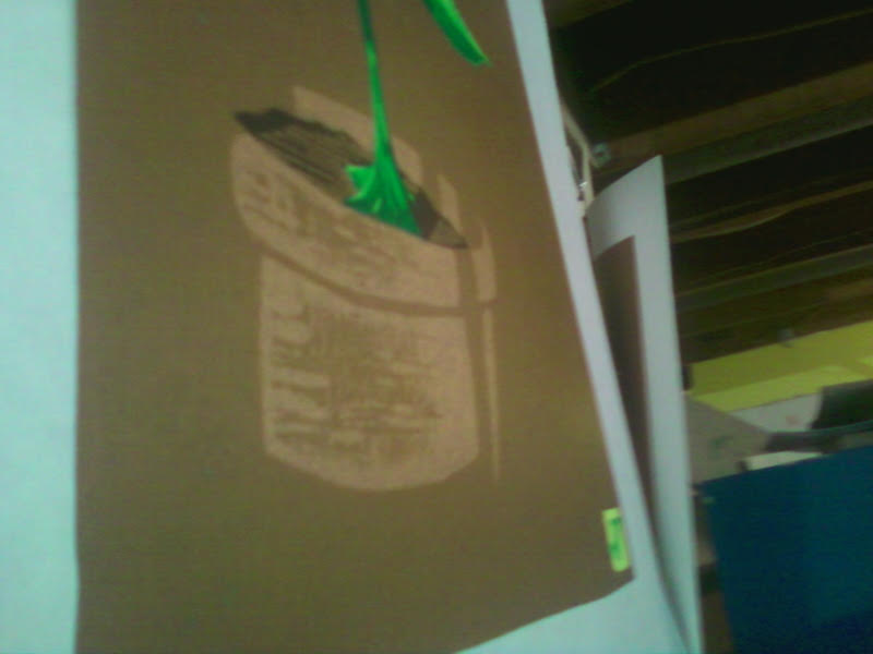
I should have shot the 2nd color backlit as well! I think you can see the color difference here. There are two grays, one light and one dark. I'm not sure which this one is yet! I will have to make the call after the ink dries. That is the drawback of reduction printing -- you can't play with colors as much. You pretty much have to have your decisions made going in. Not that it couldn't be corrected (see the newt print), but what an unnecessary step. Oh well, the debacle at the beginning of the newt print has left me wary and wiser!
Napping Cat Press: Original Hand-Printed Woodcut Prints by Jeffrey Dean
Monday, February 13, 2017
Under The Dome
I'm warmed up now, and ready to be challenged. This is the first color I printed, a nice light sky blue. I shot it backlit so you can see the detail. I hadn't realized how intricate the lines were going to be until I started drawing it out. Cutting was okay, but I need a new prescription for my glasses.
I should have shot the 2nd color backlit as well! I think you can see the color difference here. There are two grays, one light and one dark. I'm not sure which this one is yet! I will have to make the call after the ink dries. That is the drawback of reduction printing -- you can't play with colors as much. You pretty much have to have your decisions made going in. Not that it couldn't be corrected (see the newt print), but what an unnecessary step. Oh well, the debacle at the beginning of the newt print has left me wary and wiser!
Friday, February 10, 2017
Back & Forth
Years ago I worked in a shop with a talented printmaker who had studied under Frasconi. He showed me a number of his large portrait woodcuts, intricate and beautiful. The backgrounds, however, were just a series of scribbles made with a Steel. He commented that after the portrait was complete, he got bored. I get that, and the struggle with background is real.
I have struggled with background since I was in grade school. How tedious to detail what's BEHIND your subject. And too much detail camouflages the subject.
Luckily, I also study cartooning, and that has helped me immensely. Take any cartoon, and you will see most are not detailed, and instead they use spare symbols to impress upon a viewer the IDEA of what the symbols represent. Three rectangles in a blank field is a wall. A squiggle represents water, a few jagged spikes may be grass.
To that sensibility, I added an old technique I learned in kindergarten, but I've found traces it's roots to the surrealists: scribble drawings. I used the same technique with the Newt print, and found that it gives much depth. I imagine you will see more of this as I go.
This print was more an exercise than a work, but I'm quite happy with it. I'm very happy with the colors. I'm obsessed with photographing flowers, but I still haven't developed that as a skill for printmaking, thus the more abstract impression seen here.
I have struggled with background since I was in grade school. How tedious to detail what's BEHIND your subject. And too much detail camouflages the subject.
Luckily, I also study cartooning, and that has helped me immensely. Take any cartoon, and you will see most are not detailed, and instead they use spare symbols to impress upon a viewer the IDEA of what the symbols represent. Three rectangles in a blank field is a wall. A squiggle represents water, a few jagged spikes may be grass.
To that sensibility, I added an old technique I learned in kindergarten, but I've found traces it's roots to the surrealists: scribble drawings. I used the same technique with the Newt print, and found that it gives much depth. I imagine you will see more of this as I go.
This print was more an exercise than a work, but I'm quite happy with it. I'm very happy with the colors. I'm obsessed with photographing flowers, but I still haven't developed that as a skill for printmaking, thus the more abstract impression seen here.
Labels:
#artistheantidote,
art,
flowers,
hamburg,
ink,
napping CA press,
NY,
printmaking,
reduction,
surrealists,
woodcut
Sunday, January 29, 2017
All Newt Review II
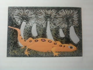
Presently untitled, here is the final finished print, in the last two states. I always love how the black ties everything together. It's a little more primitive than I'd originally conceived, but it works for this print, particularly in the shading. If I were
to do it over again -- and I am NOT!-- I might make the pink bolder, and the colors on the mushrooms darker. But I'm happy with it!
to do it over again -- and I am NOT!-- I might make the pink bolder, and the colors on the mushrooms darker. But I'm happy with it!Thursday, January 26, 2017
Hello There, Newtiful!
So here's our little guy, creeping across the forest floor. I'm still figuring out the background and how to finish, but I've no shortage of ideas.
Labels:
printing,
reduction woodcut,
woodcut,
woodcut printmaking
Wednesday, January 25, 2017
Contrasting Opinion
Yesterday I fretted about the contrasting colors and whether there would be enough contrast when the ink dried. As you can see, everything worked well. Now we get back into the darker colors, and I think that orange is really going to pop. I'm trying something new with the background, and I'm going to worry all through that too!
Labels:
ink,
printmaking,
reduction woodcut.,
woodcut,
woodcut printmaking
Tuesday, January 24, 2017
Twofer Tuesday
Having rescued the print from the trick brown I used on the disappearing mushroom, I did a nice bright pink. The animal in the picture is a newt, very comon in the woods in Western New York. They are a striking bright orange with fluorescent pink dots. I prefer not to print with fluorescents due to fading, so I do the best I can to mimic. I love the look of the pink with the brown gray.
Last night, seeing that the print had dried well, I took a risk and printed the first orange. This will be the darker orange of the shadowed areas of the newt. I was very happy with this color. However, because the lighter orange is a tone of this orange, I neetd to be mindful of what happened with the mushroom. But on one of the earlier versions of this print, I played it too safe and there was way too much contrast. Here's hoping that I've figured it out!
Labels:
mushroom,
newt,
printing,
printmaking,
reduction woodcut,
relief printing,
salamander,
woodcut
Monday, January 23, 2017
Let's Have Fun, Guy!
The first print of 2017 is well underway and following close on the heels of this accomplishment is the first problem of 2017! But it was easily resolved and I'm back at it.
First, the print is a redo of a print I first began back in 2014, then tackled a couple more times. This was the last one:
It wasn't bad, but it wasn't quite what I'd wanted. It had some whimsy, and I liked the cartoony nature of it. But I felt I could have done better -- I was using lousy birch plywood, and I don't think I'd yet learned to properly sharpen my knives. Additionally, as evidenced here, I was still a long way from finding the cure for the ink problems I was having. The entire background should have been deep black, but the ink pulled back into tiny pools on the print after pulling it from the block.
All of those problems are gone now, and here is the print with two colors:
You can see the contrast really well between the light and dark colors of the mushroom. I was very, very happy with this. I hung the prints up to dry. The next morning, I went to do my next color and found this:
I photographed this so that you could still see the image, but in straight light, it looked like a brown square. The ink had dried to almost the exact color of the first color. Anyone who has painted a room or furniture knows this effect. As an ink tech for a printing company, I was extremely surprised, as I have never witnessed this with ink. I don't do a lot of tones, so it's not a huge problem, but it sure was disappointing. Luckily, I was able to print over this with a lighter version, and it looked awesome.
Sunday, January 1, 2017
Wednesday, November 16, 2016
In the Club
Early last year, after years of promising myself I would, I participated in the Baren Forum's print exchange. You can view the participating prints in this exchange, and other exchanges by clicking http://www.barenforum.org/exchange/exchange_64/intro.html. Mine is center, second from the bottom. There was so much great work, and I feel both thrilled and unworthy to be among this group.
Thursday, September 1, 2016
Pretty As A Picture
With the addition of black, this print is complete. I would say that I have enjoyed this print more than about any since my very first prints 14 years ago.
As I mentioned in an earlier post, the intention was to set this print in New Mexico. I have been through several times, and love it. However, don't go looking for this place out west - the model I used for the gas station is actually an old service station onbBuffalo's East Side. The tree is also an invention, a small homage to Gustave Baumann, the great printmaker. The blue Chevy is a tribute to my dad. The camper color is a nod to my wife.
I have done two other little camper prints, and I plan many more.
As per usual, I can only see the things I would change, little mistakes here and there. That's how I learn. But overall, it's exactly what I had pictured, and I am thrilled with the result.
Going to take some time to plan the next print, so please stay tuned!
As I mentioned in an earlier post, the intention was to set this print in New Mexico. I have been through several times, and love it. However, don't go looking for this place out west - the model I used for the gas station is actually an old service station onbBuffalo's East Side. The tree is also an invention, a small homage to Gustave Baumann, the great printmaker. The blue Chevy is a tribute to my dad. The camper color is a nod to my wife.
I have done two other little camper prints, and I plan many more.
As per usual, I can only see the things I would change, little mistakes here and there. That's how I learn. But overall, it's exactly what I had pictured, and I am thrilled with the result.
Going to take some time to plan the next print, so please stay tuned!
Labels:
art,
buffalo,
camper,
ink,
kitties,
new Mexico,
NY,
pizza,
printmaking,
woodcut
Wednesday, August 31, 2016
Tone Depth
While it may look identical to the last color, this lighter green helps establish depth and texture on the trees and grass. One last color!
Labels:
color reduction print,
pickles,
printing,
printmaking,
wombats,
woodcut
Monday, August 29, 2016
Life On Mars
Like my woodcut hero Gustave Baumann, I am drawn the beauty of New Mexico. This print is the first in what I hope will be a series of works featuring vintage campers in all 50 states.
As alluring as the weather worn buildings, craggy rocks and red soil can be, there needs to be a little life in the picture. This dark green sets the base for the brighter green to come.
The ink layers (now at ten) are finally giving me resistance, which I expected, though at this stage the rough coverage is working in favor of the image.
As alluring as the weather worn buildings, craggy rocks and red soil can be, there needs to be a little life in the picture. This dark green sets the base for the brighter green to come.
The ink layers (now at ten) are finally giving me resistance, which I expected, though at this stage the rough coverage is working in favor of the image.
Saturday, August 27, 2016
Rusty
Here are two of the last five colors. The colors are very important to the finished print.
This color, a dark rust red, was designed to be the rust on the camper, car and tire wheel, as well as the roof tiles, camper tail lights and part of the tree. If you look back at past prints, you know that I dread printing bold colors in the middle of the process. But these new inks allow me to overprint with ease, even with lighter colors.
Though the soil is red, this red was a little ftoo bold. The scene, which I will get into deeper when I'm done, suggests New Mexico. The soil color there changes with the light throughout the day, so I wanted to keep the suggestion of the read, but to tone it down.
I would have preferred to go a tad lighter, but I needed good contrast with the beige in the camper, wall and fence; I also wanted something more tree-bark-like.
Now, on to some leaves and grass to pick up the color a bit, with a finish of black.
A note about the sign. As reported earlier, this was an improvised add, just a hint of an old painted sign, weathered away. With no significance, I chose the letter "k" because it was structurally interesting, and not necessarily difficult to carve. Although I'm still working on it, the letter got a little bit away from me. I realised today that it is reminiscent of the Sanskrit "om" symbol. This was unintended; yet, this print has surely been meditation for me. Maybe it's a sign!😂
This color, a dark rust red, was designed to be the rust on the camper, car and tire wheel, as well as the roof tiles, camper tail lights and part of the tree. If you look back at past prints, you know that I dread printing bold colors in the middle of the process. But these new inks allow me to overprint with ease, even with lighter colors.
Though the soil is red, this red was a little ftoo bold. The scene, which I will get into deeper when I'm done, suggests New Mexico. The soil color there changes with the light throughout the day, so I wanted to keep the suggestion of the read, but to tone it down.
I would have preferred to go a tad lighter, but I needed good contrast with the beige in the camper, wall and fence; I also wanted something more tree-bark-like.
Now, on to some leaves and grass to pick up the color a bit, with a finish of black.
A note about the sign. As reported earlier, this was an improvised add, just a hint of an old painted sign, weathered away. With no significance, I chose the letter "k" because it was structurally interesting, and not necessarily difficult to carve. Although I'm still working on it, the letter got a little bit away from me. I realised today that it is reminiscent of the Sanskrit "om" symbol. This was unintended; yet, this print has surely been meditation for me. Maybe it's a sign!😂
Labels:
buffalo,
new Mexico,
printmaking,
reduction woodcut,
sanskrit,
woodcut
Thursday, August 25, 2016
The Long way 'Round
Reduction printing is so simple, yet it is one of the hardest things to explain (second to Pokémon Go!). One thing that is hard to explain to people is the "why." You roll out a full block of color only to have a small area show. What a waste, right?
I disagree. Each layer is a foundation. Each layer can move you to improvisation. See the lettering? I was inspired by seeing the flat expanse of beige I had printed. The tire in the trunk was also a last minute add.
This is color #7, with 5 to go.
I disagree. Each layer is a foundation. Each layer can move you to improvisation. See the lettering? I was inspired by seeing the flat expanse of beige I had printed. The tire in the trunk was also a last minute add.
This is color #7, with 5 to go.
Tuesday, August 23, 2016
Out of Control
The original design for this print called for about seven colors, and in my last attempt, I only made it to five before I had to stop due to the ink issues. This time, because the ink is laying down so well, I keep changing the plan, adding more colors. There's only supposed to be one blue green, and the blue here was actually supposed to be part of the rainbow roll; now it's the first of two blues.
The risk, of course, is going too far, either building up the ink layers to the point that the picture loses detail; worse yet is the deterioration of the plywood, which can crumble and cause pieces that need to stay to the end, start to disappear. But the failure to explore is where art stops and factories begin, and I already spend too much of my life in a factory. So, I will play!
Labels:
art,
printmaking,
reduction printmaking,
woodcut,
woodcuts
Sunday, August 21, 2016
Emerging From The Shadows
With the addition of the darker blue-green, you can now not
only see the full form of the little camper, but you also start to see the
entire picture start to gel This is when things get exciting for me, as I can
now start to see where the picture is going to end up (I also see all of the
little mistakes that may have been made along the way, and this is when I try
to figure ways to change things around so that the mistakes look deliberate!).
On the walls of the building, you also start to see something -- are those
letters? This was an improvised decision, not part of the original cartoon, or
the first attempted printing. The building had originally been just flat, and I
wanted a little more life. It's a gamble, but we'll see how it pays off. At
this point I estimate 6 more colors.
Friday, August 19, 2016
Everything On the Line
Still untitled, the print is starting to take form now, with the addition of a pretty retro blue-green, my wife's favorite color. This is my second attempt at this print. The first attempt, which I believe was some time last summer, ended in disaster, due mostly to the ink issues I've documented. No sign of any of those problems this time. The coverage with the Renaissance and Graphic Chemical inks has been outstanding.
I usually like to show previous attempts, but I have had no luck finding an old print or even a photograph. As I recall, I made it to the last or second-to-last color before it went all to hell. You may notice that the rainbow roll looks less prominent, but as the darker colors go down, the sky will regain its vibrancy.
Labels:
printmaking,
reduction woodcuts,
trailers,
woodcuts
Tuesday, August 16, 2016
On a (rainbow) Roll
In commercial printing, the blending of two colors in gradation is usually called a "split" or a "split fountain." In block printing it is generally referred to as a "rainbow roll." For landscapes and such, it helps add depth to the picture. It can also be used to give the illusion of dimension. In "Ohio Street," I used a rainbow roll (RR) for the sky. It really works well for sky, and I'm using it again in the current subtitle piece seen here. I used to use RR a lot more when I worked with smaller sized prints. I've been reluctant to employ RR because I have been so occupied with the other printing issues I've had. Now that those appear to be resolved, I'm looking to perfect RR techniques to bring my prints the vibrancy I want.
This print is a redo of a print I attempted a while back, which fell apart due to ink issues.
Labels:
printing,
printmaking,
reduction woodcut,
woodcut
Thursday, August 11, 2016
Out of the Blue
As you know, I was just glad to have finished "Ohio Street" in time to show at the Erie County Fair. I was just happy to have solved the problems that had plagued my printmaking for years. I was so shocked and humbled by the ribbon. So much talent on display, I am certain that a mistake was made. Barring that, I am grateful to the judges and volunteers, and applaud all of my fellow participants. Every year, the arts and crafts competition elevates the fair from your average deep-fried carnival, from sewing arts to photography, fine arts to antiques. Aaaaaaaaand, it'the coldest building on the fairgrounds!
Labels:
erie county fair,
printmaking,
reduction woodcut,
woodcut
Tuesday, August 2, 2016
Ask Amy
Me: I think I might be done with the print.
Amy: Really? I thought you had one more color.
Me: Yeah, I was going to. But I don't know how much it will add to it. Why don't you take a look at it and temm me what you think.....Besides, so much of the block is missing now, it would just be a pain to print.
(too long pause)
Amy: Well, you know I'm going to say it needs the last color.
Me (sigh) I know.
That night, I reluctantly went to the studio. Just as I said, it was a long painful experience inking the block.
As she said, it needed it.
Her advice, even when I ask for it, is usually ill-timed, inconvenient, and ill-informed. But it's always right. I mean always. Thank you Sweet Pea!
Amy: Really? I thought you had one more color.
Me: Yeah, I was going to. But I don't know how much it will add to it. Why don't you take a look at it and temm me what you think.....Besides, so much of the block is missing now, it would just be a pain to print.
(too long pause)
Amy: Well, you know I'm going to say it needs the last color.
Me (sigh) I know.
That night, I reluctantly went to the studio. Just as I said, it was a long painful experience inking the block.
As she said, it needed it.
Her advice, even when I ask for it, is usually ill-timed, inconvenient, and ill-informed. But it's always right. I mean always. Thank you Sweet Pea!
Labels:
buffalo ny,
buffalo river,
printing,
printmaker,
printmaking,
reduction woodcut,
silo city
Monday, August 1, 2016
The River's End
I'm not sure if I'm done yet. I was considering one last color, a very dark purple/black, which would mostly be the trees and the river wall. But I don't know if it will really add much to the print.
I'm very happy with this print, so happy that I've worked out the ink that has plagued my work for so long. Had I known how well this would print, I would have taken a few more risks with detail. But, that's how it goes.
I confess that it's a bit safe for a competitive piece. It doesn't have the color of "Sunflower Farm" (2014) or the light-play of "Sweet Breeze" (2015). But it conveys a mood I often feel around Buffalo's big old industrial buildings.
I'm proud of the piece, mostly because of the registration. For a decade I've used a jig that often caused me problems while printing, and sometimes moved the register n mid print. I've gotten rid of all that in favor of a kento system, which has been a pleasure to work with. To illustrate how dead-on the register is, look at the doorway of the silo on the bottom left. Inside the doorway is a little lite -- this little spot has held through 7 colors. I usually lose at least a quarter of my prints due to register. This time, I only lost one.
I will post it when it's all dressed up in a frame and ready for the Fair.
I'm very happy with this print, so happy that I've worked out the ink that has plagued my work for so long. Had I known how well this would print, I would have taken a few more risks with detail. But, that's how it goes.
I confess that it's a bit safe for a competitive piece. It doesn't have the color of "Sunflower Farm" (2014) or the light-play of "Sweet Breeze" (2015). But it conveys a mood I often feel around Buffalo's big old industrial buildings.
I'm proud of the piece, mostly because of the registration. For a decade I've used a jig that often caused me problems while printing, and sometimes moved the register n mid print. I've gotten rid of all that in favor of a kento system, which has been a pleasure to work with. To illustrate how dead-on the register is, look at the doorway of the silo on the bottom left. Inside the doorway is a little lite -- this little spot has held through 7 colors. I usually lose at least a quarter of my prints due to register. This time, I only lost one.
I will post it when it's all dressed up in a frame and ready for the Fair.
Thursday, July 28, 2016
A River Runs Through It
Friday, July 15, 2016
Ink Detective
While there hasn't been much to report from the studio, a
lot has been going on behind the scenes. The fact is that I haven't completed a
print in almost two years, but it hasn't been for a lack of trying. The problem
stems from a lack of confidence caused by a grand series of disappointments.
There have been several prints started, many of which are
detailed in past posts. They would often go for five or six colors, and the
something curious would happen, destroying the print. The colors would go down
on the previous layer. I would hang it up to dry. Later, I would check on it
and find that the ink had virtually disappeared! It was crazy. At first I
thought it was that the ink wasn't printing at all, that I had thought the
color was better than it really was. It was only after many, many episodes of
this that I realized that it looked fantastic when it came off the block.
Somehow, over time, it was disappearing before my eyes.
What was happening, actually, is that the ink was beading
up, like painting a balloon with watercolors.
Now, what to do about that? First, I needed to go back and
see what I'm doing differently than what
I was doing years ago. The chief
suspect has been revealed to be Gamblin inks, specifically the white. Now,
Gamblin's products are fine, and I love their colors -- and I'm not saying it's
not something that I'm doing. Certainly, I may be adding too much oil to my
mix; I use their lithography inks, which are very stiff, so I often use a lot
of oil. It could be the drier I use; in fact, I know that I have been using too
much and have recently corrected that. In fact, I thought that had been my
issue, until I realized that it was only when I was printing over inks that
were made up mostly of white that the ink would bead up.
I used to use inks from Renaissance Graphics in
Pennsylvania, and I was always happy with them. In fact, I'm not sure why I
stopped. Well, I've ordered a small bunch from there and from Graphic Chemical
in Chicago, so my detective work will continue.
Aside from that, I have also made peace with my cast-iron
book press (I now realize that it will never give me the crisp looks that
printmakers with etching presses get) and have added spoon burnishing to the
process to help smooth out areas the book press misses. I have dumped linoleum,
poplar and birch plywood in favor of the costlier but dream-like shina plywood,
which cuts like butter and holds lines well, even after eight or nine colors. I
have discarded my jig, which used to hold my block when printing, which required
a block to be perfectly square and also left a lot of embossed marks on the
paper; now I use a kento system cut right into the printing block. I have
finally mastered the art of sharpening my tools. I have been steadily working
on drawing and designing.
Now, if I can just get the ink to work, we might have
something!!!
Tuesday, March 22, 2016
Firmly Planted
Just a small teaser snapshot. The new print with just two more colors to go. I'm excited to show off the whole thing. The shading effects on the front of the terra cotta pot were a happy accident. The hard part will be to make sure they don't print with any of the remaining colors. The final approach will take a steady hand and neatness, two things I am not known for!
Labels:
ink,
printmaking,
reduction woodcut,
terra cotta,
woodcut
Monday, March 21, 2016
Opening The Blinds
Ever since I purchased my antique cast-iron book press in the fall of 2006, I've been struggling to master my process. Every step forward seemed to herald a step back. Through it all, I kep working on my artistic abilities, falling in deep mad love with cartooning and graphic novels. Occasionally, I would dive back into printmaking to test out some new theories that I'd hope would open the doors to finally cracking the code to better prints.
Late last year I finally discovered the root of my issues: it's the antique book press itself. I know of only one other woodcut printmaker who uses one, and for good reason: the torque is not enough to allow a good smooth laydown of in. This, in addition to troubles with the wood I was using and even some ink problems, had me on the verge of leaving printmaking altogether.
Over the last year, I have studied other printmakers very closely. When you are self-taught and working alone, you need to be a good detective. You also need to be resilient. It's okay to give up, just as long as you start again as soon as possible. That's my MO: quit...for a minute.
So this week, I cracked the code. I'll get into it more in-depth later, but I have found the missing piece of the puzzle that allows me to use my press and still make prints with excellent coverage and true color saturation I demand. Here's a terrible photo of the print in mid-work. There are three colors left, and I'll be back then to give you more details, and I'll tell you how you can get a print for free!
Late last year I finally discovered the root of my issues: it's the antique book press itself. I know of only one other woodcut printmaker who uses one, and for good reason: the torque is not enough to allow a good smooth laydown of in. This, in addition to troubles with the wood I was using and even some ink problems, had me on the verge of leaving printmaking altogether.
Over the last year, I have studied other printmakers very closely. When you are self-taught and working alone, you need to be a good detective. You also need to be resilient. It's okay to give up, just as long as you start again as soon as possible. That's my MO: quit...for a minute.
So this week, I cracked the code. I'll get into it more in-depth later, but I have found the missing piece of the puzzle that allows me to use my press and still make prints with excellent coverage and true color saturation I demand. Here's a terrible photo of the print in mid-work. There are three colors left, and I'll be back then to give you more details, and I'll tell you how you can get a print for free!
Labels:
2016,
Jeffrey Dean,
napping cat press,
reduction woodcut,
woodcut print
Thursday, February 25, 2016
Tuesday, January 5, 2016
The Future Is Now
...well, at least it was, yesterday. Well, I'll just aoid the year in review. Yes, the big win at the Erie County Fair was a special treat, but 2015 has the distinction of being the only year in which I didn't finish a single print since I began printmaking in 2002. That's about to change.
If you've been following this blog (and I know you've been rapt) you know that it's been more or less a soap opera of every misstep a self-taught printmaker could make.
...in our last episode, it was finally discovered that the cheaf problem I'm having stems from the fact that I can't achieve enough pressure using my antique book press, no matter the paper, the ink or the block.
So, as the New Year 2016 begins, questions are raised:
Tune in regularly friends to find the answer to these and, inevitably, more ridiculous questions as we visit: As The Press Wheel Turns!
If you've been following this blog (and I know you've been rapt) you know that it's been more or less a soap opera of every misstep a self-taught printmaker could make.
...in our last episode, it was finally discovered that the cheaf problem I'm having stems from the fact that I can't achieve enough pressure using my antique book press, no matter the paper, the ink or the block.
So, as the New Year 2016 begins, questions are raised:
- Will Jeff press on (har har) using the same old equipment
- Will he break down and buy a new press?
- Will he change his style to accomodate the old press?
- Will he give up printmaking all together?
- Will he update his blog more than once every three months?
- will anyone care?
- Has the ship sailed?
- Can he believe it's NOT butter?
Tune in regularly friends to find the answer to these and, inevitably, more ridiculous questions as we visit: As The Press Wheel Turns!
Monday, August 17, 2015
Wind At My Back
Every year my wife and I enter various competitions in the creative arts building at the Erie County Fair (Hamburg, NY). We've been doing it for close to 15 years now, and love it every year. It's a pleasure to see such great art and craft work by our neighbors, and I'd be lying if it isn't a thrill to see a ribbon on your work. This year our craft work didn't collect any ribbons, but I was pretty surprised to find that not only did "Sweet Breeze" breeze into port flying a bright blue flag, but a green one as well. The green denotes a special prize, usually from one of the sponsors of the competition ("Autumn Camper" from a few years ago received a green from Hyatt's art supplies). And a first for me was a ribbon -- blue no less -- (AND a green) for a photograph taken at the Fair last year.
If you get a chance to attend the Fair this year, please stop by and see all of the great work from your friends and neighbors, and if you have a creative bent, PLEASE pledge to participate next year. You'll be glad you did!!!
Labels:
art,
boats,
erie county fair,
hamburg,
NY,
printmaking,
prints,
reduction woodcut,
sail boat,
woodcut
Thursday, August 6, 2015
Toon In, Turn On
I wonder what you, Dear Reader, must think of my frequent and lengthy absences from this blog. Mayhaps you think I'm fishing by some flower-wreathed waterfall in Maui; maybe you picture me gnawing pencils at my desk, feverishly trying to come up with the next woodcut. Maybe you've glanced at the obituaries (jeesh! But thanks for checking!). While it's closer to choice two (and as far away as can be from one (sigh), I'm actually very busy in these breaks.
But through it all, and over the course of these last few years, I have been immersed in self-education, focusing squarely on cartooning. I first became interested in cartooning in 1990, but other than constant doodling, I never took it seriously. Throughout my printmaking career, I often found myself drawing out cartoony images, but I usually never made them into prints (well, once: 2005 I did a Che Guevara wearing a McDonald's visor). Over the last few years I've really become an avid student of the form, but I've been doing more bookwork and theory than actual drawing, save at work, where management looks down on my doodle-covered files. The studying hasn't been part of some grand career plan; rather, I've just been interested.
Then a few months ago I participated in print exchange through Baren Forum. You may recall that I commented that it was my second design choice, and that my first choice was a cartoon I thought might be a little risque (I'm an idiot). Anyway, that cartoon led me to looking through a pile of papers I keep with little creative bits scrawled on them, and they were mostly ideas for cartoons. So, I decided to finally start drawing, which is where I am now.
During this particular break, I had an operation to repair a hernia, my second. I'd hoped to use my time off to work on artwork; however, the discomfort and medication saw an end to that fantasy. At to that a raging strep throat infection immediately following surgery kept me from even thinking of art.
But through it all, and over the course of these last few years, I have been immersed in self-education, focusing squarely on cartooning. I first became interested in cartooning in 1990, but other than constant doodling, I never took it seriously. Throughout my printmaking career, I often found myself drawing out cartoony images, but I usually never made them into prints (well, once: 2005 I did a Che Guevara wearing a McDonald's visor). Over the last few years I've really become an avid student of the form, but I've been doing more bookwork and theory than actual drawing, save at work, where management looks down on my doodle-covered files. The studying hasn't been part of some grand career plan; rather, I've just been interested.
Then a few months ago I participated in print exchange through Baren Forum. You may recall that I commented that it was my second design choice, and that my first choice was a cartoon I thought might be a little risque (I'm an idiot). Anyway, that cartoon led me to looking through a pile of papers I keep with little creative bits scrawled on them, and they were mostly ideas for cartoons. So, I decided to finally start drawing, which is where I am now.
So, this "Snowfight" cartoon is my very first finished cartoon. I'm happy to share it with you, and all of Erie County, as it's my entry into the drawing class in the creative arts competition at the Erie County Fair. I also have a woodcut print, "Sweet Breeze," in the show as well. Hope to see you there!
Thursday, July 16, 2015
All Newt Review
Sometimes printmaking just breaks your heart. Bless the ones who find their niche and master it. I, on the other hand, just keep pushing the envelope. I guess that'll lead me somewhere awesome, but the road....well, friends, the road can be tough.So, about four colors into the newt print, I knew it wasn't going to work. But I finished it. I made myself finish it, and finish the whole lot. Not just to finish it, but to make notes along the way so that I could at least salvage the education. There are things I do love about it, but other things that have me tearing my hair out.
But the one thing that calms me down is knowing that if I was just playing it safe, I wouldn't be here. So, while the nut goes uncracked, I'm certain that when I do figure this all out, there's going to be magic.
Labels:
linocut,
printmaking,
reduction printmaking,
woodcut
Friday, June 12, 2015
Tea Time
Wednesday, June 10, 2015
Newty Picture
Here's the second to last color. I'm going through with finishing it, now just as an exercise because I want to see how the colors and the other aspects of the print look. Except for the main subject, I really like the print. I'm happy with the colors, and how they look. Accepting the limitations of the book press has helped me with proper inking, and also with anticipating areas where the coverage might be an issue, which has allowed me to plan out my colors. For example, you'll notice that I have chosen in many cases to put light colors on top of dark colors, which as we've seen in past prints is not always a good idea. But here, it's to the benefit, especially on the mushrooms. The last color is black.
Monday, June 8, 2015
Creepy
Friday, June 5, 2015
Clarity
My very favorite thing about reduction printmaking, even ahead of near-perfect register, is the slow reveal. Yes, of course, I know what the final image is supposed to look out -- I work from a completed drawing. And even if I make changes as I go along, I still have a good idea about what it should look like.
But there's something about watching something happen. Maybe it's like watching a favorite movie you've watched before -- you know what's going to happen, but watching it develop is the joy. Maybe it's also like we used to stand around and watch our mom's shake a Polaroid until the image appeared (betcha some of you got a fine earworm now -- Hey, Ya!
So, with the third color down, I think it's pretty clear what we're going for, although there's going to be a lot more going on over the course of the next five colors.
The mystery animal will be much clearer after the next color goes down. I was very happy with my color choices on this one. Unfortunately, because of how I have my jig set, I'm getting crimping in the corners. However, I have designed jig modifications that should eliminate the issue.
But there's something about watching something happen. Maybe it's like watching a favorite movie you've watched before -- you know what's going to happen, but watching it develop is the joy. Maybe it's also like we used to stand around and watch our mom's shake a Polaroid until the image appeared (betcha some of you got a fine earworm now -- Hey, Ya!
So, with the third color down, I think it's pretty clear what we're going for, although there's going to be a lot more going on over the course of the next five colors.The mystery animal will be much clearer after the next color goes down. I was very happy with my color choices on this one. Unfortunately, because of how I have my jig set, I'm getting crimping in the corners. However, I have designed jig modifications that should eliminate the issue.
Thursday, June 4, 2015
Pink-A-Boo
This new print, which I first attempted last fall, is coming along nicely thanks to the education I got over the weekend regarding the limitations of my press. Here are the first two states, a pink and an orange.
The first color is the pink, and it illustrates very well the amount of work that goes into a reduction print. In reduction printing, you print a color and then carve away areas that you want to show as that color in the final print.For example, the pink is in four very small spots (in the picture at right, you can see them at the bottom center, under the white cut lines), but I needed to print the entire page pink. Then, after cutting the areas I want to stay pink, I printed the orange. These photos may not be strong enough to show where the pink does show. I could have printed the orange first, then printed the small pink areas somewhere down the road. However, I needed the pink to be as vibrant as I could make it, so I chose to print that first. Even so, the orange itself is only a small are of the print. However, the bulk of the print will be browns and tans, maybe a dark green if I'm feeling frisky. I couldn't print those first and expect the orange to be bright.
Friday Night's All Right For Artin'

This Friday night, you may want to jaunt into the city to attend the opening of Dorothy Markert's show at the Western New York Artist's Group gallery at One Linwood Avenue in Buffalo Friday, June 5, 2015 at 7:30 pm.I wrote about Dorothy on this blog last summer as part of my salute to artistic heroes and mentors (http://www.nappingcat.blogspot.com/2014/03/hall-of-heroes-dorothy-markert.html). She is highly regarded in the Western New York printmaking community and, as a Roycroft Master Artisan (emeritus), she commands quite a level of respect in the Arts & Crafts community nationally, if not globally.
See you there!
Labels:
art show,
buffalo,
Dorothy Markert,
NY,
printmaking
Wednesday, June 3, 2015
Press-ure Pointers
I have been printmaking for over 13 years now, and one of the things I love about it is that I always learn something. Every time I hit the studio, it's education.
Being self taught is freeing, but you are also hampered by your own unknowns. If you go down Path A, you will go directly to the wellspring of all knowledge. But if you don't know Path A is there, you can get lost in the woods pretty easily.
Of course, if you take Path A, you also miss all of the crazy stuff in the woods. So there it is.
Anyway, I belong to an online group of amazing artists known as Baren Forum. They've been to the font of knowledge and are kind enough to run cups back to us morons still crawling around in the weeds. As part of this group, I am encouraged to participate in the print exchanges, where up to 30 members exchange prints. I did participate, as you saw a few posts back. And it was such a great experience. But as I was going through the work of others, I was struck by how nice an opaque some of the prints looked. Some looked like screen prints, the ink was so dense and even, regardless of the paper used.
And that led me to some serious trouble shooting in the studio last night, and some serious internet investigation. And it all came down to one thing, the thing that makes everything in the universe work: pressure.
I use an antique cast iron book press, which I have just discovered offers a raction of the pressure that an etching press does. In fact, though I turn and crank that wheel as hard as I can, it gives less pressure than using a wooden spoon, which is how I used to make my prints back in the beginning.
Here is an example of spoon vs. press.
On the right is the coverage I get from a lightly-inked block. On the left is what the ink transfer is like using a wooden spoon to burnish the back.
Well, issues with my hands prevent me from going back to the spoon, and I'm not giving up printmaking. So, I have found that by inking the block a little more, and just making peace with the effect of less pressure on the block, I can get back to some solid work. We'll see, won't we?!
Being self taught is freeing, but you are also hampered by your own unknowns. If you go down Path A, you will go directly to the wellspring of all knowledge. But if you don't know Path A is there, you can get lost in the woods pretty easily.
Of course, if you take Path A, you also miss all of the crazy stuff in the woods. So there it is.
Anyway, I belong to an online group of amazing artists known as Baren Forum. They've been to the font of knowledge and are kind enough to run cups back to us morons still crawling around in the weeds. As part of this group, I am encouraged to participate in the print exchanges, where up to 30 members exchange prints. I did participate, as you saw a few posts back. And it was such a great experience. But as I was going through the work of others, I was struck by how nice an opaque some of the prints looked. Some looked like screen prints, the ink was so dense and even, regardless of the paper used.
And that led me to some serious trouble shooting in the studio last night, and some serious internet investigation. And it all came down to one thing, the thing that makes everything in the universe work: pressure.
I use an antique cast iron book press, which I have just discovered offers a raction of the pressure that an etching press does. In fact, though I turn and crank that wheel as hard as I can, it gives less pressure than using a wooden spoon, which is how I used to make my prints back in the beginning.
Here is an example of spoon vs. press.
On the right is the coverage I get from a lightly-inked block. On the left is what the ink transfer is like using a wooden spoon to burnish the back.
Well, issues with my hands prevent me from going back to the spoon, and I'm not giving up printmaking. So, I have found that by inking the block a little more, and just making peace with the effect of less pressure on the block, I can get back to some solid work. We'll see, won't we?!
Labels:
block print,
book press,
ink,
linocut,
napping cat press,
press,
printmaking,
reduction printmaking,
woodcut
Subscribe to:
Posts (Atom)