CLICK HERE TO VISIT MY ETSY SHOP!

VISIT MY ETSY.COM SITE.
Preview
JUST CLICK ON MY PRESS!

Sunday, January 21, 2018

Space Exploration

 It wasn't too long ago, but it's been a few years since "DeSoto Motel" (right). The print was similar in that it was a study of light and dark, though my chief concern was more the light of the sunset, the lights of the outdoor roof and the neon. I wasn't happy with the print though, for several reasons, one being my dismissal of the interior of the hotel office.
The current print is partially concerned with making amends for my ignoring space. Though I am still focused on the effect of light ( in this case, the orange glow of sodium arc municipal lighting), it was vital to explore the inside of the building. The image is only 9"X7", and shina plywood becomes brittle as the block gets inked and wiped, so I can't get as detailed as I might sometimes like. But I can feel the space here, and with 3 colors to go, I'm pleased.

Saturday, January 20, 2018

In the introduction to his novel, "Birdy," William Wharton offered the following poem:

"There are bird tracks
And nothing in the sky
Something lived, left
And left something"

That speaks to what I find fascinating about these storefronts, aglow as if ready to fling open their doors to commerce, but closed, locked, and still. Rest, repose, sometimes, in the case of the old empty Woolworths I used to peek into, dead.

Think of your desk, or your garage, or someplace untidy with the folderol of life, and imagine you never return to it again (let's not be maudlin -- you moved, you retired, you stepped out to get a giant Paula's Donut, you are creating new bird tracks on another beach somewhere). What would someone coming on the scene think? What story is being told about you in the universal language of stuff?

Friday, January 19, 2018

Seeing the Light

Ten years ago, when we lived in Buffalo, I took a side job delivering newspapers in the southeast corner of the city, a somewhat rough and rundown area called, ironically, Lovejoy. I'd deliver my route somewhere around four or five in the morning, just the darkest time. I saw some crazy things in that neighborhood, as the drunks stumbled home, the skunks roamed for a snack. But the solitude of that hour was calming. The houses with the droopy window eyes, the yawning garage doors, the whole world lulled to slumber by the lonely howl of a train off in the distant railyard. Or maybe I'm remembering Snoopy as the World's War I flying ace in "Great Pumpkin." Anyway, one day I had to go to that neighborhood during the day. I couldn't find my way around -- the garish colors of the houses, rotted roofs and torn sidewalks that we're rubbed out and faded by the charcoal of night's dark. Daylight sure has it's beauty, of course. But the dark of night offers a glorious pallet, and a warmth of its own

Seen here, three pools of color, trying for the perfect one. Sometimes you have to go on faith. Reduction printmaking is deep on faith -- you never no if it will work out until the end.

Thursday, January 18, 2018

Floored

For most of my formative years, up until the last decade or so, I was a night owl. You could find me at 2:00 am walking the quiet streets. A favorite place to go was the village shopping center. I loved to wander up and down the concrete walks, looking in the empty shops, quiet and cozy, with only a few lights left on. Woolworths, Pleasures & Pastimes, Ulbrich's Stationers. I can't say why I was drawn to these vacant night scenes, or why I still occasionally wander over there (P&P is now a Tuesday Morning, Woolworths is a closed tanning salon, and Ulbrich's was long ago demolished to become a Rite Aid parking lot). But a few things around there stand up against time....

Tuesday, January 16, 2018

Pop the Cork!

Happy New Year, folks.  I'm starting a little late on my first print of '18 -- I decided that it was time for a new brayer and new knives. Now that they're here, I've begun. Feels very good.

I want this print to be revealed as I go. As you see it develop, I'll add some observations and insight into this print, which I hope will lead to a larger exploration of the subject.

I live in the town I grew up in, a small pretty village South of Buffalo. I spent many late nights as a kid walking the streets in the wee hours, watching the business district change over the years. I saw it bustle with shoe stores and grocery stores and liquor stores, dissolve into vacant shopfronts and demolished buildings, rouse again with offices and new structures, empty out again as the economy collapsed, then surge back to life with an infusion of hipsters.

Through it all, though, there have been a few constants.....

Tuesday, December 5, 2017

Friday, December 1, 2017

Christmas Tradition: The Thoughtless Gift Guide


Back in 2004, when for one bright shining moment I was actually putting my college training to use, I was publishing regularly in the Buffalo Beast, a always very political, often very funny and offensive at every opportunity free newspaper circulated in the city of Buffalo, NY. The paper -- co-founded by a guy named Matt Taibbi who, I've heard, left to go work on some rag called Rolling Stone, or something -- is long gone, but my clip file endures. One of my favorite pieces, from Christmas 2004 is reprinted without permission below. Enjoy, and Happy Holidays!


Buffalo Beast #65
Ho-Ho-Hum:
The Thoughtless Gift Guide
By Jeff Dean
It's noon on Christmas eve and you've just learned that cousin Todd has been paroled and will be coming to Christmas dinner, or maybe you are "secret Santa" to the new kid in shipping who eats his lunch in the john. The clock is ticking, your credit card is scorched and suddenly you've gone from jolly to humbug. Don't panic. There are plenty of options for the last-minute gift-giver who has neither the thought nor the cash to put into another gift.
It goes without saying that you will start your hunt at a discount chain store such as Wal-Mart or Target. These stores have anticipated your arrival and have stocked their doorways and front aisles with dozens of thoughtless gifts, most under $10.
For the less-than-special woman in your life, consider a scarf and glove set, handsome winter accessories that are colorful, yet as protective as cheesecloth. Slipper sets are also popular because, hey, everyone has feet (though, with the war, you may want to check first). Resin fountains and musical water globes sporting fairies, angels and critters are also a favorite with the get-in-get-the-hell-out shopper. Why not splurge and pick up a matching resin garden stone inscribed with wispy verse?
There is no shortage of thoughtless gifts for the gent you have to buy for. Motorized tie racks, TV shaped remote control caddies, talking pedometers and 3-in-1 anythings abound at holiday time. Particularly obnoxious are the miniature pool or dart sets. Imagine the hours of fun you'll have imagining your lame-ass brother-in-law actually shooting pool on his lame-ass 5x7 inch table. And who doesn't like snacks? You could go spend an arm and a leg at Hickory Farms, or you could just stop at the drugstore and pick up a box from the Chestnut Creek Country Snack collection. For less than $5 you get smoked cheese spread, crackers, tea and sausage. The peace of mind is free.
A very popular "oh shit" gift is the mug set. Usually packaged with coffee, cocoa or soup, these handy packs come with mugs or bowls emblazoned with popular logos. This year, among the traditional Campbell's and Hershey's packs, you will find sets from John Deere, Field & Stream and NASCAR.
Maybe you've given the mug set too many times to the loser on your list, but you still don't want to come off like you care. No problem, with Kammenstein's hardwood mug tree, which prices at about half of what another mug set would have set you back.
If your budget is a little more flexible, consider a multipurpose watch. Toolmaker Stanley has lent its name to a line of watches that, in addition to, presumably, telling time, also open bottles, drive screws flash lights and offer level gauges. The watches come in metal replica toolboxes that can also double as an attractive casket for small pets.
For the ladies who barely blip on your emotional radar, seek out a nice shrink-wrapped tub of hyper-allergenic lotions and soaps, such as Wal-Mart's 20-pound Comfort & Care set, which includes bubble baths, shampoos and loofahs wrapped in a huge gilt basket so tasteless Donald Trump would roll his eyes.
If you want to be more subtly obnoxious, spring for the Febreze ScentStories player. Clocking in at just under $30, this useless gem uses fragrance cartridges to tell a story, such as "Walking Barefoot on the Beach" or "Relaxing in the Hammock." The cartridge cycles through different scents as it plays, supposedly telling an olfactory tale. Sounds ridiculous, but just try to find one.

There are so many choices for the thoughtless gift-giver, you'll wish you were obligated to put more names on your list. But instead, just relax, have a cup of Harley Davidson cocoa, maybe a bite off the sausage log, and be glad it's over for another year.

Tuesday, February 28, 2017

But WAIT! There's MORE!

This isn't a very good photo, but the darker green is actually a fairly bright, grassy green. I was pleased with the color, and I had called this print finished. Still, something was nagging at me about it.

I've long believed that you need three tones of color to show depth. Sometimes you can use shading, sometimes you need three colors.

To me, this lacked depth. The dome has three levels of color -- white and two grays, and I think it gives the dome a good feel. While the Poinsettias aren't bad, they just don't pop for me. So I went back.

So, I carved out larger areas where I had carved for the light yellow-green, and added some cross-hatching in places (notably, on the stems). I then overprinted with a fairly dark green. I definitely got the effect I wanted, but now I have a different problem: The leaves feel too 2D. That's fine, except that I have carved away all that area. With reduction printing, there's no going back.

Well, there's always a way to go back. I will carve another block and attempt to add in some darker areas and maybe do some shadowing in those hatched areas in the center. It's a lot of work, but I think this print deserves it, and you know I could use the practice. The center of the sunflower in "Sunflower Farm (2014) used the same save.

Saturday, February 25, 2017

Going Green

Just one more color to go. I'm really pleased with the colors and the coverage I'm getting from my Renaissance Graphics ink.

This light green will serve as the base for a darker green. I've had few issues with this print, and I'm surprised a bit because when a large area gets cut away, I am often plagued by ink getting on the block in areas it shouldn't be. Am--am I getting better? Gasp!🤔😁

Monday, February 20, 2017

A Stab of Color

I enjoy revealing prints to you one color at a time, because that's how I see it. Even though I know what the end image will be, I'm usually working off of a pencil and marker sketch. Like watching a Polaroid develop, printing each state reveals more and more, until at last the image is whole.

Here, you see the dome of the Buffalo and Erie County Botanical Gardens is complete, bright against a bright blue sky.

Sunday, February 19, 2017

Under The Dome: Pt. 2


I think you can see where I'm going with this. If you live in Western New York, you can see EXACTLY where I'm going with this. The gray days are over. Let's put some color on this baby.

Monday, February 13, 2017

Under The Dome

I'm warmed up now, and ready to be challenged. This is the first color I printed, a nice light sky blue. I shot it backlit so you can see the detail. I hadn't realized how intricate the lines were going to be until I started drawing it out. Cutting was okay, but I need a new prescription for my glasses.


I should have shot the 2nd color backlit as well! I think you can see the color difference here. There are two grays, one light and one dark. I'm not sure which this one is yet! I will have to make the call after the ink dries. That is the drawback of reduction printing -- you can't play with colors as much. You pretty much have to have your decisions made going in. Not that it couldn't be corrected (see the newt print), but what an unnecessary step. Oh well, the debacle at the beginning of the newt print has left me wary and wiser!

Friday, February 10, 2017

Back & Forth

Years ago I worked in a shop with a talented printmaker who had studied under Frasconi. He showed me a number of his large portrait woodcuts, intricate and beautiful. The backgrounds, however, were just a series of scribbles made with a Steel. He commented that after the portrait was complete, he got bored. I get that, and the struggle with background is real.

I have struggled with background since I was in grade school. How tedious to detail what's BEHIND your subject. And too much detail camouflages the subject.

Luckily, I also study cartooning, and that has helped me immensely. Take any cartoon, and you will see most are not detailed, and instead they use spare symbols to impress upon a viewer the IDEA of what the symbols represent. Three rectangles in a blank field is a wall. A squiggle represents water, a few jagged spikes may be grass.

To that sensibility, I added an old technique I learned in kindergarten, but I've found traces it's roots to the surrealists: scribble drawings. I used the same technique with the Newt print, and found that it gives much depth. I imagine you will see more of this as I go.

This print was more an exercise than a work, but I'm quite happy with it. I'm very happy with the colors. I'm obsessed with photographing flowers, but I still haven't developed that as a skill for printmaking, thus the more abstract impression seen here.

Sunday, January 29, 2017

All Newt Review II

 Presently untitled, here is the final finished print, in the last two states. I always love how the black ties everything together. It's a little more primitive than I'd originally conceived, but it works for this print, particularly in the shading. If I were to do it over again -- and I am NOT!-- I might make the pink bolder, and the colors on the mushrooms darker. But I'm happy with it!


Thursday, January 26, 2017

Hello There, Newtiful!

So here's our little guy, creeping across the forest floor. I'm still figuring out the background and how to finish, but I've no shortage of ideas.

Wednesday, January 25, 2017

Contrasting Opinion

Yesterday I fretted about the contrasting colors and whether there would be enough contrast when the ink dried. As you can see, everything worked well. Now we get back into the darker colors, and I think that orange is really going to pop. I'm trying something new with the background, and I'm going to worry all through that too!

Tuesday, January 24, 2017

Twofer Tuesday

Having rescued the print from the trick brown I used on the disappearing mushroom, I did a nice bright pink. The animal in the picture is a newt, very comon in the woods in Western New York. They are a striking bright orange with fluorescent pink dots. I prefer not to print with fluorescents due to fading, so I do the best I can to mimic. I love the look of the pink with the brown gray.

Last night, seeing that the print had dried well, I took a risk and printed the first orange. This will be the darker orange of the shadowed areas of the newt. I was very happy with this color. However, because the lighter orange is a tone of this orange, I neetd to be mindful of what happened with the mushroom. But on one of the earlier versions of this print, I played it too safe and there was way too much contrast. Here's hoping that I've figured it out!

Monday, January 23, 2017

Let's Have Fun, Guy!

The first print of 2017 is well underway and following close on the heels of this accomplishment is the first problem of 2017! But it was easily resolved and I'm back at it.

First, the print is a redo of a print I first began back in 2014, then tackled a couple more times. This was the last one:
It wasn't bad, but it wasn't quite what I'd wanted. It had some whimsy, and I liked the cartoony nature of it. But I felt I could have done better -- I was using lousy birch plywood, and I don't think I'd yet learned to properly sharpen my knives. Additionally, as evidenced here, I was still a long way from finding the cure for the ink problems I was having. The entire background should have been deep black, but the ink pulled back into tiny pools on the print after pulling it from the block.

All of those problems are gone now, and here is the print with two colors:
You can see the contrast really well between the light and dark colors of the mushroom. I was very, very happy with this. I hung the prints up to dry. The next morning, I went to do my next color and found this:
I photographed this so that you could still see the image, but in straight light, it looked like a brown square. The ink had dried to almost the exact color of the first color. Anyone who has painted a room or furniture knows this effect. As an ink tech for a printing company, I was extremely surprised, as I have never witnessed this with ink. I don't do a lot of tones, so it's not a huge problem, but it sure was disappointing. Luckily, I was able to print over this with a lighter version, and it looked awesome. 


Sunday, January 1, 2017

Wednesday, November 16, 2016

In the Club

Early last year, after years of promising myself I would, I participated in the Baren Forum's print exchange. You can view the participating prints in this exchange, and other exchanges by clicking http://www.barenforum.org/exchange/exchange_64/intro.html. Mine is center, second from the bottom. There was so much great work, and I feel both thrilled and unworthy to be among this group.

Thursday, September 1, 2016

Pretty As A Picture

With the addition of black, this print is complete. I would say that I have enjoyed this print more than about any since my very first prints 14 years ago.

As I mentioned in an earlier post, the intention was to set this print in New Mexico. I have been through several times, and love it. However, don't go looking for this place out west - the model I used for the gas station is actually an old service station onbBuffalo's East Side. The tree is also an invention, a small homage to Gustave Baumann, the great printmaker. The blue Chevy is a tribute to my dad. The camper color is a nod to my wife.

I have done two other little camper prints, and I plan many more.

As per usual, I can only see the things I would change, little mistakes here and there. That's how I learn. But overall, it's exactly what I had pictured, and I am thrilled with the result.

Going to take some time to plan the next print, so please stay tuned!


Wednesday, August 31, 2016

Tone Depth

 While it may look identical to the last color, this lighter green helps establish depth and texture on the trees and grass. One last color!


Monday, August 29, 2016

Life On Mars

Like my woodcut hero Gustave Baumann, I am drawn the beauty of New Mexico. This print is the first in what I hope will be a series of works featuring vintage campers in all 50 states.

As alluring as the weather worn buildings, craggy rocks and red soil can be, there needs to be a little life in the picture. This dark green sets the base for the brighter green to come.

The ink layers (now at ten) are finally giving me resistance, which I expected, though at this stage the rough coverage is working in favor of the image.

Saturday, August 27, 2016

Rusty

Here are two of the last five colors. The colors are very important to the finished print.

 This color, a dark rust red, was designed to be the rust on the camper, car and tire wheel, as well as the roof tiles, camper tail lights and part of the tree. If you look back at past prints, you know that I dread printing bold colors in the middle of the process. But these new inks allow me to overprint with ease, even with lighter colors.

Though the soil is red, this red was a little ftoo bold. The scene, which I will get into deeper when I'm done, suggests New Mexico. The soil color there changes with the light throughout the day, so I wanted to keep the suggestion of the read, but to tone it down.
I would have preferred to go a tad lighter, but I needed good contrast with the beige in the camper, wall and fence; I also wanted something more tree-bark-like.

Now, on to some leaves and grass to pick up the color a bit, with a finish of black.

A note about the sign. As reported earlier, this was an improvised add, just a hint of an old painted sign, weathered away. With no significance, I chose the letter "k" because it was structurally interesting, and not necessarily difficult to carve. Although I'm still working on it, the letter got a little bit away from me. I realised today that it is reminiscent of the Sanskrit "om" symbol. This was unintended; yet, this print has surely been meditation for me. Maybe it's a sign!😂


Thursday, August 25, 2016

The Long way 'Round

Reduction printing is so simple, yet it is one of the hardest things to explain (second to Pokémon Go!). One thing that is hard to explain to people is the "why." You roll out a full block of color only to have a small area show. What a waste, right?

I disagree. Each layer is a foundation. Each layer can move you to improvisation. See the lettering? I was inspired by seeing the flat expanse of beige I had printed. The tire in the trunk was also a last minute add.

This is color #7, with 5 to go.

Tuesday, August 23, 2016

Out of Control

The original design for this print called for about seven colors, and in my last attempt, I only made it to five before I had to stop due to the ink issues. This time, because the ink is laying down so well, I keep changing the plan, adding more colors. There's only supposed to be one blue green, and the blue here was actually supposed to be part of the rainbow roll; now it's the first of two blues.

The risk, of course, is going too far, either building up the ink layers to the point that the picture loses detail; worse yet is the deterioration of the plywood, which can crumble and cause pieces that need to stay to the end, start to disappear. But the failure to explore is where art stops and factories begin, and I already spend too much of my life in a factory. So, I will play!

Sunday, August 21, 2016

Emerging From The Shadows

With the addition of the darker blue-green, you can now not only see the full form of the little camper, but you also start to see the entire picture start to gel This is when things get exciting for me, as I can now start to see where the picture is going to end up (I also see all of the little mistakes that may have been made along the way, and this is when I try to figure ways to change things around so that the mistakes look deliberate!). On the walls of the building, you also start to see something -- are those letters? This was an improvised decision, not part of the original cartoon, or the first attempted printing. The building had originally been just flat, and I wanted a little more life. It's a gamble, but we'll see how it pays off. At this point I estimate 6 more colors.

Friday, August 19, 2016

Everything On the Line

Still untitled, the print is starting to take form now, with the addition of a pretty retro blue-green, my wife's favorite color. This is my second attempt at this print. The first attempt, which I believe was some time last summer, ended in disaster, due mostly to the ink issues I've documented. No sign of any of those problems this time. The coverage with the Renaissance and Graphic Chemical inks has been outstanding.

I usually like to show previous attempts, but I have had no luck finding an old print or even a photograph. As I recall, I made it to the last or second-to-last color before it went all to hell. You may notice that the rainbow roll looks less prominent, but as the darker colors go down, the sky will regain its vibrancy.

Tuesday, August 16, 2016

On a (rainbow) Roll

In commercial printing, the blending of two colors in gradation is usually called a "split" or a "split fountain." In block printing it is generally referred to as a "rainbow roll." For landscapes and such, it helps add depth to the picture. It can also be used to give the illusion of dimension. In "Ohio Street," I used a rainbow roll (RR) for the sky. It really works well for sky, and I'm using it again in the current subtitle piece seen here. I used to use RR a lot more when I worked with smaller sized prints. I've been reluctant to employ RR because I have been so occupied with the other printing issues I've had. Now that those appear to be resolved, I'm looking to perfect RR techniques to bring my prints the vibrancy I want.

This print is a redo of a print I attempted a while back, which fell apart due to ink issues.

Thursday, August 11, 2016

Out of the Blue

As you know, I was just glad to have finished "Ohio Street" in time to show at the Erie County Fair. I was just happy to have solved the problems that had plagued my printmaking for years. I was so shocked and humbled by the ribbon. So much talent on display, I am certain that a mistake was made. Barring that, I am grateful to the judges and volunteers, and applaud all of my fellow participants. Every year, the arts and crafts competition elevates the fair from your average deep-fried carnival, from sewing arts to photography, fine arts to antiques. Aaaaaaaaand, it'the coldest building on the fairgrounds!

Tuesday, August 2, 2016

Ask Amy

Me: I think I might be done with the print.
Amy: Really? I thought you had one more color.
Me: Yeah, I was going to. But I don't know how much it will add to it. Why don't you take a look at it and temm me what you think.....Besides, so much of the block is missing now, it would just be a pain to print.
(too long pause)
Amy: Well, you know I'm going to say it needs the last color.
Me (sigh) I know.

That night, I reluctantly went to the studio. Just as I said, it was a long painful experience inking the block.

As she said, it needed it.
Her advice, even when I ask for it, is usually ill-timed, inconvenient, and ill-informed. But it's always right. I mean always. Thank you Sweet Pea!

Monday, August 1, 2016

The River's End

I'm not sure if I'm done yet. I was considering one last color, a very dark purple/black, which would mostly be the trees and the river wall. But I don't know if it will really add much to the print.

I'm very happy with this print, so happy that I've worked out the ink that has plagued my work for so long. Had I known how well this would print, I would have taken a few more risks with detail. But, that's how it goes.

I confess that it's a bit safe for a competitive piece. It doesn't have the color of "Sunflower Farm" (2014) or the light-play of "Sweet Breeze" (2015). But it conveys a mood I often feel around Buffalo's big old industrial buildings.

I'm proud of the piece, mostly because of the registration. For a decade I've used a jig that often caused me problems while printing, and sometimes moved the register n mid print. I've gotten rid of all that in favor of a kento system, which has been a pleasure to work with.  To illustrate how dead-on the register is, look at the doorway of the silo on the bottom left. Inside the doorway is a little lite -- this little spot has held through 7 colors. I usually lose at least a quarter of my prints due to register. This time, I only lost one.

I will post it when it's all dressed up in a frame and ready for the Fair.

Thursday, July 28, 2016

A River Runs Through It


This is state #4 of the second try for the "Ohio St Bridge" print. I am happy to report that the new ink has performed excellently. The inks are Graphic Chemical and Renaissance Graphic inks. I have abandoned burnt plate oil for hydrolyzed linseed oil, known as Sets well. This gives inks a creamy, buttery texture that allowed the ink to stand up and flow out, making coverage easier and facilitating overprinting. I only use a small amount, and even with white ink, it works great. I have also switched from Grumbacher cobalt drier to Hancock, which I used for ten years without issue. One single drop per ounce of ink and The print is dry the next day. There are 3 more colors. This print will be my entry in the 2016 Erie County Fair.

Friday, July 15, 2016

Ink Detective


While there hasn't been much to report from the studio, a lot has been going on behind the scenes. The fact is that I haven't completed a print in almost two years, but it hasn't been for a lack of trying. The problem stems from a lack of confidence caused by a grand series of disappointments.

There have been several prints started, many of which are detailed in past posts. They would often go for five or six colors, and the something curious would happen, destroying the print. The colors would go down on the previous layer. I would hang it up to dry. Later, I would check on it and find that the ink had virtually disappeared! It was crazy. At first I thought it was that the ink wasn't printing at all, that I had thought the color was better than it really was. It was only after many, many episodes of this that I realized that it looked fantastic when it came off the block. Somehow, over time, it was disappearing before my eyes.

What was happening, actually, is that the ink was beading up, like painting a balloon with watercolors.

Now, what to do about that? First, I needed to go back and see what I'm doing differently than what
I was doing years ago. The chief suspect has been revealed to be Gamblin inks, specifically the white. Now, Gamblin's products are fine, and I love their colors -- and I'm not saying it's not something that I'm doing. Certainly, I may be adding too much oil to my mix; I use their lithography inks, which are very stiff, so I often use a lot of oil. It could be the drier I use; in fact, I know that I have been using too much and have recently corrected that. In fact, I thought that had been my issue, until I realized that it was only when I was printing over inks that were made up mostly of white that the ink would bead up.


I used to use inks from Renaissance Graphics in Pennsylvania, and I was always happy with them. In fact, I'm not sure why I stopped. Well, I've ordered a small bunch from there and from Graphic Chemical in Chicago, so my detective work will continue.

Aside from that, I have also made peace with my cast-iron book press (I now realize that it will never give me the crisp looks that printmakers with etching presses get) and have added spoon burnishing to the process to help smooth out areas the book press misses. I have dumped linoleum, poplar and birch plywood in favor of the costlier but dream-like shina plywood, which cuts like butter and holds lines well, even after eight or nine colors. I have discarded my jig, which used to hold my block when printing, which required a block to be perfectly square and also left a lot of embossed marks on the paper; now I use a kento system cut right into the printing block. I have finally mastered the art of sharpening my tools. I have been steadily working on drawing and designing.

Now, if I can just get the ink to work, we might have something!!!

Tuesday, March 22, 2016

Firmly Planted

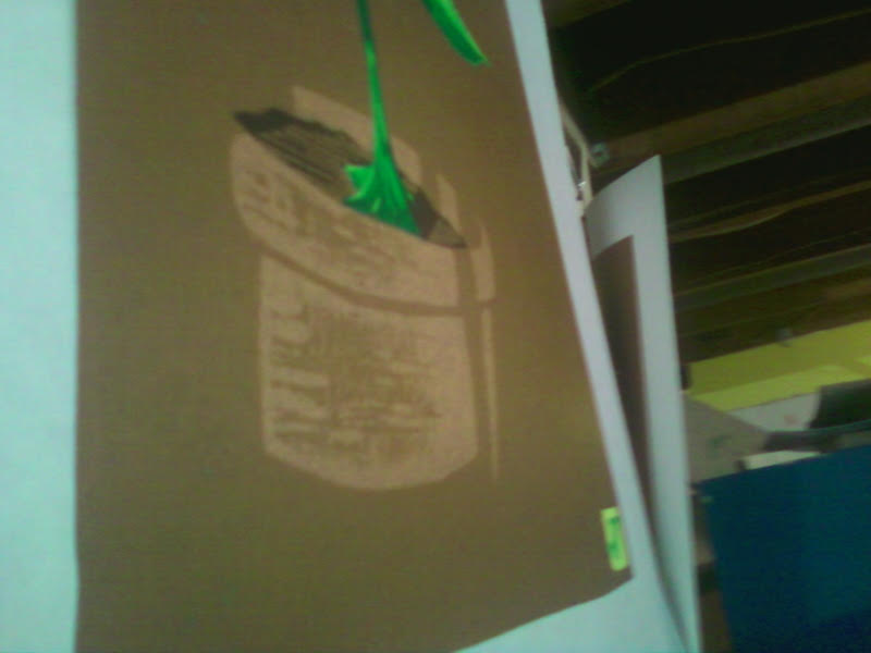
Just a small teaser snapshot. The new print with just two more colors to go. I'm excited to show off the whole thing. The shading effects on the front of the terra cotta pot were a happy accident. The hard part will be to make sure they don't print with any of the remaining colors. The final approach will take a steady hand and neatness, two things I am not known for!

Monday, March 21, 2016

Opening The Blinds

Ever since I purchased my antique cast-iron book press in the fall of 2006, I've been struggling to master my process. Every step forward seemed to herald a step back. Through it all, I kep working on my artistic abilities, falling in deep mad love with cartooning and graphic novels. Occasionally, I would dive back into printmaking to test out some new theories  that I'd hope would open the doors to finally cracking the code to better prints.

Late last year I finally discovered the root of my issues: it's the antique book press itself. I know of only one other woodcut printmaker who uses one, and for good reason: the torque is not enough to allow a good smooth laydown of in. This, in addition to troubles with the wood I was using and even some ink problems, had me on the verge of leaving printmaking altogether.

Over the last year, I have studied other printmakers very closely. When you are self-taught and working alone, you need to be a good detective. You also need to be resilient. It's okay to give up, just as long as you start again as soon as possible. That's my MO: quit...for a minute.

So this week, I cracked the code. I'll get into it more in-depth later, but I have found the missing piece of the puzzle that allows me to use my press and still make prints with excellent coverage and true color saturation I demand. Here's a terrible photo of the print in mid-work. There are three colors left, and I'll be back then to give you more details, and I'll tell you how you can get a print for free!

Thursday, February 25, 2016