CLICK HERE TO VISIT MY ETSY SHOP!

VISIT MY ETSY.COM SITE.
Preview
JUST CLICK ON MY PRESS!

Wednesday, August 28, 2013

Touch of Gray

I was very happy to see how well the gray covered the red. The very fine line for the neon stayed open surprisingly well. I am especially happy that the sky is turning out so well. I just wanted a touch of that flame red in the sky, but I wasn't sure how I wanted to use it. I think I have just enough red in the sky, and I'm thinking of modifying the original color I had planned.

I'm a little nervous still about about the red I used. It's a tricky thing creating light with printing inks. We'll have to see if the color pops better as the colors in this print get darker.

Monday, August 26, 2013

How Green Was My Valley?

Well, that made the flowers pop, didn't it. I love the bright colors on this one. The weekend was actually about as productive as last weekend, with a lot of printing going on in the studio.

Friday, August 23, 2013

Red, Son? At NIGHT?

Ha ha. I do love a good pun. Anyway, if you've been reading this blog for a while, and I know you have (I'm apparently very popular with someone in Latvia (Heloooooo Riga!)) you know that I have a certain history with red. For some reason, I love to add it to a print early in the process, and then battle my way through the rest of the print trying to escape the red showing through.

"Motel DeSoto" third state (red)
This time is different. Through thorough testing and color selection, and the fact that this is a sunset scene where everything has a certain red tinge, this was the perfect opportunity to add this magnificent bright red. I don't want to go into detail about where the red will be used, but I will say that you shouldn't expect an update on this print for several days, due to the fact that I have a lot of fine-line carving to do, and I intend for it to be awesome, so I'm going to go as slow as I need to. In the meantime, though, I'm looking forward to putting a couple of colors down on "Sunflower Farm" this weekend.

As for what we're looking at now, you can see the outdoor recessed lights on the exterior ceiling, as well as the face of a clock (it's not a moon), and now also you see rows of windows in the background, and the lit windows of the motel office.

Thursday, August 22, 2013

Here Comes The Sun...And It's All Right!

It seems that in woodcut printmaking, there are a few subjects every printmaker takes a shot at. Cows are one, and/or animals with stripes. Another is the sunset at the beach. But the one that is probably tried at least once by a goo 90% or more of block printers is the humble sunflower.

And now, at last, my turn. This print is inspired by an acceidental stumbling upon a sunflower farm somewhere in Western New York (I'm not being purposely vague; we really can't remember where the hell it is). I took a few pictures there, and one with a red barn in the background was so nice, I wanted to enter it in the Erie County Fair's photography competition. Due to time constraints and technical difficulties, that didn't happen. So, I decided to use it as a model for this print.

While I was drawing out the cartoon from which I'm now working, I realized how dull it can be trying to be "photorealistic," and decided to go with a more whimsical, expressionist approach. This may be the departure that sends me on the way to a new style of woodcut. Glad you could be here to see it!

Monday, August 19, 2013

Torrential Output

It's been a very busy weekend in the studio. Not sure what spurred it, but it resulted in getting way ahead on two new prints. The first, tentatively titled "Sunflower Farm," had an interesting unintended consequence. Having learned from my issues on preveious prints, I decided to put down a blue sky without inking the whole block. Then, when I printed the nice bright yellow, I got hills! Green hills! And they're right where I was planning to put green hills. Unfortunately, this anomaly will get printed over anyway, as it isn't the green I want, but it was a nice surprise I will have to revisit down the road.
 
And here's a little shot of the "Sunflower" block to give an idea of the layout. More on how this picture came to be will follow in the coming days and weeks.
 
And here is the first and second states of the "Desoto Motel" print. Since you can't really tell, the first color was a white very lightly tinted blue. This will be the outdoor lights on the exposed ceiling just outside the foyer. I'm really excited about this print, as it is an evening scene calling for both very bright and very dark colors, a print of great contrasts.


Thursday, August 15, 2013

Memorial Day (Eleven Color Woodcut, 2013)

What an adventure this was! I'm still not sure about the black. And, actually, I'm just now wondering if I'm really done. I'm teasing myself with the idea of adding brown to the branches. But I'm putting it on the back burner for now. I am turning my attention to two prints now. The first is a "googie" style (look it up) motel (abandoned) we found in Olean called the DeSoto. The second is from a nearby sunflower farm, so please stay tuned to watch these come together. And let's see if I've really learned anything!
Finished...?

Monday, August 12, 2013

Shadowy Figure

Many years ago, before I found my passion for printmaking, my dream was to be a writer. I concentrated on short fiction, heavily influenced by Raymond Carver and Rod Serling. This meant dark depressing prose, surreal plot twists, and "you-can-guess-the-rest" endings. All three seriously unnerved my wife, but none more so than the endings. She'd read a story, actually enjoying the writing, until the end, and she'd look up and say "Where's the rest?" It sure made me cranky, but over time, I have come to realize she's right. Not about most things. No, about everything.

Okay, she's probably left the blog. Here's the real story: my wife is a critic's critic. If she could write worth a damn, the artists, writers and musicians of the world would be trembling. And no, her batting average as far as being right probably gets around .200. Except with my work. Yes, she was spot on with the short stories, and she's a vicious truthteller regarding my artwork. So yesterday, after I wrapped up the dark blue, I brought it to her and asked what I thought. I was asking because I thought the blue might be enough. I've seen woodcuts without a black key block, and I've liked the effect, at times. But I just wasn't sure about this print.

The silence that emanated from her answered the question before her lips even moved. So, black it is!

Friday, August 9, 2013

Green Green Grass of (ALMOST!) Home

I apologize again for the lousy picture. I need to stop using my camera phone, but for now it's the best I can do. The camera really doesn't pick up the beautiful effect created by the second layer of green. It really gives the piece texture and depth. I was pretty stunned when I saw how it printed. This print has been particularly destructive to the block, which makes it a challenge to properly ink the block. There isn't much left on the block to carve. But so far, the print is looking really, really good. A dark blue and a black will finish this off. It has been one of my most challenging prints to date, probably more so than "Autumn Camper."

Already thinking about the next print. There are so many things I want to try. And though I wouldn't mind a simple four color job, I kee looking to push the envelope.

'Cause that's why, you know, I'm the, er, bad boy of block printing. Yarp.

Thursday, August 8, 2013

Red Means GO!

I would like to thank the judges for the Fine Arts competition at the 2013 Erie County Fair (Hamburg, New York) for selecting my print "Autumn Camper" for Second Place (Red Ribbon)--Professional division. It's a real honor to be judged by one's peers. The competition is nothing short of amazing, and if you make it to the Fair this year, please stop by the arts building located at the lower level of the Grandstand. The Fair has made so many improvements to the interior that it's a real treat to spend some time looking at the amazing talents of your friends and neighbors. It's also the coldest place at the Fair -- the A/C is full blast all the time!

It has been eleven years since I entered my very first color reduction woodcut print into the Fair competition, taking second place in the Novice Division. It's always been an honor to hang on the wall with some really great work.

Congratulations also to my wife, Amy, who's flowers made of cut aluminum soda cans earned a white ribbon in the Recycled Crafts competition!

Monday, August 5, 2013

Green Light!

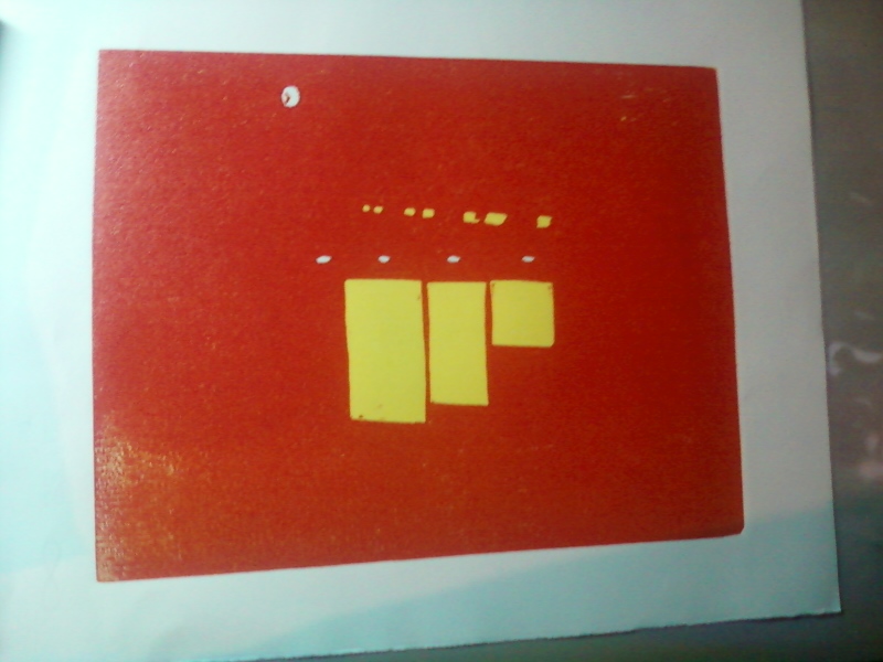
Well, here in the Western New York region, the past few days have been pretty chilly, and the James E. Strates Shows train has pulled into the village depot signalling a.) the start of the Erie County Fair and b.) the coming end of summer. I know, it's barely August, but knowing that, after the Fair, it's a pretty fast slide into dark mornings and frosty nights.

However, the bright green of the latest state for "Memorial Day" has cheered me immensely. There are three more colors left, and I hope to use them to really bring some depth to this print. The last three are dark green, dark blue and black.

I was very concerned about the green, because the color is made with pthalo green and hansa yellow, two very transparent inks. However, I got a nice surprise -- the ink worked well with the blue beneath it, toning down the yellow in the color and bringing out a more natural, summery leaf green.

Speaking of the Fair, my print "Autumn Camper" will be in competition in the Arts Building. It's been a while since I entered, and I'm happy to be back on the wall. Judging by the entries I saw on drop off day, the competition is stiff, with so much great art, from amateur to professional. I would hate to be a judge. I love to see other artists doing greatwork, and I hope to be soundly trounced.

I have to praise the Erie County Fair for making the recarpeting of the Arts Building a priority. The building, which was formerly the racetrack's casino, had the garish floors only Donald Trump could love. They were downright disorienting. But now, they are a nice neutral, and there are quilt-like paintings on the ceilings. Great job -- it makes the building a lot more pleasant to spend time in.