Napping Cat Press: Original Hand-Printed Woodcut Prints by Jeffrey Dean
Wednesday, May 17, 2023
2 of 12
1 of 12
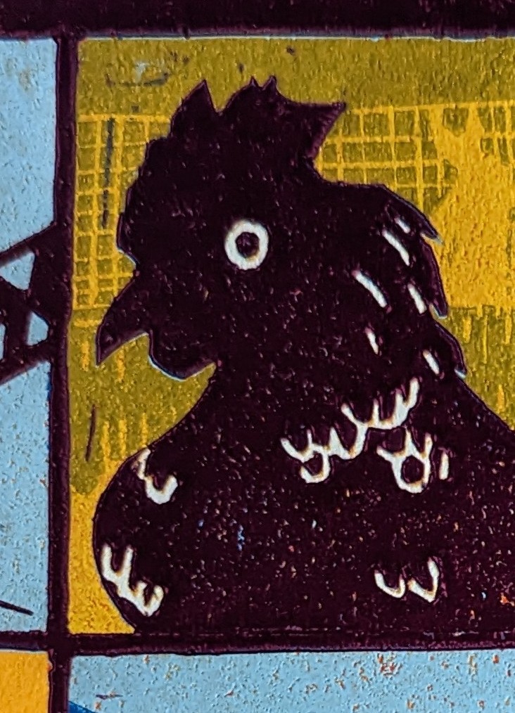
The Erie County Fair slogan is "The Best 12 Days of Summer. Opening day has changed over the years, but the anticipation is still great. When I was a kid, it was preceded by the arrival of the James E. Strates shows train, and by a grand parade full of floats built by every community in the County. For myriad reasons, the opening has become more compact, with a grand opening at the main gate, and a canned food drive. When people say "This ain't the fair I remember!" My answer is "That's because it's alive. The only things that don't change are in museums." The fair that adults remember today were pale imposters to our great grandparents. Kids going to the Fair in 2023 will relish the memories, and scoff at the 227th. That's how history works.
To honor Opening Day, I have the Main Gate wrought Iron sign, with balloons st aloft. This was the square I fretted over from the moment I drew it. The lettering and thin lines were a fright to carve. But it all printed beautifully.Tuesday, May 2, 2023
Whew!
....so far.
But I've learned -- again! --that patience is the most important tool with reduction woodcut.
Unfortunately, the clock is ticking on this print, or I'd give each color 5 days of drying. I'm hoping 48 hours is enough. We're well into the rainy season right now, so the humidity is a huge issue.
Hoping to print ochre Thursday. After that, we get into the blues!
Sunday, September 23, 2018
Tied Up With A Ribbon
I was humbled by all of the great work on the walls at the Fair. Such great local talent!
I also participated in the Plein Air competition. I'm not a painter, but I had the BEST time. Great weather, great people. My effort was less than stellar, but I'm proud they I participated.
Monday, August 6, 2018
Dry In Time
I'm happy with it overall, but I can see all the places where I rushed. I'm currently designing a jig that will allow me to do rainbow rolls again -- the gradation of color helps to give the impression of depth. But I love the colors and the movement -- the sense of movement in the grass. I think the seed buds of the grass came out really well. The clouds would have looked much better on a graded sky.
Also up for consideration is "Canyons of Buffalo." I'm really feeling the pull back to the studio, so I'm hoping to report more on here.
Hope you can make it to the Erie County Fair this year, and please stop into the Creative Arts building (in the grandstand) and see what your friends and neighbors have been up to. Careful though -- you may get inspired!
Thursday, August 11, 2016
Out of the Blue
Thursday, July 28, 2016
A River Runs Through It
Monday, August 17, 2015
Wind At My Back
If you get a chance to attend the Fair this year, please stop by and see all of the great work from your friends and neighbors, and if you have a creative bent, PLEASE pledge to participate next year. You'll be glad you did!!!
Friday, August 8, 2014
A Fair Critique
If you head out to the Fair this year, make a point of stopping at the Creative Arts building (now located in the Grandstand) and check out the amazing work of your friends and neighbors. It looks to be the best fair ever!
Tuesday, July 29, 2014
Rocking A Slice of Pie
Thursday, August 8, 2013
Red Means GO!
It has been eleven years since I entered my very first color reduction woodcut print into the Fair competition, taking second place in the Novice Division. It's always been an honor to hang on the wall with some really great work.
Congratulations also to my wife, Amy, who's flowers made of cut aluminum soda cans earned a white ribbon in the Recycled Crafts competition!
Monday, August 5, 2013
Green Light!
Well, here in the Western New York region, the past few days have been pretty chilly, and the James E. Strates Shows train has pulled into the village depot signalling a.) the start of the Erie County Fair and b.) the coming end of summer. I know, it's barely August, but knowing that, after the Fair, it's a pretty fast slide into dark mornings and frosty nights.However, the bright green of the latest state for "Memorial Day" has cheered me immensely. There are three more colors left, and I hope to use them to really bring some depth to this print. The last three are dark green, dark blue and black.
I was very concerned about the green, because the color is made with pthalo green and hansa yellow, two very transparent inks. However, I got a nice surprise -- the ink worked well with the blue beneath it, toning down the yellow in the color and bringing out a more natural, summery leaf green.
Speaking of the Fair, my print "Autumn Camper" will be in competition in the Arts Building. It's been a while since I entered, and I'm happy to be back on the wall. Judging by the entries I saw on drop off day, the competition is stiff, with so much great art, from amateur to professional. I would hate to be a judge. I love to see other artists doing greatwork, and I hope to be soundly trounced.
I have to praise the Erie County Fair for making the recarpeting of the Arts Building a priority. The building, which was formerly the racetrack's casino, had the garish floors only Donald Trump could love. They were downright disorienting. But now, they are a nice neutral, and there are quilt-like paintings on the ceilings. Great job -- it makes the building a lot more pleasant to spend time in.


