CLICK HERE TO VISIT MY ETSY SHOP!

VISIT MY ETSY.COM SITE.
Preview
JUST CLICK ON MY PRESS!

Tuesday, February 24, 2015

I'm A Katz Man

In late 2002, as I was devouring all things woodcut, I read an article in the Buffalo News about an exhibition at the Albright-Knox that featured the work of Alex Katz. I was familiar with his work as a painter of mostly portraits, and was very excited to see his woodcuts.

"Camp", 1990, shown here, stole the show for me. They only needed to hang this one up. As I recall, it was the first print one saw when entering the exhibition hall (and I mean hall; one of the things that drives me nuts is that works on paper are often relegated to this little underground hallway, which is clean and well lit, but I get the feeling that, unless you know to look for it, you'll walk on by).

I guess one might look at this print and sneer at it's minimalism, just a few colors, no detail. But there's a story here.

Or maybe there isn't. For decades people have been reading messages and moods in Edward Hopper's work, but in interviews he has claimed to only have been painting the effects of light and shadow.

This painting by Katz has become very influential to me, which I think you will see soon.

Mic Century Modern Mind

 I have had a fascination with mid century modern (MCM) design, architecture and aesthetic since I was a small child playing with boxes of colorful books and packages in our attic. There was nothing special about these things. In fact, most of these things were little more than a dozen years old when I found them. The architecture of the period took a bit longer to grow on me. I often found MCM architecture too clean, too artificial -- it often left me cold. It seemed -- still seems -- so lonely. The building at left is the Niagara Power Vista, an awesome piece of period architecture.
 Another type of design from the period is known by several names, most popularly "Googie," after a 1950s coffee shop in California. Known for sweeping rooflines and oddball shapes, it was once considered a scourge on the landscape. Now preservationists fight to save these buildings. Many Buffalo-are libraries built in the era are prime examples of period architecture, like the Lake Shore branch in Wanakah.
I have not been able to really find the genesis of mid century graphic design. Oh, but when I see it -- I can't explain why I love it so much. This placque is outside of the Giraffe House at the Buffalo Zoological Gardens.
The west side crown jewel, the Saarinen's Kleinhans Music Hall was built in the late thirties, just outside of the MCM brackets. However, it foretells of the MCM period too come, with its sweeping shapes, clean lines and open space.

Saturday, February 21, 2015

Spudnik

When I discovered printmaking, I had just ended a 12-year chapter in my life devoted to writing bad fiction. I was desperately looking for a new outlet for my creativity. I'd been working as a prepress technician at a large local commercial printer which was, due to economic downturns and post-9/11 consumer wariness, heading for a massive layoff. They'd been very good to me, but I was first in line to be shown the door. Sensing this instability, I was looking in all directions for a trade to learn. In late summer 2001, I'd been flirting with carpentry, but I think I knew it wasn't going to work. Poor math skills and no real passion for woodwork, coupled with owning exactly two tools -- a hammer and a hand saw -- suggested that I was in big trouble. In January 2002, I started writing again, but found it terribly unfulfilling. It was a very ugly time, full of stress and doubt. It was also January, which is cold, white and awful anyway.

One night I lay in bed, trying to think of a direction, looking for some sign to help push me forward. I just began to fall asleep when I dreamed a quick image of a block of wood with an image carved in it, inked up and pressed on paper. My eyes flipped open, and my heart was racing. For a quick moment, I had thought that I'd invented woodcut printing. It sounds silly, but even though I was in the industry, and for a time in the 1990s even worked as a letterpress printer, I never knew the possibilities of printmaking. It was similar to a moment in 1987 when I was having dinner with my grandmother and her sister, and I mentioned wanting to be a writer, and I first realized -- again, silly to think now -- that people who wrote books got paid for their work, that it was a job (yes, debatable; but let's just say for now).

The next day I spent hours on the Internet researching woodcuts and printmaking, and names and images flooded my head, and it was wonderful. I'd found home. I went to the library and looked up every book on the subject (all three!).

And when it came time to press my dreams to paper, I used the only materials I had: a paring knife, a bag of potatoes, some of my wife's fabric paint, and some old newsprint.

The very first print was a goldfish (npot pictured). The second was the guitar, which I eagerly shared with my musician friend, Damon Pipitone, who promptly used it as artwork in the CD packaging for "Dark Guitar," an album from his band, "The Willies."

The third print was of a leaf, and it was printed in two colors. It has a very mid century design feel to it. Finally, I tried a bunch of grapes, printed in two colors. It was my first multi-color print, multi-block print.

A month after I discovered this world, I was carving the block with my brother's face on it. I created a quartet of prints for him for his office wall for his birthday, a take on Warhol. Here's another proof from that project, hand colored with sparkly fabric paints. I call it "Glam Rock Bill."

Hmmm...

Friday, February 20, 2015

Deep Cuts

So, I guess I'm neglecting the idea that, if you are going to blog about visual media, you should include a few pictures. When last you stopped by, we discussed my humble beginnings, but I offered no pictures. Well, last night I stumbled on a box of old prints, and I found a trove of early prints. I was even shocked to find that one was dated 2/19/2002 -- exactly 13 years ago. So, here they are, in three acts:

1: Amy, 2002. This is the first woodcut I ever made. I used a printout of a heavily contrasted photo as a template (everything now is hand-drawn, but this was a great way to begin in the day). I do still love it because it was my first print, and I think it came out pretty good, given the rust exacto knives, cheep pine wood, and fabric paint I was working with. At the same time...Good Lord! Sorry, honey.


#2: Maybe it was to make up for "Amy," but my second, using the poplar wood, was a giant Valentine to Amy, hand colored with diluted acrylic. I was heavily influenced by the Arts & Crafts style, which you can tell because I just wrote it. If you notice, my font, which I drew up all by myself, incorporates hearts into each letter. The penis-topped-asparagus is actually thick-stemmed rosebuds. Pervert. This is just a proof. The original, hid somewhere in a drawer, is on a very cool paper that had leaves and flower petals in it, which I got from Hyatt's downtown.
#4: So, then I used another modifed photo printout to create a block of my brother, the architect William C. Dean, Jr, AIA, SOB. I remember one specific thing about this block -- I did almost the whole thing with a #11 Xacto, and my hands haven't been the same since.


#5: This print is actually from early 2003. I believe I was still using poplar, but was by this time using Speedball oil-based inks. The Frank Lloyd Wright-designed Robie House in Chicago.I actually have one of these hanging in a beautiful frame my wife made arounf the same time. I had been printing for more than a year at this point, but was struggling with inks and colors, and rhe effects of printing color over color (nothing's changed!). I'd recently read a suggestion to add Vaseline to the ink to help it flow. It worked great, but often left halos around the images. Can you spot the glowing error in this print, which nearly left me in a spiral of despair? Look at the capstone on the front wall --it's red, when it should be dark gray. I only noticed it halfway through! Originally, I was disappointed in this work, as it was a lot darker than I had envisioned. Now, I can't imagine it any other way.

So, there's a brief look back. I hope to have some fresh work soon, but I hope you enjoy these little snippets from the past. 


Wednesday, February 18, 2015

The Poplar Kid

Planks a lot.
From the moment I began making woodcuts in the late minter of 2002, I've had a hard time explaining what
exactly a woodcut is. I usually end up comparing it to a rubber stamp. It is the same principal -- relief printing. But then, so is a finger print, but it would be wrong, I think, to consider every perp at the police station a "printmaker."

Sorry: "alleged" perp.

I've mentioned before that my first prints were made with a potato and some glitter paint. However, my first authentic woodcut was made with a plank of pine I had from a brief flirtation with carpentry. It was a print of my wife; as per usual, I thought it was lovely, she thought it was hideous. We are still married.

Very quickly, I discovered poplar. I don't know how I came to discover poplar -- maybe Internet research, maybe a book. I loved how sturdy it was. My first piece was 12"x12"x1/2", and my first print off of poplar was a very large Valentine's Day card for my critic...er, wife. This time, she loved it. That's not why I stuck with poplar, of course. Pine was easy to cut, but it was very splintery. And a little thirsty for the water-based inks I used at the time.

With the poplar, I switched to oil-based inks, and the combination was great. For reasons lost to me now, I switched from poplar to birch plywood. I think the deciding factor was a combination of crappy dull tools/idiot who couldn't figure out how to sharpen his tools. More the latter than the former. Birch plywood was great for me -- I could do almost all of my carving with an Xacto.

Why Ply?
I used 1/4" plywood, which meant that warping was a constant issue. Also, the wood was prone to very unfortunate splintering. I was also too often finding big knotholes in the sublayer, which ended up ruining a number of prints. A lot of printmakers swear by their plywoods, and I can see why. A lot also love their poplar. I went back to poplar a couple of years ago -- after learning how to sharpen my tools, of course.

I'm a believer in sustainable resources, when they work (I tried -- I really TRIED -- to use
a greener solvent for cleanup. It was awful. Sorry, Earth). And I do feel guilty carving up a plank of poplar for my prints, when linoleum is readily available.

This IS your father's linoleum.
Oh, didn't you know linoleum is a green resource? Yeah, it's kind of crazy -- I always thought it was rubber or plastic, but it's linseed oil and sawdust. Probably poplar sawdust. And I love  the look of linocuts -- the lines are so clean, and the impressions are so even. I may do a little linoleum this summer. But it will take a lot to get me to change my mind about poplar. I love how it works. I love that it's sturdy, and can hold up to the many carvings and prints that reduction printing imposes.
Linoleum done right: William Hays, "Quiet Night."

There are so many options for printmakers. I knew a guy who would find old cabinet doors in the trash and use them for woodcuts. I've made collagraphs with cut out styrofoam. The art of art is never locking yourself into one medium, one subject, one idea.

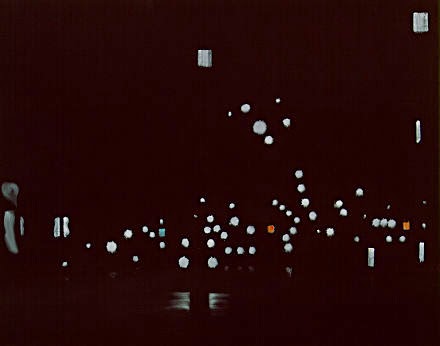
The print at left is a reduction linocut by artist William Hays. He is my printmaking hero. Check out his amazing work at: http://www.artfulhome.com/artist/William-Hays/8352

Wednesday, February 11, 2015

Etsy Store Reopened

Just a quick note to remind you that the etsy.com shop is back up for the new year. On my way home from work yesterday afternoon, I caught a V of over 50 Canada geese overhead. They were heading north; however, they seemed to be arguing loudly about the decision!

Tuesday, February 10, 2015

Too Cool

February in Buffalo, New York is special. There usually aren't any big blustery storms like we had back in November. The festive twinkling lights of December have long been unplugged. The echoes of holiday warmth have died out over the course of snowy January.

February. It's the shortest month of the year. But it's really the longest month, if you know what I mean. It's the deep freeze month, when all of the snow that has fallen turns into a browning gray block of rock hard ice. Tempers are short, you start climbing the walls. One of the best depictions of winter in my opinion is "Valley Winter Song" by Fountains of Wayne, which features the verse:

 And late December
Can drag a man down
You feel it deep in your gut
Short days and afternoons spent pottering around
In a dark house with the windows painted shut

Late December? Mmmm, not here. No, this verse perfectly matches up with February.

But, when you're an artist, you always got sunshine in a bag, right? Well, sorta. I mean, assuming you can force the clouds out of your head and get to whatever media you use. I'm lucky in that I have a large space to work in, a clean, dry basement. I went down there this weekend to get things straightened up. This is how my wife found me:


While the basement is great in the summer, at a near constant 68 degrees, right now it's about 58. But I'm pressing on. I'll have to bring the ink upstairs to warm up and grab a sweatshirt, but I have to do something to beat the winter doldrums away!