
VISIT MY ETSY.COM SITE.
JUST CLICK ON MY PRESS!
The Erie County Fair slogan is "The Best 12 Days of Summer. Opening day has changed over the years, but the anticipation is still great. When I was a kid, it was preceded by the arrival of the James E. Strates shows train, and by a grand parade full of floats built by every community in the County. For myriad reasons, the opening has become more compact, with a grand opening at the main gate, and a canned food drive. When people say "This ain't the fair I remember!" My answer is "That's because it's alive. The only things that don't change are in museums." The fair that adults remember today were pale imposters to our great grandparents. Kids going to the Fair in 2023 will relish the memories, and scoff at the 227th. That's how history works.


In February of this year, the Erie County Fair put out a call for artists to submit designs for the 183rd Erie County Fair. I'd missed the email, and a friend who is also an artist and Fair fan told me about it and suggested that I enter. I'm not a poster maker, but I had an idea, and thought I might enter, just for fun.
The call was to submit a sketch of the proposal, photos of past work, an an artist's statement. At the eleventh hour, I found my original idea unworkable, and a little dull. A day before deadline, I basically gave up. I went for a walk to clear my head and to berate myself for not being much of an idea guy.
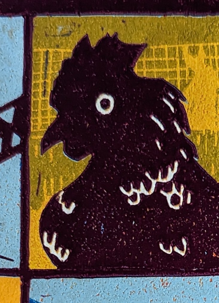
In the middle of that walk, I had a vision: tell the story of how I view "The Best 12 Days of Summer." Graphically, colorfully, in a very woodcut way.
I drew and inked my cartoon and got my application in just before deadline. I loved my concept, but I knew it didn't have the slick look and clean lines of modern computer-aided posters, and so I just prided myself on getting into the mix.
A few days later, while I was expecting a "thank you for entering, however...," I was pretty surprised to be informed that I was in the top 3. WOW!
The next step was to interview with the Commemorative Poster Committee. A wonderful group asked me questions about my own history as a Fairgoer, and were genuinely interested in my medium. They graciously let me ramble on for half an hour. As I walked home, I was full of pride for achieving that, and expecting to win the third place slot.
A couple days later, walking downtown to my bus on a sunny afternoon, I received the call.
They loved the design. They loved my passion for the fair. They were intrigued by the process.
I would be creating the poster for the 2023 Erie County Fair.


....so far.
But I've learned -- again! --that patience is the most important tool with reduction woodcut.
Unfortunately, the clock is ticking on this print, or I'd give each color 5 days of drying. I'm hoping 48 hours is enough. We're well into the rainy season right now, so the humidity is a huge issue.
Hoping to print ochre Thursday. After that, we get into the blues!

Disaster. The register was all over the place. It looked like the print had skated over the block on the layer of ink. It was a very sickening feeling. I stopped with about 15 prints left. I hope to try again tonight. If the prints feel tacky I'll wait another day. I had one print that came out sharp, so it's not the block.
It's humid, and I've been trying to rush. I should know better.🤷♂️
If I can't save it, I need to start over, but I need to rethink the block.