CLICK HERE TO VISIT MY ETSY SHOP!

VISIT MY ETSY.COM SITE.
Preview
JUST CLICK ON MY PRESS!

Monday, August 17, 2015

Wind At My Back

Every year my wife and I enter various competitions in the creative arts building at the Erie County Fair (Hamburg, NY). We've been doing it for close to 15 years now, and love it every year. It's a pleasure to see such great art and craft work by our neighbors, and I'd be lying if it isn't a thrill to see a ribbon on your work. This year our craft work didn't collect any ribbons, but I was pretty surprised to find that not only did "Sweet Breeze" breeze into port flying a bright blue flag, but a green one as well. The green denotes a special prize, usually from one of the sponsors of the competition ("Autumn Camper" from a few years ago received a green from Hyatt's art supplies). And a first for me was a ribbon -- blue no less -- (AND a green) for a photograph taken at the Fair last year.

If you get a chance to attend the Fair this year, please stop by and see all of the great work from your friends and neighbors, and if you have a creative bent, PLEASE pledge to participate next year. You'll be glad you did!!!

Thursday, August 6, 2015

Toon In, Turn On

I wonder what you, Dear Reader, must think of my frequent and lengthy absences from this blog. Mayhaps you think I'm fishing by some flower-wreathed waterfall in Maui; maybe you picture me gnawing pencils at my desk, feverishly trying to come up with the next woodcut. Maybe you've glanced at the obituaries (jeesh! But thanks for checking!). While it's closer to choice two (and as far away as can be from one (sigh), I'm actually very busy in these breaks.

During this particular break, I had an operation to repair a hernia, my second. I'd hoped to use my time off to work on artwork; however, the discomfort and medication saw an end to that fantasy. At to that a raging strep throat infection immediately following surgery kept me from even thinking of art.

But through it all, and over the course of these last few years, I have been immersed in self-education, focusing squarely on cartooning. I first became interested in cartooning in 1990, but other than constant doodling, I never took it seriously. Throughout my printmaking career, I often found myself drawing out cartoony images, but I usually never made them into prints (well, once: 2005 I did a Che Guevara wearing a McDonald's visor). Over the last few years I've really become an avid student of the form, but I've been doing more bookwork and theory than actual drawing, save at work, where management looks down on my doodle-covered files. The studying hasn't been part of some grand career plan; rather, I've just been interested.

Then a few months ago I participated in print exchange through Baren Forum. You may recall that I commented that it was my second design choice, and that my first choice was a cartoon I thought might be a little risque (I'm an idiot). Anyway, that cartoon led me to looking through a pile of papers I keep with little creative bits scrawled on them, and they were mostly ideas for cartoons. So, I decided to finally start drawing, which is where I am now.

So, this "Snowfight" cartoon is my very first finished cartoon. I'm happy to share it with you, and all of Erie County, as it's my entry into the drawing class in the creative arts competition at the Erie County Fair. I also have a woodcut print, "Sweet Breeze," in the show as well. Hope to see you there!

Thursday, July 16, 2015

All Newt Review

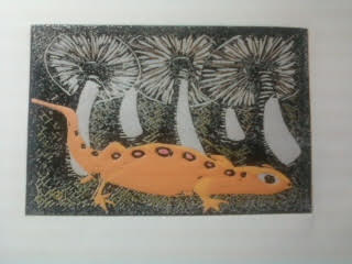
Sometimes printmaking just breaks your heart. Bless the ones who find their niche and master it. I, on the other hand, just keep pushing the envelope. I guess that'll lead me somewhere awesome, but the road....well, friends, the road can be tough.

So, about four colors into the newt print, I knew it wasn't going to work. But I finished it. I made myself finish it, and finish the whole lot. Not just to finish it, but to make notes along the way so that I could at least salvage the education. There are things I do love about it, but other things that have me tearing my hair out.

But the one thing that calms me down is knowing that if I was just playing it safe, I wouldn't be here. So, while the nut goes uncracked, I'm certain that when I do figure this all out, there's going to be magic.


Friday, June 12, 2015

Tea Time

I was killing some time at lunch and found this deep in the blog archives. Call it throwback Thursday, Friday edition. It was actually an attempt at a valentines day card, and it came out pretty good, I think. Then I took a four year hiatus. The hiatuses kill me.

Wednesday, June 10, 2015

Newty Picture

Here's the second to last color. I'm going through with finishing it, now just as an exercise because I want to see how the colors and the other aspects of the print look. Except for the main subject, I really like the print. I'm happy with the colors, and how they look. Accepting the limitations of the book press has helped me with proper inking, and also with anticipating areas where the coverage might be an issue, which has allowed me to plan out my colors. For example, you'll notice that I have chosen in many cases to put light colors on top of dark colors, which as we've seen in past prints is not always a good idea. But here, it's to the benefit, especially on the mushrooms. The last color is black.

Monday, June 8, 2015

Creepy

A busy weekend in the studio. The next color down was a dark green, which defined our subject. The following color is a nice earthy brown. I tried to get a third color last night, but was only able to cut the block. It was a great deal of precision cutting, and I was pretty tired after that.


Friday, June 5, 2015

Clarity

My very favorite thing about reduction printmaking, even ahead of near-perfect register, is the slow reveal. Yes, of course, I know what the final image is supposed to look out -- I work from a completed drawing. And even if I make changes as I go along, I still have a good idea about what it should look like.

But there's something about watching something happen. Maybe it's like watching a favorite movie you've watched before -- you know what's going to happen, but watching it develop is the joy. Maybe it's also like we used to stand around and watch our mom's shake a Polaroid until the image appeared (betcha some of you got a fine earworm now -- Hey, Ya!

So, with the third color down, I think it's pretty clear what we're going for, although there's going to be a lot more going on over the course of the next five colors.

The mystery animal will be much clearer after the next color goes down. I was very happy with my color choices on this one. Unfortunately, because of how I have my jig set, I'm getting crimping in the corners. However, I have designed jig modifications that should eliminate the issue.


Thursday, June 4, 2015

Pink-A-Boo

This new print, which I first attempted last fall, is coming along nicely thanks to the education I got over the weekend regarding the limitations of my press. Here are the first two states, a pink and an orange.

The first color is the pink, and it illustrates very well the amount of work that goes into a reduction print. In reduction printing, you print a color and then carve away areas that you want to show as that color in the final print.


 For example, the pink is in four very small spots (in the picture at right, you can see them at the bottom center, under the white cut lines), but I needed to print the entire page pink. Then, after cutting the areas I want to stay pink, I printed the orange. These photos may not be strong enough to show where the pink does show. I could have printed the orange first, then printed the small pink areas somewhere down the road. However, I needed the pink to be as vibrant as I could make it, so I chose to print that first. Even so, the orange itself is only a small are of the print. However, the bulk of the print will be browns and tans, maybe a dark green if I'm feeling frisky. I couldn't print those first and expect the orange to be bright.


Friday Night's All Right For Artin'

This Friday night, you may want to jaunt into the city to attend the opening of Dorothy Markert's show at the Western New York Artist's Group gallery at One Linwood Avenue in Buffalo Friday, June 5, 2015 at 7:30 pm.

I wrote about Dorothy on this blog last summer as part of my salute to artistic heroes and mentors (http://www.nappingcat.blogspot.com/2014/03/hall-of-heroes-dorothy-markert.html). She is highly regarded in the Western New York printmaking community and, as a Roycroft Master Artisan (emeritus), she commands quite a level of respect in the Arts & Crafts community nationally, if not globally.

See you there!

Wednesday, June 3, 2015

Press-ure Pointers

I have been printmaking for over 13 years now, and one of the things I love about it is that I always learn something. Every time I hit the studio, it's education.

Being self taught is freeing, but you are also hampered by your own unknowns. If you go down Path A, you will go directly to the wellspring of all knowledge. But if you don't know Path A is there, you can get lost in the woods pretty easily.

Of course, if you take Path A, you also miss all of the crazy stuff in the woods. So there it is.

Anyway, I belong to an online group of amazing artists known as Baren Forum. They've been to the font of knowledge and are kind enough to run cups back to us morons still crawling around in the weeds. As part of this group, I am encouraged to participate in the print exchanges, where up to 30 members exchange prints. I did participate, as you saw a few posts back. And it was such a great experience. But as I was going through the work of others, I was struck by how nice an opaque some of the prints looked. Some looked like screen prints, the ink was so dense and even, regardless of the paper used.

And that led me to some serious trouble shooting in the studio last night, and some serious internet investigation. And it all came down to one thing, the thing that makes everything in the universe work: pressure.

I use an antique cast iron book press, which I have just discovered offers a raction of the pressure that an etching press does. In fact, though I turn and crank that wheel as hard as I can, it gives less pressure than using a wooden spoon, which is how I used to make my prints back in the beginning.

Here is an example of spoon vs. press.

On the right is the coverage I get from a lightly-inked block. On the left is what the ink transfer is like using a wooden spoon to burnish the back.

Well, issues with my hands prevent me from going back to the spoon, and I'm not giving up printmaking. So, I have found that by inking the block a little more, and just making peace with the effect of less pressure on the block, I can get back to some solid work. We'll see, won't we?!

Sunday, May 17, 2015

Almost every revolutionary building or artwork was shunned, derided and hated before it was loved and revered. I grew up despising Brutalism and the likes of the Shoreline Apartments. But as I've been studying the art and architecture of the mid-20th century, I have come to understand that we must protect the truly revolutionary until their importance can fully be understood. Anyone who's parked in the lot that was once the Frank Lloyd Wright Larkin Administration building understands that. Take a minute to fill out the petition. Thanks.

https://www.change.org/p/mid-century-modern-buffalo-preserve-paul-rudolph-s-shoreline-apartments-in-buffalo-ny?recruiter=166688124&utm_source=share_sponsor_thank_you&utm_medium=facebook&utm_campaign=facebook_link&fb_action_ids=10205793561091968&fb_action_types=og.shares

The origin of Brutalism is fascinating, and I recommend doing a little research, particularly if you are NOT a fan. Buffalo has a high concentration of buildings in the style, including the convention center, the bus station and the small boat harbor. They are cold, monolithic and devoid of humanity. They were also inexpensive to construct and maintain. The roots of the style goes back to before World War II, but the aftermath of war made the style necessary.

Saturday, May 16, 2015

No Telling the Times, the Number of Times

Here we have the completed 4-color reduction linocut "Loon in Maroon" (2015). A remake of an original woodcut made in 2013.

Clearly I've made some strides forward. I learned a lot on this print, and I'm ready to get working on some original stuff after solving a few issues that arose in the printing.

I'm tempted to go back through my entire catalog and redo prints that failed as woodcuts. But what fun is that? Gotta move ahead.

So, of Maroon. I have a link on an earlier post that will take you to a video made for Ken Nordine's "Maroon" on Youtube. You may think you don't know Mr. Nordine, now in his 90s, but you do. He's a well-known voiceover artist, and you've heard him on plenty of commercials. He inspired Tom Waits to begin adding spoken word tracks to his albums, and they have worked together. 

His album "Colors" is mindblowing; it actually began as a series of radio spots for a paint company. Here is the poem in its entirety:


'Think of the times, the number of times, that you can make rhymes with that friend - maroon

There's the month of June - maroon

There's a singers croon - maroon

As she sings a tune - maroon

To an orange moon - maroon

Like a crazy loon - maroon

Please say prune - maroon

With a silver spoon - maroon

How high is noon? - maroon

Tell me soon, tell me soon, tell me soon, tell me soon

No telling the times, the number of rhymes, that we can make with our friend maroon

Platoon, cartoon, monsoon, lampoon, spitoon, baboon, octoroon, macaroon, baffoon, afternoon, opportune, pantaloon, immune.

Yeah, there's so many rhymes for good old maroon

I'm sure if you try you can think of a few that have slipped me by

See what you can rhyme with maroon

Do it soon, do it soon, do it soon'

------Ken Nordine, "Maroon."

Friday, May 15, 2015

Maroon Loon

The second color, the eponymous maroon, went down nicely.The foundation colors are important, but you can't really see much going on until the dark colors go down. Usually, the darker colors go on way down the line, but since this is a night picture, the dark comes on quickly.

I'm still getting used to the linoleum. It cuts wonderfully, but it's easy to dent the block around the lines, so I have to keep the tools sharp. I also don't need to cut as deep as with the wood. I also need to refine the jig I use to print, as it's causing crimping of the paper in the corners. These are pretty easy issues to resolve, I think. Right now, I am just having fun doing the work, something I've been missing for a while. It's good to be back.

Thursday, May 14, 2015

Dance By The Might of the Loon

Loon puns are hard. Luckily, the first color was not. I photographed this drying on the clothesline, backlit to show detail. The color is a very pale yellorange. Yes, yellorange. It will comprise the moon and the moon reflection.

Don't strain. The details will be clearer as the darker colors go down.

Wednesday, May 13, 2015

Loon-ar Landing

In December 2012, after settling back in Hamburg, I unpacked my studio and set to work on a new woodcut print. The print was inspired by "Maroon," a track off of the sublime Ken Nordine album, "Colors."

So much went wrong with this print, I won't detail it. But I was very unhappy with it when it was done. As you look at it here, you can see that one of my biggest problems was the most common problem -- coverage.

There were three problems affecting coverage here: the grain of the wood (which is such an awesome thing in woodcuts, but has been a nightmare in reduction printing), the grain of the paper, which had way too much texture for this type of printing, and the fact that the paper was like card-stock. Woodcuts fare better when the paper has some give. But it's what I had. And at this point, having just found refuge back in my hometown after a horrible exile in the city, we were scrounging pennies (we're scrounging nickels now, so everything's much better).

But now, 2.5 years later, I want to give it another go using the linoleum I recently purchased. Come walk with me as I redo "Maroon." In the meantime, go check out Ken Nordine's "Maroon" on Youtube!  https://www.youtube.com/watch?v=9pwyjqq2ju4

Monday, May 11, 2015

Passion Play

Last week, I received my box of linoleum blocks. I went with the 4x6 blocks. I've been working in 9x7 for the last few years, but I figured I would go back to how I originally started with woodcuts and work my way back up.

This is just goofing around on a block. I used rubber cement to adhere the linoleum to a large block so it would fit in the "chase" I have built for the press. It works like a charm.

What you're looking at here is just some playing around with cuts and colors, to see how the blades work on the linoleum, and especially to see how the ink lays down, layer upon layer.

I'm very happy with how the linoleum responds. The letter "A," which in wood may have taken a half hour of eye-straining, finger-mangling work, took just minutes. The ink lays down so evenly (I purposely put lights over darks to see how the ink would behave).

I still love wood, but for reduction printing, my new passion is linoleum. I'll be starting my first "real" print this week. Keep posted!

Monday, May 4, 2015

Floored

I have to know. I've fought the good fight; pulled out all the stops, and all other manner of cliches in my quest to perfect the reduction woodcut. But I think I need to get serious about the tools I use.

In the last print, which I call "Untitled" (up all night thinking of that one), I found the same old issues that have been plaguing me for almost fourteen years. I'm just not getting a smooth laydown of ink. I've sanded the wood, and sealed the wood, swore at the wood, oiled the wood, thrown the wood. Hell, maybe it's not the wood at all. Maybe the ink's too stiff. Or too runny, or it's just stupid. The time has come to get serious and rule out the block.

I simply know three things:
1.) I've spent too long trying to figure this out.
2.) Every reduction artist I admire uses linoleum
3.) The next print I post will be my first linoleum block print

I also know that if this doesn't at least help my issues, I'm going to take up performance art. My first piece is "Deranged Former Printer Shotputs His Cas
t Iron Press Through The Wall". Should be fun.

Sunday, May 3, 2015

Hit the Bars

Here is the finished product, 4 colors.

Friday, May 1, 2015

Erase The Past

Well, it's been a long winter in Western New York. I have a nice basement in which to work, but from December through April it barely gets above 60 degrees, which makes it pretty uncomfortable (though in July, that's exactly the temp I'd like it to be).

And, as the weather breaks and the heat rises, I get the pull to be down in the studio again. It's always a difficult start. Things run a little rough. I have to rearrange everything that got knocked out of the way during the mad rush to find Christmas decorations.

This year I have a little help. Back in January, when I was dreaming of the end of the most recent Ice Age (we've been 10 days snow free!), I signed up for a print exchange through an online printmakers group I've belonged to for the last dozen years. The deadline is today.

The print above is the third color of an as-yet-untitled print, one of the smallest I've done (not counting the Christmas ornaments from last November) (2.5x3" on a 5x7" piece of paper). The theme for the exchange was "Freedom of Expression." I batted around a few ideas, one which was pretty funny, but risque, and I have an odd sense of humor, so I went safe.

Hmmm. In creating a piece to celebrate freedom of expression, I chose to censor myself. That's very interesting.

Well, don't think too much on it, as I will be tackling that one at some point down the road. Still, the print I have is a pretty important departure for me in many ways. One, it's a pretty full concept piece, something I've attempted only a few times before (The print at right, conceived as a powerful anti-war print, remains unfinished; a planned 16-color beast  from around 2005 that I really wish I'd stuck with, though the little girl in the corner gives me the willies!).

The print above -- my very own left hand, by the way, immortalized in ink! -- demonstrates an artist removing the bars of injustice with an eraser. Pretty simple, gets the point across, I suppose. But wait til you see the naughty one!

Tuesday, February 24, 2015

I'm A Katz Man

In late 2002, as I was devouring all things woodcut, I read an article in the Buffalo News about an exhibition at the Albright-Knox that featured the work of Alex Katz. I was familiar with his work as a painter of mostly portraits, and was very excited to see his woodcuts.

"Camp", 1990, shown here, stole the show for me. They only needed to hang this one up. As I recall, it was the first print one saw when entering the exhibition hall (and I mean hall; one of the things that drives me nuts is that works on paper are often relegated to this little underground hallway, which is clean and well lit, but I get the feeling that, unless you know to look for it, you'll walk on by).

I guess one might look at this print and sneer at it's minimalism, just a few colors, no detail. But there's a story here.

Or maybe there isn't. For decades people have been reading messages and moods in Edward Hopper's work, but in interviews he has claimed to only have been painting the effects of light and shadow.

This painting by Katz has become very influential to me, which I think you will see soon.

Mic Century Modern Mind

 I have had a fascination with mid century modern (MCM) design, architecture and aesthetic since I was a small child playing with boxes of colorful books and packages in our attic. There was nothing special about these things. In fact, most of these things were little more than a dozen years old when I found them. The architecture of the period took a bit longer to grow on me. I often found MCM architecture too clean, too artificial -- it often left me cold. It seemed -- still seems -- so lonely. The building at left is the Niagara Power Vista, an awesome piece of period architecture.
 Another type of design from the period is known by several names, most popularly "Googie," after a 1950s coffee shop in California. Known for sweeping rooflines and oddball shapes, it was once considered a scourge on the landscape. Now preservationists fight to save these buildings. Many Buffalo-are libraries built in the era are prime examples of period architecture, like the Lake Shore branch in Wanakah.
I have not been able to really find the genesis of mid century graphic design. Oh, but when I see it -- I can't explain why I love it so much. This placque is outside of the Giraffe House at the Buffalo Zoological Gardens.
The west side crown jewel, the Saarinen's Kleinhans Music Hall was built in the late thirties, just outside of the MCM brackets. However, it foretells of the MCM period too come, with its sweeping shapes, clean lines and open space.

Saturday, February 21, 2015

Spudnik

When I discovered printmaking, I had just ended a 12-year chapter in my life devoted to writing bad fiction. I was desperately looking for a new outlet for my creativity. I'd been working as a prepress technician at a large local commercial printer which was, due to economic downturns and post-9/11 consumer wariness, heading for a massive layoff. They'd been very good to me, but I was first in line to be shown the door. Sensing this instability, I was looking in all directions for a trade to learn. In late summer 2001, I'd been flirting with carpentry, but I think I knew it wasn't going to work. Poor math skills and no real passion for woodwork, coupled with owning exactly two tools -- a hammer and a hand saw -- suggested that I was in big trouble. In January 2002, I started writing again, but found it terribly unfulfilling. It was a very ugly time, full of stress and doubt. It was also January, which is cold, white and awful anyway.

One night I lay in bed, trying to think of a direction, looking for some sign to help push me forward. I just began to fall asleep when I dreamed a quick image of a block of wood with an image carved in it, inked up and pressed on paper. My eyes flipped open, and my heart was racing. For a quick moment, I had thought that I'd invented woodcut printing. It sounds silly, but even though I was in the industry, and for a time in the 1990s even worked as a letterpress printer, I never knew the possibilities of printmaking. It was similar to a moment in 1987 when I was having dinner with my grandmother and her sister, and I mentioned wanting to be a writer, and I first realized -- again, silly to think now -- that people who wrote books got paid for their work, that it was a job (yes, debatable; but let's just say for now).

The next day I spent hours on the Internet researching woodcuts and printmaking, and names and images flooded my head, and it was wonderful. I'd found home. I went to the library and looked up every book on the subject (all three!).

And when it came time to press my dreams to paper, I used the only materials I had: a paring knife, a bag of potatoes, some of my wife's fabric paint, and some old newsprint.

The very first print was a goldfish (npot pictured). The second was the guitar, which I eagerly shared with my musician friend, Damon Pipitone, who promptly used it as artwork in the CD packaging for "Dark Guitar," an album from his band, "The Willies."

The third print was of a leaf, and it was printed in two colors. It has a very mid century design feel to it. Finally, I tried a bunch of grapes, printed in two colors. It was my first multi-color print, multi-block print.

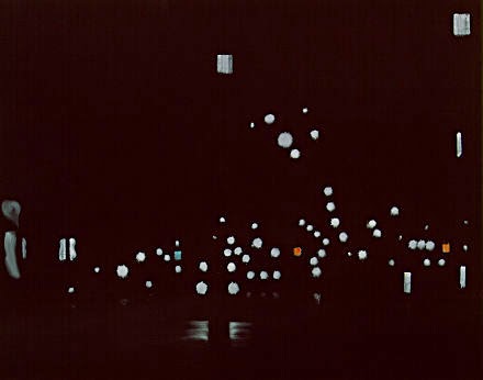
A month after I discovered this world, I was carving the block with my brother's face on it. I created a quartet of prints for him for his office wall for his birthday, a take on Warhol. Here's another proof from that project, hand colored with sparkly fabric paints. I call it "Glam Rock Bill."

Hmmm...

Friday, February 20, 2015

Deep Cuts

So, I guess I'm neglecting the idea that, if you are going to blog about visual media, you should include a few pictures. When last you stopped by, we discussed my humble beginnings, but I offered no pictures. Well, last night I stumbled on a box of old prints, and I found a trove of early prints. I was even shocked to find that one was dated 2/19/2002 -- exactly 13 years ago. So, here they are, in three acts:

1: Amy, 2002. This is the first woodcut I ever made. I used a printout of a heavily contrasted photo as a template (everything now is hand-drawn, but this was a great way to begin in the day). I do still love it because it was my first print, and I think it came out pretty good, given the rust exacto knives, cheep pine wood, and fabric paint I was working with. At the same time...Good Lord! Sorry, honey.


#2: Maybe it was to make up for "Amy," but my second, using the poplar wood, was a giant Valentine to Amy, hand colored with diluted acrylic. I was heavily influenced by the Arts & Crafts style, which you can tell because I just wrote it. If you notice, my font, which I drew up all by myself, incorporates hearts into each letter. The penis-topped-asparagus is actually thick-stemmed rosebuds. Pervert. This is just a proof. The original, hid somewhere in a drawer, is on a very cool paper that had leaves and flower petals in it, which I got from Hyatt's downtown.
#4: So, then I used another modifed photo printout to create a block of my brother, the architect William C. Dean, Jr, AIA, SOB. I remember one specific thing about this block -- I did almost the whole thing with a #11 Xacto, and my hands haven't been the same since.


#5: This print is actually from early 2003. I believe I was still using poplar, but was by this time using Speedball oil-based inks. The Frank Lloyd Wright-designed Robie House in Chicago.I actually have one of these hanging in a beautiful frame my wife made arounf the same time. I had been printing for more than a year at this point, but was struggling with inks and colors, and rhe effects of printing color over color (nothing's changed!). I'd recently read a suggestion to add Vaseline to the ink to help it flow. It worked great, but often left halos around the images. Can you spot the glowing error in this print, which nearly left me in a spiral of despair? Look at the capstone on the front wall --it's red, when it should be dark gray. I only noticed it halfway through! Originally, I was disappointed in this work, as it was a lot darker than I had envisioned. Now, I can't imagine it any other way.

So, there's a brief look back. I hope to have some fresh work soon, but I hope you enjoy these little snippets from the past. 


Wednesday, February 18, 2015

The Poplar Kid

Planks a lot.
From the moment I began making woodcuts in the late minter of 2002, I've had a hard time explaining what
exactly a woodcut is. I usually end up comparing it to a rubber stamp. It is the same principal -- relief printing. But then, so is a finger print, but it would be wrong, I think, to consider every perp at the police station a "printmaker."

Sorry: "alleged" perp.

I've mentioned before that my first prints were made with a potato and some glitter paint. However, my first authentic woodcut was made with a plank of pine I had from a brief flirtation with carpentry. It was a print of my wife; as per usual, I thought it was lovely, she thought it was hideous. We are still married.

Very quickly, I discovered poplar. I don't know how I came to discover poplar -- maybe Internet research, maybe a book. I loved how sturdy it was. My first piece was 12"x12"x1/2", and my first print off of poplar was a very large Valentine's Day card for my critic...er, wife. This time, she loved it. That's not why I stuck with poplar, of course. Pine was easy to cut, but it was very splintery. And a little thirsty for the water-based inks I used at the time.

With the poplar, I switched to oil-based inks, and the combination was great. For reasons lost to me now, I switched from poplar to birch plywood. I think the deciding factor was a combination of crappy dull tools/idiot who couldn't figure out how to sharpen his tools. More the latter than the former. Birch plywood was great for me -- I could do almost all of my carving with an Xacto.

Why Ply?
I used 1/4" plywood, which meant that warping was a constant issue. Also, the wood was prone to very unfortunate splintering. I was also too often finding big knotholes in the sublayer, which ended up ruining a number of prints. A lot of printmakers swear by their plywoods, and I can see why. A lot also love their poplar. I went back to poplar a couple of years ago -- after learning how to sharpen my tools, of course.

I'm a believer in sustainable resources, when they work (I tried -- I really TRIED -- to use
a greener solvent for cleanup. It was awful. Sorry, Earth). And I do feel guilty carving up a plank of poplar for my prints, when linoleum is readily available.

This IS your father's linoleum.
Oh, didn't you know linoleum is a green resource? Yeah, it's kind of crazy -- I always thought it was rubber or plastic, but it's linseed oil and sawdust. Probably poplar sawdust. And I love  the look of linocuts -- the lines are so clean, and the impressions are so even. I may do a little linoleum this summer. But it will take a lot to get me to change my mind about poplar. I love how it works. I love that it's sturdy, and can hold up to the many carvings and prints that reduction printing imposes.
Linoleum done right: William Hays, "Quiet Night."

There are so many options for printmakers. I knew a guy who would find old cabinet doors in the trash and use them for woodcuts. I've made collagraphs with cut out styrofoam. The art of art is never locking yourself into one medium, one subject, one idea.

The print at left is a reduction linocut by artist William Hays. He is my printmaking hero. Check out his amazing work at: http://www.artfulhome.com/artist/William-Hays/8352

Wednesday, February 11, 2015

Etsy Store Reopened

Just a quick note to remind you that the etsy.com shop is back up for the new year. On my way home from work yesterday afternoon, I caught a V of over 50 Canada geese overhead. They were heading north; however, they seemed to be arguing loudly about the decision!

Tuesday, February 10, 2015

Too Cool

February in Buffalo, New York is special. There usually aren't any big blustery storms like we had back in November. The festive twinkling lights of December have long been unplugged. The echoes of holiday warmth have died out over the course of snowy January.

February. It's the shortest month of the year. But it's really the longest month, if you know what I mean. It's the deep freeze month, when all of the snow that has fallen turns into a browning gray block of rock hard ice. Tempers are short, you start climbing the walls. One of the best depictions of winter in my opinion is "Valley Winter Song" by Fountains of Wayne, which features the verse:

 And late December
Can drag a man down
You feel it deep in your gut
Short days and afternoons spent pottering around
In a dark house with the windows painted shut

Late December? Mmmm, not here. No, this verse perfectly matches up with February.

But, when you're an artist, you always got sunshine in a bag, right? Well, sorta. I mean, assuming you can force the clouds out of your head and get to whatever media you use. I'm lucky in that I have a large space to work in, a clean, dry basement. I went down there this weekend to get things straightened up. This is how my wife found me:


While the basement is great in the summer, at a near constant 68 degrees, right now it's about 58. But I'm pressing on. I'll have to bring the ink upstairs to warm up and grab a sweatshirt, but I have to do something to beat the winter doldrums away!

Tuesday, January 27, 2015

Re-Membering

When I first began woodcut printmaking, I knew nothing about it. History, theory, practice -- nothing. After having a dream about printing wood and pressing it to paper, I began carving potatoes in different shapes, stamping them out on paper. I quickly moved to a plank of pine board I had in the garage, some rusty X-acto knives long abandoned by my wife's dad, and some of her fabric paint. I then discovered Speedball ink, brayers, and poplar, and fancy papers.

This was all in the course of a week or two -- I move quick when I get obsessed.

Once I discovered Gwen Diehn's "Simple Printmaking," which helped me really straighten out the process, I went to the internet looking for as much information as I could find. I stumbled on  Baren Forum, a group I've written about in past posts They have been a great source of knowledge and friendship throughout my education in the art.

One of the features of the group is the "Print Exchange." Members who want to participate create a print, usually with a common thread (size, style, or a theme). After my "comeback" last summer, I decided that this would be the year I really became a member and participated. So, I have signed up, and I'm very excited to participate. For me this will be a "graduation" of sorts, a commencemnet into the next level of work. Please check back to see what I'm up to, and in the meanwhile, check out some of the past exchanges here:
http://www.barenforum.org/exchange/exchange_58/intro.html.

Monday, January 26, 2015

Art Conne-sewer

This weekend my wife and I went into Buffalo to poke around an estate sale. looking for a few mid century modern gems to hoard away in the garage. We found a beautiful mansion on the north side of the city near the museum district, a house that just went on forever. Not our style, but you have to admire places like that. Anyway, on one wall they had this gem. Couldn't tell you the artist or the price; I was so blown away by the exquisite hideousness of it, all I could to was snap a quick photo.

Later, after posting the picture to FB, a large number of friends tried to get me to go back in and buy it. I really wanted to, if only to donate it to the Museum of Bad Art in Massachusetts. I didn't, of course. I guess I was too sore from my pride being batted around -- got more attention for posting this than any of my woodcuts. But that's the way she goes.

So, without further ado, please enjoy this baby:
My good friend, artist John Redden, who is pretty quick with a computer, did his best to encourage me to add this to my collection:
Frankly, it really opened my eyes as to the imact of setting on artwork, cuz there it's a mite less creepy!