CLICK HERE TO VISIT MY ETSY SHOP!

VISIT MY ETSY.COM SITE.
Preview
JUST CLICK ON MY PRESS!
Showing posts with label ink. Show all posts

Friday, December 18, 2020

Check In


 You have arrived at your destination. "Motel DeSoto II" 9"X7" 12-color reduction woodcut, using Renaissance Graphics oil inks and Shina plywood on machine made sulfite paper.


This building has been demolished to make way for another vacant lot in Olean, NY. We we're lucky enough to see her shortly before a Buffalo development company bought her.  When I printed "Motel DeSoto" in 2013, I'd expressed hope that she'd be saved. No luck. She has a sister in Bradford PA of similar design, though the sign has been modernized.


This is actually the third time I've tried to do this scene. I originally started with blocks of bold color, and stopped after two colors because it wasn't my vision. The second try was more my vision, but not quite there. This latest pass, while much closer, still misses for me. So, we'll see where I am with it in 7 years!

There's much I like in MDII, and I've learned a great deal, which I'm excited to put into the next print.👃

Tuesday, March 19, 2019

Floating An Idea


Etsy shop is now back up. Just click on the picture of my press!

Whatever your impression of Buffalo, you haven't experienced it without a Kayak trip down the Buffalo River (not to confuse it with the Niagara River, on which a fellow DID try to navigate Niagara Falls once; that didn't go so well). A blend of rich history, the heroic reclamation of the land by nature, rust vs wood. Stop by the shop for more details!

Wednesday, October 3, 2018

Concept: Proved

Pleasantly imperfect, the very first Napping Cat Press Card is born!

Monday, January 29, 2018

Baggage

It's really not travel I dislike. But I'm a naturally anxious person, and from the moment the house fades away in the rearview, I begin to imagine all of the calamities that could happen at home -- from the trite is-the-coffee-pot-still-on to the more realistic daymare of one of our cats getting a tail amputated by a door blown shut to the insane Rube Goldbergesque fantasies of a spilled bowl of water ballooning into a situation in which first responders bust in and then everyone will know that I didn't clear the breakfast dishes! Yeah, that's the inside of my skull. And I haven't even begun with all of the insane possibilities of hitting the road.

In my defense, when we headed out to Columbus, OH last May for our anniversary, we didn't make it to the Eden-Angola exit before the windshield wiper came loose and began flopping around. So I'm not TOTALLY nuts. I'm not.

I'm NOT.

Totally.

Sunday, January 28, 2018

New Arrival

I hate traveling. I live in constants (unrealistic) fear that we will win the lottery, and my wife will drag me all over the world. Ugh. I mean, I like BEING somewhere, I like SEEING things, but traveling, I just don't enjoy it. Unfamiliar places put me into a small panic. I love Chicago, but we arrived on a Sunday evening, and downtown was as desolate as Buffalo on a Sunday evening. Looking for a cheap place to get a quick bite, we found nothing but a Subway restaurant. Thrilling. I'm sure there were other places, but, like I said, new places put me into a mode of constant worry.

I'd love to SEE the world, I'm just not keen on how to GET there.

Oddly, I love to drive, long aimless drives to nowhere. But if you give me an itinerary, I'd rather be....why, I'd rather be down in the studio!

Thursday, January 25, 2018

Night Lights

"Sans Furniture" Reduction woodcut print, 8 colors, printed on Masa paper from single shina plywood block using Renaissance Graphic oil ink on an antique cast iron book press with additional burnishing via wooden spoon. Edition TBD. First print of 2018.

I love this print. Folks familiar with Hamburg know Sans Furniture, which has occupied a mid century modern building in the heart of the Village for my entire life time and beyond. While their bold storefront dominates on Buffalo Street, the rear Pine Street entrance, seen here, is cosier and more inviting. I pass by often at night on weary walks home from the bus stop, peering into the windows warm with the golden glow of artificial homescapes.

As a color mixer by trade, I'm most proud of the colors here. The sky, yellow gray with the aura of street light, the warm interior. The ceiling was a crap shoot -- I left it unfinished in my drawing, unsure how to execute.

It may be my most favorite print yet.

Sunday, January 21, 2018

Space Exploration

 It wasn't too long ago, but it's been a few years since "DeSoto Motel" (right). The print was similar in that it was a study of light and dark, though my chief concern was more the light of the sunset, the lights of the outdoor roof and the neon. I wasn't happy with the print though, for several reasons, one being my dismissal of the interior of the hotel office.
The current print is partially concerned with making amends for my ignoring space. Though I am still focused on the effect of light ( in this case, the orange glow of sodium arc municipal lighting), it was vital to explore the inside of the building. The image is only 9"X7", and shina plywood becomes brittle as the block gets inked and wiped, so I can't get as detailed as I might sometimes like. But I can feel the space here, and with 3 colors to go, I'm pleased.

Saturday, January 20, 2018

In the introduction to his novel, "Birdy," William Wharton offered the following poem:

"There are bird tracks
And nothing in the sky
Something lived, left
And left something"

That speaks to what I find fascinating about these storefronts, aglow as if ready to fling open their doors to commerce, but closed, locked, and still. Rest, repose, sometimes, in the case of the old empty Woolworths I used to peek into, dead.

Think of your desk, or your garage, or someplace untidy with the folderol of life, and imagine you never return to it again (let's not be maudlin -- you moved, you retired, you stepped out to get a giant Paula's Donut, you are creating new bird tracks on another beach somewhere). What would someone coming on the scene think? What story is being told about you in the universal language of stuff?

Friday, January 19, 2018

Seeing the Light

Ten years ago, when we lived in Buffalo, I took a side job delivering newspapers in the southeast corner of the city, a somewhat rough and rundown area called, ironically, Lovejoy. I'd deliver my route somewhere around four or five in the morning, just the darkest time. I saw some crazy things in that neighborhood, as the drunks stumbled home, the skunks roamed for a snack. But the solitude of that hour was calming. The houses with the droopy window eyes, the yawning garage doors, the whole world lulled to slumber by the lonely howl of a train off in the distant railyard. Or maybe I'm remembering Snoopy as the World's War I flying ace in "Great Pumpkin." Anyway, one day I had to go to that neighborhood during the day. I couldn't find my way around -- the garish colors of the houses, rotted roofs and torn sidewalks that we're rubbed out and faded by the charcoal of night's dark. Daylight sure has it's beauty, of course. But the dark of night offers a glorious pallet, and a warmth of its own

Seen here, three pools of color, trying for the perfect one. Sometimes you have to go on faith. Reduction printmaking is deep on faith -- you never no if it will work out until the end.

Saturday, February 25, 2017

Going Green

Just one more color to go. I'm really pleased with the colors and the coverage I'm getting from my Renaissance Graphics ink.

This light green will serve as the base for a darker green. I've had few issues with this print, and I'm surprised a bit because when a large area gets cut away, I am often plagued by ink getting on the block in areas it shouldn't be. Am--am I getting better? Gasp!🤔😁

Friday, February 10, 2017

Back & Forth

Years ago I worked in a shop with a talented printmaker who had studied under Frasconi. He showed me a number of his large portrait woodcuts, intricate and beautiful. The backgrounds, however, were just a series of scribbles made with a Steel. He commented that after the portrait was complete, he got bored. I get that, and the struggle with background is real.

I have struggled with background since I was in grade school. How tedious to detail what's BEHIND your subject. And too much detail camouflages the subject.

Luckily, I also study cartooning, and that has helped me immensely. Take any cartoon, and you will see most are not detailed, and instead they use spare symbols to impress upon a viewer the IDEA of what the symbols represent. Three rectangles in a blank field is a wall. A squiggle represents water, a few jagged spikes may be grass.

To that sensibility, I added an old technique I learned in kindergarten, but I've found traces it's roots to the surrealists: scribble drawings. I used the same technique with the Newt print, and found that it gives much depth. I imagine you will see more of this as I go.

This print was more an exercise than a work, but I'm quite happy with it. I'm very happy with the colors. I'm obsessed with photographing flowers, but I still haven't developed that as a skill for printmaking, thus the more abstract impression seen here.

Sunday, January 29, 2017

All Newt Review II

 Presently untitled, here is the final finished print, in the last two states. I always love how the black ties everything together. It's a little more primitive than I'd originally conceived, but it works for this print, particularly in the shading. If I were to do it over again -- and I am NOT!-- I might make the pink bolder, and the colors on the mushrooms darker. But I'm happy with it!


Wednesday, January 25, 2017

Contrasting Opinion

Yesterday I fretted about the contrasting colors and whether there would be enough contrast when the ink dried. As you can see, everything worked well. Now we get back into the darker colors, and I think that orange is really going to pop. I'm trying something new with the background, and I'm going to worry all through that too!

Thursday, September 1, 2016

Pretty As A Picture

With the addition of black, this print is complete. I would say that I have enjoyed this print more than about any since my very first prints 14 years ago.

As I mentioned in an earlier post, the intention was to set this print in New Mexico. I have been through several times, and love it. However, don't go looking for this place out west - the model I used for the gas station is actually an old service station onbBuffalo's East Side. The tree is also an invention, a small homage to Gustave Baumann, the great printmaker. The blue Chevy is a tribute to my dad. The camper color is a nod to my wife.

I have done two other little camper prints, and I plan many more.

As per usual, I can only see the things I would change, little mistakes here and there. That's how I learn. But overall, it's exactly what I had pictured, and I am thrilled with the result.

Going to take some time to plan the next print, so please stay tuned!


Thursday, July 28, 2016

A River Runs Through It


This is state #4 of the second try for the "Ohio St Bridge" print. I am happy to report that the new ink has performed excellently. The inks are Graphic Chemical and Renaissance Graphic inks. I have abandoned burnt plate oil for hydrolyzed linseed oil, known as Sets well. This gives inks a creamy, buttery texture that allowed the ink to stand up and flow out, making coverage easier and facilitating overprinting. I only use a small amount, and even with white ink, it works great. I have also switched from Grumbacher cobalt drier to Hancock, which I used for ten years without issue. One single drop per ounce of ink and The print is dry the next day. There are 3 more colors. This print will be my entry in the 2016 Erie County Fair.

Tuesday, March 22, 2016

Firmly Planted

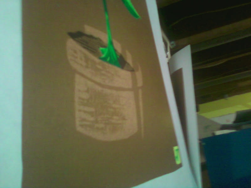
Just a small teaser snapshot. The new print with just two more colors to go. I'm excited to show off the whole thing. The shading effects on the front of the terra cotta pot were a happy accident. The hard part will be to make sure they don't print with any of the remaining colors. The final approach will take a steady hand and neatness, two things I am not known for!

Wednesday, June 3, 2015

Press-ure Pointers

I have been printmaking for over 13 years now, and one of the things I love about it is that I always learn something. Every time I hit the studio, it's education.

Being self taught is freeing, but you are also hampered by your own unknowns. If you go down Path A, you will go directly to the wellspring of all knowledge. But if you don't know Path A is there, you can get lost in the woods pretty easily.

Of course, if you take Path A, you also miss all of the crazy stuff in the woods. So there it is.

Anyway, I belong to an online group of amazing artists known as Baren Forum. They've been to the font of knowledge and are kind enough to run cups back to us morons still crawling around in the weeds. As part of this group, I am encouraged to participate in the print exchanges, where up to 30 members exchange prints. I did participate, as you saw a few posts back. And it was such a great experience. But as I was going through the work of others, I was struck by how nice an opaque some of the prints looked. Some looked like screen prints, the ink was so dense and even, regardless of the paper used.

And that led me to some serious trouble shooting in the studio last night, and some serious internet investigation. And it all came down to one thing, the thing that makes everything in the universe work: pressure.

I use an antique cast iron book press, which I have just discovered offers a raction of the pressure that an etching press does. In fact, though I turn and crank that wheel as hard as I can, it gives less pressure than using a wooden spoon, which is how I used to make my prints back in the beginning.

Here is an example of spoon vs. press.

On the right is the coverage I get from a lightly-inked block. On the left is what the ink transfer is like using a wooden spoon to burnish the back.

Well, issues with my hands prevent me from going back to the spoon, and I'm not giving up printmaking. So, I have found that by inking the block a little more, and just making peace with the effect of less pressure on the block, I can get back to some solid work. We'll see, won't we?!

Saturday, May 16, 2015

No Telling the Times, the Number of Times

Here we have the completed 4-color reduction linocut "Loon in Maroon" (2015). A remake of an original woodcut made in 2013.

Clearly I've made some strides forward. I learned a lot on this print, and I'm ready to get working on some original stuff after solving a few issues that arose in the printing.

I'm tempted to go back through my entire catalog and redo prints that failed as woodcuts. But what fun is that? Gotta move ahead.

So, of Maroon. I have a link on an earlier post that will take you to a video made for Ken Nordine's "Maroon" on Youtube. You may think you don't know Mr. Nordine, now in his 90s, but you do. He's a well-known voiceover artist, and you've heard him on plenty of commercials. He inspired Tom Waits to begin adding spoken word tracks to his albums, and they have worked together. 

His album "Colors" is mindblowing; it actually began as a series of radio spots for a paint company. Here is the poem in its entirety:


'Think of the times, the number of times, that you can make rhymes with that friend - maroon

There's the month of June - maroon

There's a singers croon - maroon

As she sings a tune - maroon

To an orange moon - maroon

Like a crazy loon - maroon

Please say prune - maroon

With a silver spoon - maroon

How high is noon? - maroon

Tell me soon, tell me soon, tell me soon, tell me soon

No telling the times, the number of rhymes, that we can make with our friend maroon

Platoon, cartoon, monsoon, lampoon, spitoon, baboon, octoroon, macaroon, baffoon, afternoon, opportune, pantaloon, immune.

Yeah, there's so many rhymes for good old maroon

I'm sure if you try you can think of a few that have slipped me by

See what you can rhyme with maroon

Do it soon, do it soon, do it soon'

------Ken Nordine, "Maroon."

Tuesday, September 30, 2014

Intermission

In the middle of a marathon to finish the last three colors of the drive-in print, and thought I'd take a minute to talk about color.

Color is very important to me, as an artist and as someone who likes to eat and sleep under a roof (I'm an ink technician for a printing company by trade). I almost gave up on reduction printing a few years ago because I couldn't get the colors to do what I wanted them to (see http://nappingcat.blogspot.com/2010/04/fresh-print-doonagore-castle.html for an example). One can often tell a reduction print by the muted, muddied colors that are the result of colors affecting the colors printed over them. Instead of giving up, I've made it my mission to overcome this issue.

One of the things I do before starting a print is to get a good idea of the colors I will be using. I then mix some test colors, overprinting them to see how they play off each other. I use screen printing to do this step, so the results are not necessarily transferable to woodcut. But it does give me a pretty good idea of what I want the final color to look like. Once I start printing with a block, I usually print one or two extra pieces, so that I can use them as color proofs.

The picture to the right is my color palette for my next print. Any guesses on what the subject might be?

Tuesday, July 8, 2014

Extreme Closeup: Sunflower Farm

Better photo to come, but this was a cell phone closeup of "Sunflower Farm" immediately after finishing color #10.
 Sorry about the orientation: grampaw isn't so good with his technology. As I said, better pictures are forthcoming.

As you may know, I traditionally enter a print in the Fine Arts competition at the Erie County Fair. As I prepared to start this print, I found myself in the muck of procrastination. "You need to get going on a print," my wife chided. "You need to give yourself time to do it over."

The joke is, of course, that I have a tendency to do a print a few times before it's right. And while I nailed this baby right out of the gate, allow me to take you back almost exactly one year, to the summer of 2013, when I was working on a little something I called "Sunflower Farm..."

This attempt was donated to the Chaffee Landfill, if anyone wants to go digging for it.