CLICK HERE TO VISIT MY ETSY SHOP!

VISIT MY ETSY.COM SITE.
Preview
JUST CLICK ON MY PRESS!
Showing posts with label linocut. Show all posts

Thursday, July 16, 2015

All Newt Review

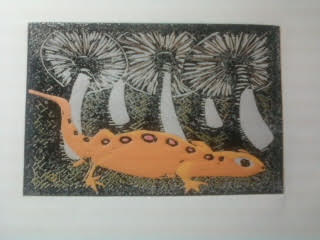
Sometimes printmaking just breaks your heart. Bless the ones who find their niche and master it. I, on the other hand, just keep pushing the envelope. I guess that'll lead me somewhere awesome, but the road....well, friends, the road can be tough.

So, about four colors into the newt print, I knew it wasn't going to work. But I finished it. I made myself finish it, and finish the whole lot. Not just to finish it, but to make notes along the way so that I could at least salvage the education. There are things I do love about it, but other things that have me tearing my hair out.

But the one thing that calms me down is knowing that if I was just playing it safe, I wouldn't be here. So, while the nut goes uncracked, I'm certain that when I do figure this all out, there's going to be magic.


Wednesday, June 10, 2015

Newty Picture

Here's the second to last color. I'm going through with finishing it, now just as an exercise because I want to see how the colors and the other aspects of the print look. Except for the main subject, I really like the print. I'm happy with the colors, and how they look. Accepting the limitations of the book press has helped me with proper inking, and also with anticipating areas where the coverage might be an issue, which has allowed me to plan out my colors. For example, you'll notice that I have chosen in many cases to put light colors on top of dark colors, which as we've seen in past prints is not always a good idea. But here, it's to the benefit, especially on the mushrooms. The last color is black.

Monday, June 8, 2015

Creepy

A busy weekend in the studio. The next color down was a dark green, which defined our subject. The following color is a nice earthy brown. I tried to get a third color last night, but was only able to cut the block. It was a great deal of precision cutting, and I was pretty tired after that.


Friday, June 5, 2015

Clarity

My very favorite thing about reduction printmaking, even ahead of near-perfect register, is the slow reveal. Yes, of course, I know what the final image is supposed to look out -- I work from a completed drawing. And even if I make changes as I go along, I still have a good idea about what it should look like.

But there's something about watching something happen. Maybe it's like watching a favorite movie you've watched before -- you know what's going to happen, but watching it develop is the joy. Maybe it's also like we used to stand around and watch our mom's shake a Polaroid until the image appeared (betcha some of you got a fine earworm now -- Hey, Ya!

So, with the third color down, I think it's pretty clear what we're going for, although there's going to be a lot more going on over the course of the next five colors.

The mystery animal will be much clearer after the next color goes down. I was very happy with my color choices on this one. Unfortunately, because of how I have my jig set, I'm getting crimping in the corners. However, I have designed jig modifications that should eliminate the issue.


Wednesday, June 3, 2015

Press-ure Pointers

I have been printmaking for over 13 years now, and one of the things I love about it is that I always learn something. Every time I hit the studio, it's education.

Being self taught is freeing, but you are also hampered by your own unknowns. If you go down Path A, you will go directly to the wellspring of all knowledge. But if you don't know Path A is there, you can get lost in the woods pretty easily.

Of course, if you take Path A, you also miss all of the crazy stuff in the woods. So there it is.

Anyway, I belong to an online group of amazing artists known as Baren Forum. They've been to the font of knowledge and are kind enough to run cups back to us morons still crawling around in the weeds. As part of this group, I am encouraged to participate in the print exchanges, where up to 30 members exchange prints. I did participate, as you saw a few posts back. And it was such a great experience. But as I was going through the work of others, I was struck by how nice an opaque some of the prints looked. Some looked like screen prints, the ink was so dense and even, regardless of the paper used.

And that led me to some serious trouble shooting in the studio last night, and some serious internet investigation. And it all came down to one thing, the thing that makes everything in the universe work: pressure.

I use an antique cast iron book press, which I have just discovered offers a raction of the pressure that an etching press does. In fact, though I turn and crank that wheel as hard as I can, it gives less pressure than using a wooden spoon, which is how I used to make my prints back in the beginning.

Here is an example of spoon vs. press.

On the right is the coverage I get from a lightly-inked block. On the left is what the ink transfer is like using a wooden spoon to burnish the back.

Well, issues with my hands prevent me from going back to the spoon, and I'm not giving up printmaking. So, I have found that by inking the block a little more, and just making peace with the effect of less pressure on the block, I can get back to some solid work. We'll see, won't we?!

Saturday, May 16, 2015

No Telling the Times, the Number of Times

Here we have the completed 4-color reduction linocut "Loon in Maroon" (2015). A remake of an original woodcut made in 2013.

Clearly I've made some strides forward. I learned a lot on this print, and I'm ready to get working on some original stuff after solving a few issues that arose in the printing.

I'm tempted to go back through my entire catalog and redo prints that failed as woodcuts. But what fun is that? Gotta move ahead.

So, of Maroon. I have a link on an earlier post that will take you to a video made for Ken Nordine's "Maroon" on Youtube. You may think you don't know Mr. Nordine, now in his 90s, but you do. He's a well-known voiceover artist, and you've heard him on plenty of commercials. He inspired Tom Waits to begin adding spoken word tracks to his albums, and they have worked together. 

His album "Colors" is mindblowing; it actually began as a series of radio spots for a paint company. Here is the poem in its entirety:


'Think of the times, the number of times, that you can make rhymes with that friend - maroon

There's the month of June - maroon

There's a singers croon - maroon

As she sings a tune - maroon

To an orange moon - maroon

Like a crazy loon - maroon

Please say prune - maroon

With a silver spoon - maroon

How high is noon? - maroon

Tell me soon, tell me soon, tell me soon, tell me soon

No telling the times, the number of rhymes, that we can make with our friend maroon

Platoon, cartoon, monsoon, lampoon, spitoon, baboon, octoroon, macaroon, baffoon, afternoon, opportune, pantaloon, immune.

Yeah, there's so many rhymes for good old maroon

I'm sure if you try you can think of a few that have slipped me by

See what you can rhyme with maroon

Do it soon, do it soon, do it soon'

------Ken Nordine, "Maroon."

Friday, May 15, 2015

Maroon Loon

The second color, the eponymous maroon, went down nicely.The foundation colors are important, but you can't really see much going on until the dark colors go down. Usually, the darker colors go on way down the line, but since this is a night picture, the dark comes on quickly.

I'm still getting used to the linoleum. It cuts wonderfully, but it's easy to dent the block around the lines, so I have to keep the tools sharp. I also don't need to cut as deep as with the wood. I also need to refine the jig I use to print, as it's causing crimping of the paper in the corners. These are pretty easy issues to resolve, I think. Right now, I am just having fun doing the work, something I've been missing for a while. It's good to be back.

Thursday, May 14, 2015

Dance By The Might of the Loon

Loon puns are hard. Luckily, the first color was not. I photographed this drying on the clothesline, backlit to show detail. The color is a very pale yellorange. Yes, yellorange. It will comprise the moon and the moon reflection.

Don't strain. The details will be clearer as the darker colors go down.

Monday, May 11, 2015

Passion Play

Last week, I received my box of linoleum blocks. I went with the 4x6 blocks. I've been working in 9x7 for the last few years, but I figured I would go back to how I originally started with woodcuts and work my way back up.

This is just goofing around on a block. I used rubber cement to adhere the linoleum to a large block so it would fit in the "chase" I have built for the press. It works like a charm.

What you're looking at here is just some playing around with cuts and colors, to see how the blades work on the linoleum, and especially to see how the ink lays down, layer upon layer.

I'm very happy with how the linoleum responds. The letter "A," which in wood may have taken a half hour of eye-straining, finger-mangling work, took just minutes. The ink lays down so evenly (I purposely put lights over darks to see how the ink would behave).

I still love wood, but for reduction printing, my new passion is linoleum. I'll be starting my first "real" print this week. Keep posted!

Wednesday, February 18, 2015

The Poplar Kid

Planks a lot.
From the moment I began making woodcuts in the late minter of 2002, I've had a hard time explaining what
exactly a woodcut is. I usually end up comparing it to a rubber stamp. It is the same principal -- relief printing. But then, so is a finger print, but it would be wrong, I think, to consider every perp at the police station a "printmaker."

Sorry: "alleged" perp.

I've mentioned before that my first prints were made with a potato and some glitter paint. However, my first authentic woodcut was made with a plank of pine I had from a brief flirtation with carpentry. It was a print of my wife; as per usual, I thought it was lovely, she thought it was hideous. We are still married.

Very quickly, I discovered poplar. I don't know how I came to discover poplar -- maybe Internet research, maybe a book. I loved how sturdy it was. My first piece was 12"x12"x1/2", and my first print off of poplar was a very large Valentine's Day card for my critic...er, wife. This time, she loved it. That's not why I stuck with poplar, of course. Pine was easy to cut, but it was very splintery. And a little thirsty for the water-based inks I used at the time.

With the poplar, I switched to oil-based inks, and the combination was great. For reasons lost to me now, I switched from poplar to birch plywood. I think the deciding factor was a combination of crappy dull tools/idiot who couldn't figure out how to sharpen his tools. More the latter than the former. Birch plywood was great for me -- I could do almost all of my carving with an Xacto.

Why Ply?
I used 1/4" plywood, which meant that warping was a constant issue. Also, the wood was prone to very unfortunate splintering. I was also too often finding big knotholes in the sublayer, which ended up ruining a number of prints. A lot of printmakers swear by their plywoods, and I can see why. A lot also love their poplar. I went back to poplar a couple of years ago -- after learning how to sharpen my tools, of course.

I'm a believer in sustainable resources, when they work (I tried -- I really TRIED -- to use
a greener solvent for cleanup. It was awful. Sorry, Earth). And I do feel guilty carving up a plank of poplar for my prints, when linoleum is readily available.

This IS your father's linoleum.
Oh, didn't you know linoleum is a green resource? Yeah, it's kind of crazy -- I always thought it was rubber or plastic, but it's linseed oil and sawdust. Probably poplar sawdust. And I love  the look of linocuts -- the lines are so clean, and the impressions are so even. I may do a little linoleum this summer. But it will take a lot to get me to change my mind about poplar. I love how it works. I love that it's sturdy, and can hold up to the many carvings and prints that reduction printing imposes.
Linoleum done right: William Hays, "Quiet Night."

There are so many options for printmakers. I knew a guy who would find old cabinet doors in the trash and use them for woodcuts. I've made collagraphs with cut out styrofoam. The art of art is never locking yourself into one medium, one subject, one idea.

The print at left is a reduction linocut by artist William Hays. He is my printmaking hero. Check out his amazing work at: http://www.artfulhome.com/artist/William-Hays/8352

Monday, October 19, 2009

A Change of Direction


Soooo..... Well, I didn't think I'd been away from the blog so long. It's been a very educational couple of weeks. So, I redid the print, and found that the grains were so open on the wood that it was very hard to see the details. So, after consulting some online sources, I treated the blocks with a solution of glue and water and sanded them down. And it still sucked. So, I've decided to go with carving linoleum. I'd been thinking of carving linoleum for some time, mainly because it's made of linseed oil and sawdust, which means it's biodegradable. It's also cheaper. There's no grain, so that issue will be done with. It will be very interesting to see how it turns out.
As for the greeting cards -- the long awaited greeting cards, we've had another setback. I'm just trying to gather up enough resources to fund the purchase of the equipment. At this point, it doesn't look like there will be Christmas Cards this year. On the plus side, I've decided to pay the mortgage instead! Look at me and my crazy priorities!
The linoleum should be here for the weekend, I hope, and then this blog might actually be worth checking in on!